This is the last in a series of excerpts from Elements of Data Science, now available from Lulu.com and online booksellers.
This article is based on the Recidivism Case Study, which is about algorithmic fairness. The goal of the case study is to explain the statistical arguments presented in two articles from 2016:
“Machine Bias”, by Julia Angwin, Jeff Larson, Surya Mattu and Lauren Kirchner, and published by ProPublica.
Both are about COMPAS, a statistical tool used in the justice system to assign defendants a “risk score” that is intended to reflect the risk that they will commit another crime if released.
The ProPublica article evaluates COMPAS as a binary classifier, and compares its error rates for black and white defendants. In response, the Washington Post article shows that COMPAS has the same predictive value black and white defendants. And they explain that the test cannot have the same predictive value and the same error rates at the same time.
In the first notebook I replicated the analysis from the ProPublica article. In the second notebook I replicated the analysis from the WaPo article. In this article I use the same methods to evaluate the performance of COMPAS for male and female defendants. I find that COMPAS is unfair to women: at every level of predicted risk, women are less likely to be arrested for another crime.
The authors of the ProPublica article published a supplementary article, How We Analyzed the COMPAS Recidivism Algorithm, which describes their analysis in more detail. In the supplementary article, they briefly mention results for male and female respondents:
The COMPAS system unevenly predicts recidivism between genders. According to Kaplan-Meier estimates, women rated high risk recidivated at a 47.5 percent rate during two years after they were scored. But men rated high risk recidivated at a much higher rate – 61.2 percent – over the same time period. This means that a high-risk woman has a much lower risk of recidivating than a high-risk man, a fact that may be overlooked by law enforcement officials interpreting the score.
We can replicate this result using the methods from the previous notebooks; we don’t have to do Kaplan-Meier estimation.
According to the binary gender classification in this dataset, about 81% of defendants are male.
male = cp["sex"] == "Male"
male.mean()
0.8066260049902967
female = cp["sex"] == "Female"
female.mean()
0.19337399500970334
Here are the confusion matrices for male and female defendants.
from rcs_utils import make_matrix

matrix_male = make_matrix(cp[male])
matrix_male
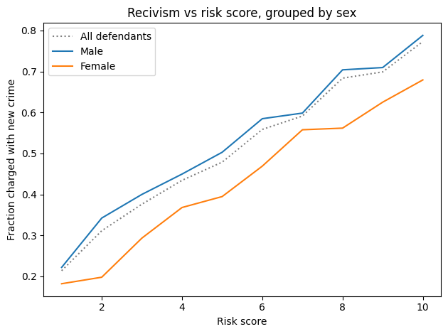
The fraction of defendants charged with another crime (prevalence) is substantially higher for male defendants (47% vs 36%).
Nevertheless, the error rates for the two groups are about the same. As a result, the predictive values for the two groups are substantially different:
PPV: Women classified as high risk are less likely to be charged with another crime, compared to high-risk men (51% vs 64%).
NPV: Women classified as low risk are more likely to “survive” two years without a new charge, compared to low-risk men (76% vs 67%).
The difference in predictive values implies that COMPAS is not calibrated for men and women. Here are the calibration curves for male and female defendants.
For all risk scores, female defendants are substantially less likely to be charged with another crime. Or, reading the graph the other way, female defendants are given risk scores 1-2 points higher than male defendants with the same actual risk of recidivism.
To the degree that COMPAS scores are used to decide which defendants are incarcerated, those decisions:
Are unfair to women.
Are less effective than they could be, if they incarcerate lower-risk women while allowing higher-risk men to go free.
What would it take?
Suppose we want to fix COMPAS so that predictive values are the same for male and female defendants. We could do that by using different thresholds for the two groups. In this section, we’ll see what it would take to re-calibrate COMPAS; then we’ll find out what effect that would have on error rates.
From the previous notebook, sweep_threshold loops through possible thresholds, makes the confusion matrix for each threshold, and computes the accuracy metrics. Here are the resulting tables for all defendants, male defendants, and female defendants.
from rcs_utils import sweep_threshold

table_all = sweep_threshold(cp)
table_male = sweep_threshold(cp[male])
table_female = sweep_threshold(cp[female])
As we did in the previous notebook, we can find the threshold that would make predictive value the same for both groups.
from rcs_utils import crossing

crossing(table_male["PPV"], ppv)
array(3.36782883)
crossing(table_male["NPV"], npv)
array(3.40116329)
With a threshold near 3.4, male defendants would have the same predictive values as the general population. Now let’s do the same computation for female defendants.
crossing(table_female["PPV"], ppv)
array(6.88124668)
crossing(table_female["NPV"], npv)
array(6.82760429)
To get the same predictive values for men and women, we would need substantially different thresholds: about 6.8 compared to 3.4. At those levels, the false positive rates would be very different:
from rcs_utils import interpolate

interpolate(table_male["FPR"], 3.4)
array(39.12)
interpolate(table_female["FPR"], 6.8)
array(9.14)
And so would the false negative rates.
interpolate(table_male["FNR"], 3.4)
array(30.98)
interpolate(table_female["FNR"], 6.8)
array(74.18)
If the test is calibrated in terms of predictive value, it is uncalibrated in terms of error rates.
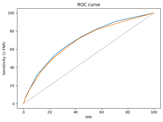
from rcs_utils import plot_roc

plot_roc(table_male)
plot_roc(table_female)
The ROC curves are nearly identical, which implies that it is possible to calibrate COMPAS equally for male and female defendants.
Summary
With respect to sex, COMPAS is fair by the criteria posed by the ProPublica article: it has the same error rates for groups with different prevalence. But it is unfair by the criteria of the WaPo article, which argues:
A risk score of seven for black defendants should mean the same thing as a score of seven for white defendants. Imagine if that were not so, and we systematically assigned whites higher risk scores than equally risky black defendants with the goal of mitigating ProPublica’s criticism. We would consider that a violation of the fundamental tenet of equal treatment.
With respect to male and female defendants, COMPAS violates this tenet.
So who’s right? We have two competing definitions of fairness, and it is mathematically impossible to satisfy them both. Is it better to have equal error rates for all groups, as COMPAS does for men and women? Or is it better to be calibrated, which implies equal predictive values? Or, since we can’t have both, should the test be “tempered”, allowing both error rates and predictive values to depend on prevalence?
This is the fifth in a series of excerpts from Elements of Data Science, now available from Lulu.com and online booksellers. It’s based on Chapter 16, which is part of the political alignment case study. You can read the complete example here, or run the Jupyter notebook on Colab.
Because this is a teaching example, it builds incrementally. If you just want to see the results, scroll to the end!
Chapter 16 is a template for exploring relationships between political alignment (liberal or conservative) and other beliefs and attitudes. In this example, we’ll use that template to look at the ways confidence in the press has changed over the last 50 years in the U.S.
The dataset we’ll use is an excerpt of data from the General Social Survey. It contains three resamplings of the original data. We’ll start with the first.
It contains one row for each respondent and one column per variable.
Changes in Confidence
The General Social Survey includes several questions about a confidence in various institutions. Here are the names of the variables that contain the responses.
' '.join(column for column in gss.columns if 'con' in column)
Here’s how this section of the survey is introduced.
I am going to name some institutions in this country. As far as the people running these institutions are concerned, would you say you have a great deal of confidence, only some confidence, or hardly any confidence at all in them?
The variable we’ll explore is conpress, which is about “the press”.
The special value NaN indicates that the respondent was not asked the question, declined to answer, or said they didn’t know.
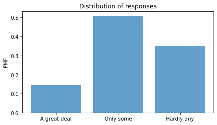
The following cell shows the numerical values and the text of the responses they stand for.
responses = [1, 2, 3]

labels = [
    "A great deal",
    "Only some",
    "Hardly any",
]
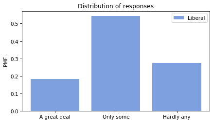
Here’s what the distribution looks like. plt.xticks puts labels on the
-axis.
pmf = Pmf.from_seq(column)
pmf.bar(alpha=0.7)

decorate(ylabel="PMF", title="Distribution of responses")
plt.xticks(responses, labels);
About had of the respondents have “only some” confidence in the press – but we should not make too much of this result because it combines different numbers of respondents interviewed at different times.
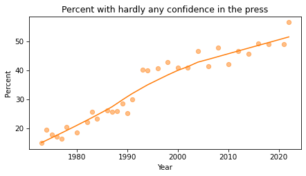
Responses over time
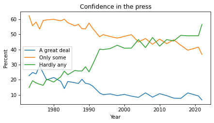
If we make a cross tabulation of year and the variable of interest, we get the distribution of responses over time.
for response, label in zip(responses, labels):
    xtab[response].plot(label=label)

decorate(xlabel="Year", ylabel="Percent", title="Confidence in the press")
The percentages of “A great deal” and “Only some” have been declining since the 1970s. The percentage of “Hardly any” has increased substantially.
Political alignment
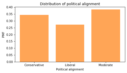
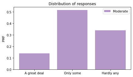
To explore the relationship between these responses and political alignment, we’ll recode political alignment into three groups:
Now we can make a PMF of responses for each group.
for name, group in by_polviews:
    plt.figure()
    pmf = Pmf.from_seq(group[varname])
    pmf.bar(label=name, color=color_map[name], alpha=0.7)

    decorate(ylabel="PMF", title="Distribution of responses")
    plt.xticks(responses, labels)
Looking at the “Hardly any” response, it looks like conservatives have the least confidence in the press.
Recode
To quantify changes in these responses over time, one option is to put them on a numerical scale and compute the mean. Another option is to compute the percentage who choose a particular response or set of responses. Since the changes have been most notable in the “Hardly any” response, that’s what we’ll track. We’ll use replace to recode the values so “Hardly any” is 1 and all other responses are 0.
We can use value_counts to confirm that it worked.
gss["recoded"].value_counts(dropna=False)
0.0    31371
NaN    24250
1.0    16769
Name: conpress, dtype: int64
Now if we compute the mean, we can interpret it as the fraction of respondents who report “hardly any” confidence in the press. Multiplying by 100 makes it a percentage.
gss["recoded"].mean() * 100
34.833818030743664
Note that the Series method mean drops NaN values before computing the mean. The NumPy function mean does not.
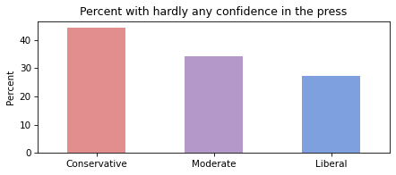
Average by group
We can use by_polviews to compute the mean of the recoded variable in each group, and multiply by 100 to get a percentage.
title = "Percent with hardly any confidence in the press"
colors = color_map.values()
means[groups].plot(kind="bar", color=colors, alpha=0.7, label="")

decorate(
    xlabel="",
    ylabel="Percent",
    title=title,
)

plt.xticks(rotation=0);
Conservatives have less confidence in the press than liberals, and moderates are somewhere in the middle.
But again, these results are an average over the interval of the survey, so you should not interpret them as a current condition.
Time series
We can use groupby to group responses by year.
by_year = gss.groupby("year")
From the result we can select the recoded variable and compute the percentage that responded “Hardly any”.
time_series = by_year["recoded"].mean() * 100
And we can plot the results with the data points themselves as circles and a local regression model as a line.
The fraction of respondents with “Hardly any” confidence in the press has increased consistently over the duration of the survey.
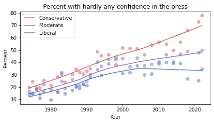
Time series by group
So far, we have grouped by polviews3 and computed the mean of the variable of interest in each group. Then we grouped by year and computed the mean for each year. Now we’ll use pivot_table to compute the mean in each group for each year.
The result is a table that has years running down the rows and political alignment running across the columns. Each entry in the table is the mean of the variable of interest for a given group in a given year.
Plotting the results
Now let’s see the results.
for group in groups:
series = table[group]
plot_series_lowess(series, color_map[group])
decorate(
xlabel="Year",
ylabel="Percent",
title="Percent with hardly any confidence in the press",
)
Confidence in the press has decreased in all three groups, but among liberals it might have leveled off or even reversed.
Resampling
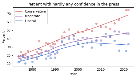
The figures we’ve generated so far in this notebook are based on a single resampling of the GSS data. Some of the features we see in these figures might be due to random sampling rather than actual changes in the world. By generating the same figures with different resampled datasets, we can get a sense of how much variation there is due to random sampling. To make that easier, the following function contains the code from the previous analysis all in one place.
def plot_by_polviews(gss, varname):
"""Plot mean response by polviews and year.
gss: DataFrame
varname: string column name
"""
gss["polviews3"] = gss["polviews"].replace(d_polviews)
column = gss[varname]
gss["recoded"] = column.replace(d_recode)
table = gss.pivot_table(
    values="recoded", index="year", columns="polviews3", aggfunc="mean"
) * 100
for group in groups:
series = table[group]
plot_series_lowess(series, color_map[group])
decorate(
xlabel="Year",
ylabel="Percent",
title=title,
)
Now we can loop through the three resampled datasets and generate a figure for each one.
datafile = "gss_pacs_resampled.hdf"

for key in ["gss0", "gss1", "gss2"]:
    df = pd.read_hdf(datafile, key)

    plt.figure()
    plot_by_polviews(df, varname)
If you see an effect that is consistent in all three figures, it is less likely to be due to random sampling. If it varies from one resampling to the next, you should probably not take it too seriously.
Based on these results, it seems likely that confidence in the press is continuing to decrease among conservatives and moderates, but not liberals – with the result that polarization on this issue has increased since the 1990s.
This is the fourth in a series of excerpts from Elements of Data Science, now available from Lulu.com and online booksellers. It’s from Chapter 15, which is part of the political alignment case study. You can read the complete chapter here, or run the Jupyter notebook on Colab.
In the previous chapter, we used data from the General Social Survey (GSS) to plot changes in political alignment over time. In this notebook, we’ll explore the relationship between political alignment and respondents’ beliefs about themselves and other people.
First we’ll use groupby to compare the average response between groups and plot the average as a function of time. Then we’ll use the Pandas function pivot table to compute the average response within each group as a function of time.
Are People Fair?
In the GSS data, the variable fair contains responses to this question:
Do you think most people would try to take advantage of you if they got a chance, or would they try to be fair?
The possible responses are:
Code
Response
1
Take advantage
2
Fair
3
Depends
As always, we start by looking at the distribution of responses, that is, how many people give each response:
The plurality think people try to be fair (2), but a substantial minority think people would take advantage (1). There are also a number of NaNs, mostly respondents who were not asked this question.
gss["fair"].isna().sum()
29987
To count the number of people who chose option 2, “people try to be fair”, we’ll use a dictionary to recode option 2 as 1 and the other options as 0.
recode_fair = {1: 0, 2: 1, 3: 0}
As an alternative, we could include option 3, “depends”, by replacing it with 1, or give it less weight by replacing it with an intermediate value like 0.5. We can use replace to recode the values and store the result as a new column in the DataFrame.
gss["fair2"] = gss["fair"].replace(recode_fair)
And we’ll use values to make sure it worked.
values(gss["fair2"])
0.0    18986
1.0    23417
Name: fair2, dtype: int64
Now let’s see how the responses have changed over time.
Fairness Over Time
As we saw in the previous chapter, we can use groupby to group responses by year.
gss_by_year = gss.groupby("year")
From the result we can select fair2 and compute the mean.
fair_by_year = gss_by_year["fair2"].mean()
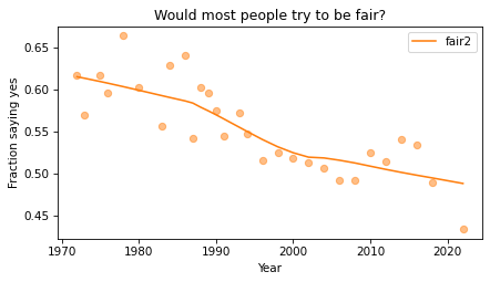
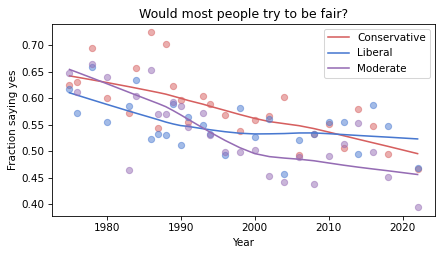
Here’s the result, which shows the fraction of people who say people try to be fair, plotted over time. As in the previous chapter, we plot the data points themselves with circles and a local regression model as a line.
plot_series_lowess(fair_by_year, "C1")

decorate(
    xlabel="Year",
    ylabel="Fraction saying yes",
    title="Would most people try to be fair?",
)
Sadly, it looks like faith in humanity has declined, at least by this measure. Let’s see what this trend looks like if we group the respondents by political alignment.
Political Views on a 3-point Scale
In the previous notebook, we looked at responses to polviews, which asks about political alignment. The valid responses are:
Code
Response
1
Extremely liberal
2
Liberal
3
Slightly liberal
4
Moderate
5
Slightly conservative
6
Conservative
7
Extremely conservative
To make it easier to visualize groups, we’ll lump the 7-point scale into a 3-point scale.
It looks like conservatives are a little more optimistic, in this sense, than liberals and moderates. But this result is averaged over the last 50 years. Let’s see how things have changed over time.
Fairness over Time by Group
So far, we have grouped by polviews3 and computed the mean of fair2 in each group. Then we grouped by year and computed the mean of fair2 for each year. Now we’ll group by polviews3 and year, and compute the mean of fair2 in each group over time.
We could do that computation “by hand” using the tools we already have, but it is so common and useful that it has a name. It is called a pivot table, and Pandas provides a function called pivot_table that computes it. It takes the following arguments:
values, which is the name of the variable we want to summarize: fair2 in this example.
index, which is the name of the variable that will provide the row labels: year in this example.
columns, which is the name of the variable that will provide the column labels: polview3 in this example.
aggfunc, which is the function used to “aggregate”, or summarize, the values: mean in this example.
The result is a DataFrame that has years running down the rows and political alignment running across the columns. Each entry in the table is the mean of fair2 for a given group in a given year.
table.head()
polviews3
Conservative
Liberal
Moderate
year
1975
0.625616
0.617117
0.647280
1976
0.631696
0.571782
0.612100
1978
0.694915
0.659420
0.665455
1980
0.600000
0.554945
0.640264
1983
0.572438
0.585366
0.463492
Reading across the first row, we can see that in 1975, moderates were slightly more optimistic than the other groups. Reading down the first column, we can see that the estimated mean of fair2 among conservatives varies from year to year. It is hard to tell looking at these numbers whether it is trending up or down – we can get a better view by plotting the results.
Plotting the Results
Before we plot the results, I’ll make a dictionary that maps from each group to a color. Seaborn provide a palette called muted that contains the colors we’ll use.
groups = ["Conservative", "Liberal", "Moderate"]
for group in groups:
    series = table[group]
    plot_series_lowess(series, color_map[group])

decorate(
    xlabel="Year",
    ylabel="Fraction saying yes",
    title="Would most people try to be fair?",
)
The fraction of respondents who think people try to be fair has dropped in all three groups, although liberals and moderates might have leveled off. In 1975, liberals were the least optimistic group. In 2022, they might be the most optimistic. But the responses are quite noisy, so we should not be too confident about these conclusions.
Discussion
I heard from a reader that they appreciated this explanation of pivot tables because it provides a concrete example of something that can be pretty abstract. I occurred to me that it is hard to define what a pivot table it because the table itself can be almost anything. What the term really refers to is the computation pattern rather than the result. One way to express the computational pattern is “Group by this on one axis, group by that on the other axis, select a variable, and summarize”.
In Pandas, another way to compute a pivot table is like this:
This way of writing it makes the grouping part of the computation more explicit. And the groupby function is more versatile, so if you only want to learn one thing, you might prefer this version. The unstack at the end is only needed if you want a wide table (with time down the rows and alignment across the columns) — without it, you get the long table (with one row for each pair of time and alignment, and only one column).
So, should we forget about pivot_table (and crosstab while we’re at it) and use groupby for everything? I’m not sure. For people who are already know the terms, it can be helpful to use functions with familiar names. But if you understand the group-by computational pattern, it might not be useful to use different functions for particular instances of the pattern.
The premise of Think Stats, and the other books in the Think series, is that programming is a tool for teaching and learning — and many ideas that are commonly presented in math notation can be more clearly presented in code.
In the draft third edition of Think Stats there is almost no math — not because I made a special effort to avoid it, but because I found that I didn’t need it. For example, here’s how I present the binomial distribution in Chapter 5:
Mathematically, the distribution of these outcomes follows a binomial distribution, which has a PMF that is easy to compute.
SciPy provides the comb function, which computes the number of combinations of n things taken k at a time, often pronounced “n choose k”.
binomial_pmf computes the probability of getting k hits out of n attempts, given p.
I could also present the PMF in math notation, but I’m not sure how it would help — the Python code represents the computation just as clearly. Some readers find math notation intimidating, and even for the ones who don’t, it takes some effort to decode. In my opinion, the payoff for this additional effort is too low.
But one of the people who read the draft disagrees. They wrote:
Provide equations for the distributions. You assume that the reader knows them and then you suddenly show a programming code for them — the code is a challenge to the reader to interpret without knowing the actual equation.
I acknowledge that my approach defies the expectation that we should present math first and then translate it into code. For readers who are used to this convention, presenting the code first is “sudden”.
But why? I think there are two reasons, one practical and one philosophical:
The practical reason is the presumption that the reader is more familiar with math notation and less familiar with code. Of course that’s true for some people, but for other people, it’s the other way around. People who like math have lots of books to choose from; people who like code don’t.
The philosophical reason is what I’m calling math supremacy, which is the idea that math notation is the real thing, and everything else — including and especially code — is an inferior imitation. My correspondent hints at this idea with the suggestion that the reader should see the “actual equation”. Math is actual; code is not.
I reject math supremacy. Math notation did not come from the sky on stone tablets; it was designed by people for a purpose. Programming languages were also designed by people, for different purposes. Math notation has some good properties — it is concise and it is nearly universal. But programming languages also have good properties — most notably, they are executable. When we express an idea in code, we can run it, test it, and debug it.
So here’s a thought: if you are writing for an audience that is comfortable with math notation, and your ideas can be expressed well in that form — go ahead and use math notation. But if you are writing for an audience that understands code, and your ideas can be expressed well in code — well then you should probably use code. “Actual” code.
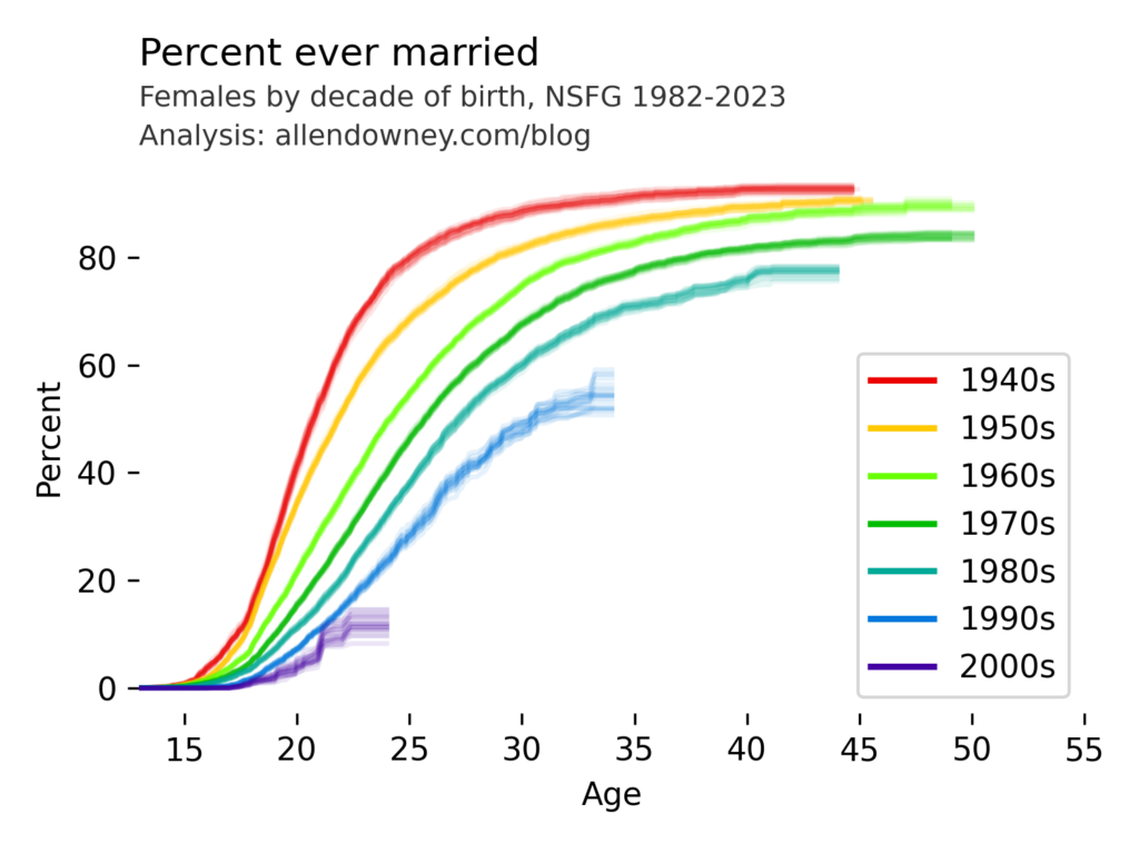
I’ve written before about changes in marriage patterns in the U.S., and it’s one of the examples in Chapter 13 of the new third edition of Think Stats. My analysis uses data from the National Survey of Family Growth (NSFG). Today they released the most recent data, from surveys conducted in 2022 and 2023. So here are the results, updated with the newest data:
The patterns are consistent with what we’ve see in previous iterations — each successive cohort marries later than the previous one, and it looks like an increasing percentage of them will remain unmarried.
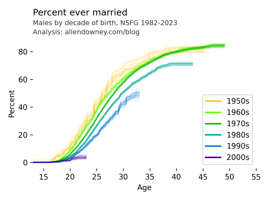
UPDATE: Here’s the same analysis for male respondents:
The pattern is similar — compared to previous generations, very few young men are getting married.
Data: National Center for Health Statistics (NCHS). (2024). 2022–2023 National Survey of Family Growth Public Use Data and Documentation. Hyattsville, MD: CDC National Center for Health Statistics. Retrieved from NSFG 2022–2023 Public Use Data Files, December 11, 2024.
This is the third is a series of excerpts from Elements of Data Science which available from Lulu.com and online booksellers. It’s from Chapter 10, which is about multiple regression. You can read the complete chapter here, or run the Jupyter notebook on Colab.
In the previous chapter we used simple linear regression to quantify the relationship between two variables. In this chapter we’ll get farther into regression, including multiple regression and one of my all-time favorite tools, logistic regression. These tools will allow us to explore relationships among sets of variables. As an example, we will use data from the General Social Survey (GSS) to explore the relationship between education, sex, age, and income.
The GSS dataset contains hundreds of columns. We’ll work with an extract that contains just the columns we need, as we did in Chapter 8. Instructions for downloading the extract are in the notebook for this chapter.
We can read the DataFrame like this and display the first few rows.
import pandas as pd

gss = pd.read_hdf('gss_extract_2022.hdf', 'gss')
gss.head()
year
id
age
educ
degree
sex
gunlaw
grass
realinc
0
1972
1
23.0
16.0
3.0
2.0
1.0
NaN
18951.0
1
1972
2
70.0
10.0
0.0
1.0
1.0
NaN
24366.0
2
1972
3
48.0
12.0
1.0
2.0
1.0
NaN
24366.0
3
1972
4
27.0
17.0
3.0
2.0
1.0
NaN
30458.0
4
1972
5
61.0
12.0
1.0
2.0
1.0
NaN
50763.0
We’ll start with a simple regression, estimating the parameters of real income as a function of years of education. First we’ll select the subset of the data where both variables are valid.
data = gss.dropna(subset=['realinc', 'educ'])
xs = data['educ']
ys = data['realinc']
Now we can use linregress to fit a line to the data.
from scipy.stats import linregress
res = linregress(xs, ys)
res._asdict()
The first argument is a formula string that specifies that we want to regress income as a function of education. The second argument is the DataFrame containing the subset of valid data. The names in the formula string correspond to columns in the DataFrame.
The result from ols is an object that represents the model – it provides a function called fit that does the actual computation.
The result is a RegressionResultsWrapper, which contains a Series called params, which contains the estimated intercept and the slope associated with educ.
The results from Statsmodels are the same as the results we got from SciPy, so that’s good!
Multiple Regression
In the previous section, we saw that income depends on education, and in the exercise we saw that it also depends on age. Now let’s put them together in a single model.
Intercept   -17999.726908
educ          3665.108238
age             55.071802
dtype: float64
In this model, realinc is the variable we are trying to explain or predict, which is called the dependent variable because it depends on the the other variables – or at least we expect it to. The other variables, educ and age, are called independent variables or sometimes “predictors”. The + sign indicates that we expect the contributions of the independent variables to be additive.
The result contains an intercept and two slopes, which estimate the average contribution of each predictor with the other predictor held constant.
The estimated slope for educ is about 3665 – so if we compare two people with the same age, and one has an additional year of education, we expect their income to be higher by $3514.
The estimated slope for age is about 55 – so if we compare two people with the same education, and one is a year older, we expect their income to be higher by $55.
In this model, the contribution of age is quite small, but as we’ll see in the next section that might be misleading.
Grouping by Age
Let’s look more closely at the relationship between income and age. We’ll use a Pandas method we have not seen before, called groupby, to divide the DataFrame into age groups.
grouped = gss.groupby('age')
type(grouped)
pandas.core.groupby.generic.DataFrameGroupBy
The result is a GroupBy object that contains one group for each value of age. The GroupBy object behaves like a DataFrame in many ways. You can use brackets to select a column, like realinc in this example, and then invoke a method like mean.
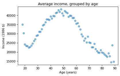
mean_income_by_age = grouped['realinc'].mean()
The result is a Pandas Series that contains the mean income for each age group, which we can plot like this.
import matplotlib.pyplot as plt

plt.plot(mean_income_by_age, 'o', alpha=0.5)
plt.xlabel('Age (years)')
plt.ylabel('Income (1986 $)')
plt.title('Average income, grouped by age');
Average income increases from age 20 to age 50, then starts to fall. And that explains why the estimated slope is so small, because the relationship is non-linear. To describe a non-linear relationship, we’ll create a new variable called age2 that equals age squared – so it is called a quadratic term.
gss['age2'] = gss['age']**2
Now we can run a regression with both age and age2 on the right side.
model = smf.ols('realinc ~ educ + age + age2', data=gss)
results = model.fit()
results.params
Intercept   -52599.674844
educ          3464.870685
age           1779.196367
age2           -17.445272
dtype: float64
In this model, the slope associated with age is substantial, about $1779 per year.
The slope associated with age2 is about -$17. It might be unexpected that it is negative – we’ll see why in the next section. But first, here are two exercises where you can practice using groupby and ols.
Visualizing regression results
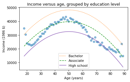
In the previous section we ran a multiple regression model to characterize the relationships between income, age, and education. Because the model includes quadratic terms, the parameters are hard to interpret. For example, you might notice that the parameter for educ is negative, and that might be a surprise, because it suggests that higher education is associated with lower income. But the parameter for educ2 is positive, and that makes a big difference. In this section we’ll see a way to interpret the model visually and validate it against data.
Here’s the model from the previous exercise.
gss['educ2'] = gss['educ']**2

model = smf.ols('realinc ~ educ + educ2 + age + age2', data=gss)
results = model.fit()
results.params
The results object provides a method called predict that uses the estimated parameters to generate predictions. It takes a DataFrame as a parameter and returns a Series with a prediction for each row in the DataFrame. To use it, we’ll create a new DataFrame with age running from 18 to 89, and age2 set to age squared.
Next, we’ll pick a level for educ, like 12 years, which is the most common value. When you assign a single value to a column in a DataFrame, Pandas makes a copy for each row.
df['educ'] = 12
df['educ2'] = df['educ']**2
Then we can use results to predict the average income for each age group, holding education constant.
pred12 = results.predict(df)
The result from predict is a Series with one prediction for each row. So we can plot it with age on the x-axis and the predicted income for each age group on the y-axis. And we’ll plot the data for comparison.
The dots show the average income in each age group. The line shows the predictions generated by the model, holding education constant. This plot shows the shape of the model, a downward-facing parabola.
We can do the same thing with other levels of education, like 14 years, which is the nominal time to earn an Associate’s degree, and 16 years, which is the nominal time to earn a Bachelor’s degree.
The lines show expected income as a function of age for three levels of education. This visualization helps validate the model, since we can compare the predictions with the data. And it helps us interpret the model since we can see the separate contributions of age and education.
Sometimes we can understand a model by looking at its parameters, but often it is better to look at its predictions. In the exercises, you’ll have a chance to run a multiple regression, generate predictions, and visualize the results.
If I have a tumor that I’ve been told has a malignancy rate of 2% per year, does that compound? So after 5 years there’s a 10% chance it will turn malignant?
This turns out to be an interesting question, because the answer depends on what that 2% means. If we know that it’s the same for everyone, and it doesn’t vary over time, computing the compounded probability after 5 years is a relatively simple.
But if that 2% is an average across people with different probabilities, the computation is a little more complicated – and the answer turns out to be substantially different, so this is not a negligible effect.
To demonstrate both computations, I’ll assume that the probability for a given patient doesn’t change over time. This assumption is consistent with the multistage model of carcinogenesis, which posits that normal cells become cancerous through a series of mutations, where the probability of any of those mutations is constant over time.
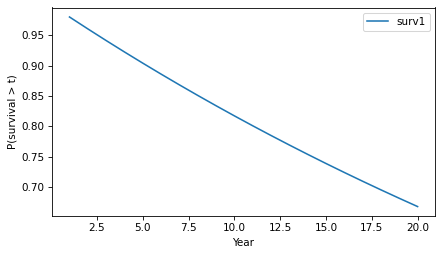
Let’s start with the simpler calculation, where the probability that a tumor progresses to malignancy is known to be 2% per year and constant. In that case, we can answer OP’s question by making a constant hazard function and using it to compute a survival function.
empiricaldist provides a Hazard object that represents a hazard function. Here’s one where the hazard is 2% per year for 20 years.
from empiricaldist import Hazard

p = 0.02
ts = np.arange(1, 21)
hazard = Hazard(p, ts, name='hazard1')
The probability that a tumor survives a given number of years without progressing is the cumulative product of the complements of the hazard, which we can compute like this.
p_surv = (1 - hazard).cumprod()
Hazard provides a make_surv method that does this computation and returns a Surv object that represents the corresponding survival function.
The y-axis shows the probability that a tumor “survives” for more than a given number of years without progressing. The probability of survival past Year 1 is 98%, as you might expect.
surv.head()
probs
1
0.980000
2
0.960400
3
0.941192
And the probability of going more than 10 years without progressing is about 82%.
surv(10)
array(0.81707281)
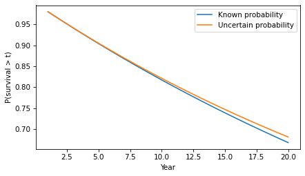
Because of the way the probabilities compound, the survival function drops off with decreasing slope, even though the hazard is constant.
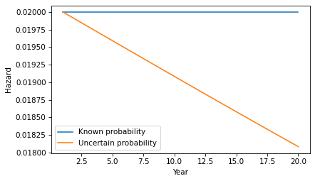
Knowledge is Power
Now let’s add a little more realism to the model. Suppose that in the observed population the average rate of progression is 2% per year, but it varies from one person to another. As an example, suppose the actual rate is 1% for half the population and 3% for the other half. And for a given patient, suppose we don’t know initially which group they are in.
[UPDATE: If you read an earlier version of this article, there was an error in this section – I had the likelihood ratio wrong and it had a substantial effect on the results.]
As in the previous example, the probability that the tumor goes a year without progressing is 98%. However, at the end of that year, if it has not progressed, we have evidence in favor of the hypothesis that the patient is in the low-progression group. Specifically, the likelihood ratio is 99/97 in favor of that hypothesis.
Now we can apply Bayes’s rule in odds form. Since the prior odds were 1:1 and the likelihood ratio is 99/97, the posterior odds are 99:97 – so after one year we now believe the probability is 50.5% that the patient is in the low-progression group.
p_low = 99 / (99 + 97)
p_low
0.5051020408163265
In that case we can update the probability that the tumor progresses in the second year:
p1 = 0.01
p2 = 0.03

p_low * p1 + (1-p_low) * p2
0.019897959183673472
If the tumor survives a year without progressing, the probability it will progress in the second year is 1.99%, slightly less than the initial estimate of 2%. Note that this change is due to evidence that the patient is in the low progression group. It does not assume that anything has changed in the world – only that we have more information about which world we’re in.
If the tumor lasts another year without progressing, we would do the same update again. The following loop repeats this computation for 20 years.
odds = 1
ratio = 99/97
res = []

for year in hazard.index:
    p_low = odds / (odds + 1)
    haz = p_low * p1 + (1-p_low) * p2
    res.append((p_low, haz))
    odds *= ratio
Each year, the probability increases that the patient is in the low-progression group, so the probability of progressing in the next year is a little lower.
Here’s what the corresponding survival function looks like.
The difference in survival is small, but it accumulates over time. For example, the probability of going more than 20 years without progression increases from 67% to 68%.
surv(20), surv2(20)
(array(0.66760797), array(0.68085064))
In this example, there are only two groups with different probabilities of progression. But we would see the same effect in a more realistic model with a range of probabilities. As time passes without progression, it becomes more likely that the patient is in a low-progression group, so their hazard during the next period is lower. The more variability there is in the probability of progression, the stronger this effect.
Discussion
This example demonstrates a subtle point about a distribution of probabilities. To explain it, let’s consider a more abstract scenario. Suppose you have two coin-flipping devices:
One of them is known to flips head and tails with equal probability.
The other is known to be miscalibrated so it flips heads with either 60% probability or 40% probability – and we don’t know which, but they are equally likely.
If we use the first device, the probability of heads is 50%. If we use the second device, the probability of heads is 50%. So it might seem like there is no difference between them – and more generally, it might seem like we can always collapse a distribution of probabilities down to a single probability.
But that’s not true, as we can demonstrate by running the coin-flippers twice. For the first, the probability of two heads is 25%. For the second, it’s either 36% or 16% with equal probability – so the total probability is 26%.
p1, p2 = 0.6, 0.4
np.mean([p1**2, p2**2])
0.26
In general, there’s a difference between a scenario where a probability is known precisely and a scenario where there is uncertainty about the probability.
Our World in Data recently announced that they are providing APIs to access their data. Coincidentally, I am using one of their datasets in my workshop on time series analysis at PyData Global 2024. So I took this opportunity to update my example using the new API – this notebook shows what I learned.
import numpy as np
import pandas as pd
import matplotlib.pyplot as plt
Air Temperature
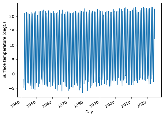
In the chapter on time series analysis, in an exercise on seasonal decomposition, I use monthly average surface temperatures in the United States, from a dataset from Our World in Data that includes “temperature [in Celsius] of the air measured 2 meters above the ground, encompassing land, sea, and in-land water surfaces,” for most countries in the world from 1941 to 2024.
The following cells download and display the metadata that describes the dataset.
import requests
url = ( "https://ourworldindata.org/grapher/" "average-monthly-surface-temperature.metadata.json" ) query_params = { "v": "1", "csvType": "full", "useColumnShortNames": "true" } headers = {'User-Agent': 'Our World In Data data fetch/1.0'}
The result is a nested dictionary. Here are the top-level keys.
metadata.keys()
dict_keys(['chart', 'columns', 'dateDownloaded'])
Here’s the chart-level documentation.
from pprint import pprint

pprint(metadata['chart'])
{'citation': 'Contains modified Copernicus Climate Change Service information '
             '(2019)',
 'originalChartUrl': 'https://ourworldindata.org/grapher/average-monthly-surface-temperature?v=1&csvType=full&useColumnShortNames=true',
 'selection': ['World'],
 'subtitle': 'The temperature of the air measured 2 meters above the ground, '
             'encompassing land, sea, and in-land water surfaces.',
 'title': 'Average monthly surface temperature'}
And here’s the documentation of the column we’ll use.
pprint(metadata['columns']['temperature_2m'])
{'citationLong': 'Contains modified Copernicus Climate Change Service '
                 'information (2019) – with major processing by Our World in '
                 'Data. “Annual average” [dataset]. Contains modified '
                 'Copernicus Climate Change Service information, “ERA5 monthly '
                 'averaged data on single levels from 1940 to present 2” '
                 '[original data].',
 'citationShort': 'Contains modified Copernicus Climate Change Service '
                  'information (2019) – with major processing by Our World in '
                  'Data',
 'descriptionKey': [],
 'descriptionProcessing': '- Temperature measured in kelvin was converted to '
                          'degrees Celsius (°C) by subtracting 273.15.\n'
                          '\n'
                          '- Initially, the temperature dataset is provided '
                          'with specific coordinates in terms of longitude and '
                          'latitude. To tailor this data to each country, we '
                          'utilize geographical boundaries as defined by the '
                          'World Bank. The method involves trimming the global '
                          'temperature dataset to match the exact geographical '
                          'shape of each country. To correct for potential '
                          "distortions caused by the Earth's curvature on a "
                          'flat map, we apply a latitude-based weighting. This '
                          'step is essential for maintaining accuracy, '
                          'especially in high-latitude regions where '
                          'distortion is more pronounced. The result of this '
                          'process is a latitude-weighted average temperature '
                          'for each nation.\n'
                          '\n'
                          "- It's important to note, however, that due to the "
                          'resolution constraints of the Copernicus dataset, '
                          'this methodology might not be as effective for '
                          'countries with very small landmasses. In these '
                          'cases, the process may not yield reliable data.\n'
                          '\n'
                          '- The derived 2-meter temperature readings for each '
                          'country are calculated based on administrative '
                          'borders, encompassing all land surface types within '
                          'these defined areas. As a result, temperatures over '
                          'oceans and seas are not included in these averages, '
                          'focusing the data primarily on terrestrial '
                          'environments.\n'
                          '\n'
                          '- Global temperature averages and anomalies are '
                          'calculated over all land and ocean surfaces.',
 'descriptionShort': 'The temperature of the air measured 2 meters above the '
                     'ground, encompassing land, sea, and in-land water '
                     'surfaces. The 2024 data is incomplete and was last '
                     'updated 13 October 2024.',
 'fullMetadata': 'https://api.ourworldindata.org/v1/indicators/819532.metadata.json',
 'lastUpdated': '2023-12-20',
 'owidVariableId': 819532,
 'shortName': 'temperature_2m',
 'shortUnit': '°C',
 'timespan': '1940-2024',
 'titleLong': 'Annual average',
 'titleShort': 'Annual average',
 'type': 'Numeric',
 'unit': '°C'}
The following cells download the data for the United States – to see data from another country, change country_code to almost any three-letter ISO 3166 country codes.
country_code = 'USA' # replace this with other three-letter country codes base_url = ( "https://ourworldindata.org/grapher/" "average-monthly-surface-temperature.csv" )
In general, you can find out which query parameters are supported by exploring the dataset online and pressing the download icon, which displays a URL with query parameters corresponding to the filters you selected by interacting with the chart.
temp_df.head()
Entity
Code
year
Day
temperature_2m
temperature_2m.1
0
United States
USA
1941
1941-12-15
-1.878019
8.016244
1
United States
USA
1942
1942-01-15
-4.776551
7.848984
2
United States
USA
1942
1942-02-15
-3.870868
7.848984
3
United States
USA
1942
1942-03-15
0.097811
7.848984
4
United States
USA
1942
1942-04-15
7.537291
7.848984
The resulting DataFrame includes the column that’s documented in the metadata, temperature_2m, and an additional undocumented column, which might be an annual average.
temp_series.plot(label=country_code)
plt.ylabel("Surface temperature (℃)");
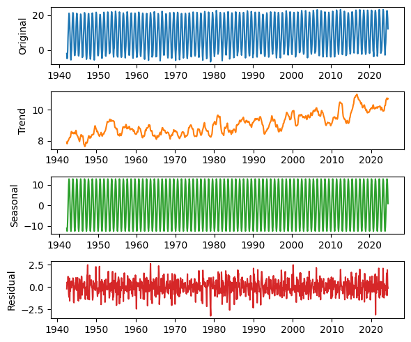
Not surprisingly, there is a strong seasonal pattern. We can use seasonal_decompose from StatsModels to identify a long-term trend, a seasonal component, and a residual.
from statsmodels.tsa.seasonal import seasonal_decompose

decomposition = seasonal_decompose(temp_series, model="additive", period=12)
We’ll use the following function to plot the results.
Recently I heard the word “chartist” for the first time in my life (that I recall). And then later the same day, I heard it again. So that raises two questions:
What are the chances of going 57 years without hearing a word, and then hearing it twice in one day?
Also, what’s a chartist?
To answer the second question first, it’s someone who supported chartism, which was “a working-class movement for political reform in the United Kingdom that erupted from 1838 to 1857”, quoth Wikipedia. The name comes from the People’s Charter of 1838, which called for voting rights for unpropertied men, among other reforms.
To answer the first question, we’ll do some Bayesian statistics. My solution is based on a model that’s not very realistic, so we should not take the result too seriously, but it demonstrates some interesting methods, I think. And as you’ll see, there is a connection to Zipf’s law, which I wrote about last week.
Since last week’s post was at the beginner level, I should warn you that this one is more advanced – in rapid succession, it involves the beta distribution, the t distribution, the negative binomial, and the binomial.
This post is based on Think Bayes 2e, which is available from Bookshop.org and Amazon.
If you don’t hear a word for more than 50 years, that suggests it is not a common word. We can use Bayes’s theorem to quantify this intuition. First we’ll compute the posterior distribution of the word’s frequency, then the posterior predictive distribution of hearing it again within a day.
Because we have only one piece of data – the time until first appearance – we’ll need a good prior distribution. Which means we’ll need a large, good quality sample of English text. For that, I’ll use a free sample of the COCA dataset from CorpusData.org. The following cells download and read the data.
import zipfile


def generate_lines(zip_path="coca-samples-text.zip"):
    with zipfile.ZipFile(zip_path, "r") as zip_file:
        file_list = zip_file.namelist()
        for file_name in file_list:
            with zip_file.open(file_name) as file:
                lines = file.readlines()
                for line in lines:
                    yield (line.decode("utf-8"))
We’ll use a Counter to count the number of times each word appears.
import re
from collections import Counter

pattern = r"[ /\n]+|--"

counter = Counter()
for line in generate_lines():
    words = re.split(pattern, line)[1:]
    counter.update(word.lower() for word in words if word)
The dataset includes about 188,000 unique strings, but not all of them are what we would consider words.
len(counter), counter.total()
(188086, 11503819)
To narrow it down, I’ll remove anything that starts or ends with a non-alphabetical character – so hyphens and apostrophes are allowed in the middle of a word.
for s in list(counter.keys()):
    if not s[0].isalpha() or not s[-1].isalpha():
        del counter[s]
This filter reduces the number of unique words to about 151,000.
Of the 50 most common words, all of them have one syllable except number 38. Before you look at the list, can you guess the most common two-syllable word? Here’s a theory about why common words are short.
for i, (word, freq) in enumerate(counter.most_common(50)):
    print(f'{i+1}\t{word}\t{freq}')
1	the	461991
2	to	237929
3	and	231459
4	of	217363
5	a	203302
6	in	153323
7	i	137931
8	that	123818
9	you	109635
10	it	103712
11	is	93996
12	for	78755
13	on	64869
14	was	64388
15	with	59724
16	he	57684
17	this	51879
18	as	51202
19	n't	49291
20	we	47694
21	are	47192
22	have	46963
23	be	46563
24	not	43872
25	but	42434
26	they	42411
27	at	42017
28	do	41568
29	what	35637
30	from	34557
31	his	33578
32	by	32583
33	or	32146
34	she	29945
35	all	29391
36	my	29390
37	an	28580
38	about	27804
39	there	27291
40	so	27081
41	her	26363
42	one	26022
43	had	25656
44	if	25373
45	your	24641
46	me	24551
47	who	23500
48	can	23311
49	their	23221
50	out	22902
There are about 72,000 words that only appear once in the corpus, technically known as hapax legomena.
singletons = [word for (word, freq) in counter.items() if freq == 1]
len(singletons), len(singletons) / counter.total() * 100
(72159, 0.811715228893143)
Here’s a random selection of them. Many are proper names, typos, or other non-words, but some are legitimate but rare words.
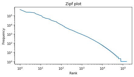
Zipf’s law suggest that the result should be a straight line with slope close to -1. It’s not exactly a straight line, but it’s close, and the slope is about -1.1.
run = np.log10(ranks[-1]) - np.log10(ranks[0])
run
5.180166032638616
rise / run
-1.0935235433575892
The Zipf plot is a well-known visual representation of the distribution of frequencies, but for the current problem, we’ll switch to a different representation.
Tail Distribution
Given the number of times each word appear in the corpus, we can compute the rates, which is the number of times we expect each word to appear in a sample of a given size, and the inverse rates, which are the number of words we need to see before we expect a given word to appear.
We will find it most convenient to work with the distribution of inverse rates on a log scale. The first step is to use the observed frequencies to estimate word rates – we’ll estimate the rate at which each word would appear in a random sample.
We’ll do that by creating a beta distribution that represents the posterior distribution of word rates, given the observed frequencies (see this section of Think Bayes) – and then drawing a random sample from the posterior. So words that have the same frequency will not generally have the same inferred rate.
Now we can compute the inverse rates, which are the number of words we have to sample before we expect to see each word once.
inverse_rates = 1 / inferred_rates
And here are their magnitudes, expressed as logarithms base 10.
mags = np.log10(inverse_rates)
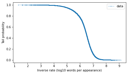
To represent the distribution of these magnitudes, we’ll use a Surv object, which represents survival functions, but we’ll use a variation of the survival function which is the probability that a randomly-chosen value is greater than or equal to a given quantity. The following function computes this version of a survival function, which is called a tail probability.
from empiricaldist import Surv


def make_surv(seq):
    """Make a non-standard survival function, P(X>=x)"""
    pmf = Pmf.from_seq(seq)
    surv = pmf.make_surv() + pmf

    # correct for numerical error
    surv.iloc[0] = 1
    return Surv(surv)
Here’s how we make the survival function.
surv = make_surv(mags)
And here’s what it looks like.
options = dict(marker=".", ms=2, lw=0.5, label="data")
surv.plot(**options)
decorate(xlabel="Inverse rate (log10 words per appearance)", ylabel="Tail probability")
The tail distribution has the sigmoid shape that is characteristic of normal distributions and t distributions, although it is notably asymmetric.
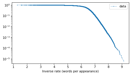
And here’s what the tail probabilities look like on a log-y scale.
surv.plot(**options)
decorate(xlabel="Inverse rate (words per appearance)", yscale="log")
If this distribution were normal, we would expect this curve to drop off with increasing slope. But for the words with the lowest frequencies – that is, the highest inverse rates – it is almost a straight line. And that suggests that a
distribution might be a good model for this data.
Fitting a Model
To estimate the frequency of rare words, we will need to model the tail behavior of this distribution and extrapolate it beyond the data. So let’s fit a t distribution and see how it looks. I’ll use code from Chapter 8 of Probably Overthinking It, which is all about these long-tailed distributions.
The following function makes a Surv object that represents a t distribution with the given parameters.
from scipy.stats import t as t_dist


def truncated_t_sf(qs, df, mu, sigma):
    """Makes Surv object for a t distribution.

    Truncated on the left, assuming all values are greater than min(qs)
    """
    ps = t_dist.sf(qs, df, mu, sigma)
    surv_model = Surv(ps / ps[0], qs)
    return surv_model
If we are given the df parameter, we can use the following function to find the values of mu and sigma that best fit the data, focusing on the central part of the distribution.
from scipy.optimize import least_squares


def fit_truncated_t(df, surv):
    """Given df, find the best values of mu and sigma."""
    low, high = surv.qs.min(), surv.qs.max()
    qs_model = np.linspace(low, high, 2000)
    ps = np.linspace(0.1, 0.8, 20)
    qs = surv.inverse(ps)

    def error_func_t(params, df, surv):
        mu, sigma = params
        surv_model = truncated_t_sf(qs_model, df, mu, sigma)

        error = surv(qs) - surv_model(qs)
        return error

    pmf = surv.make_pmf()
    pmf.normalize()
    params = pmf.mean(), pmf.std()
    res = least_squares(error_func_t, x0=params, args=(df, surv), xtol=1e-3)
    assert res.success
    return res.x
But since we are not given df, we can use the following function to search for the value that best fits the tail of the distribution.
from scipy.optimize import minimize
def minimize_df(df0, surv, bounds=[(1, 1e3)], ps=None): low, high = surv.qs.min(), surv.qs.max() qs_model = np.linspace(low, high * 1.2, 2000)
if ps is None: t = surv.ps[0], surv.ps[-5] low, high = np.log10(t) ps = np.logspace(low, high, 30, endpoint=False)
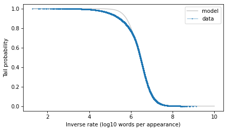
surv_model.plot(color="gray", alpha=0.4, label="model")
surv.plot(**options)
decorate(xlabel="Inverse rate (log10 words per appearance)", ylabel="Tail probability")
With the y-axis on a linear scale, we can see that the model fits the data reasonably well, except for a range between 5 and 6 – that is for words that appear about 1 time in a million.
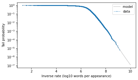
Here’s what the model looks like on a log-y scale.
surv_model.plot(color="gray", alpha=0.4, label="model")
surv.plot(**options)
decorate(
    xlabel="Inverse rate (log10 words per appearance)",
    ylabel="Tail probability",
    yscale="log",
)
The model fits the data well in the extreme tail, which is exactly where we need it. And we can use the model to extrapolate a little beyond the data, to make sure we cover the range that will turn out to be likely in the scenario where we hear a word for this first time after 50 years.
The Update
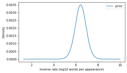
The model we’ve developed is the distribution of inverse rates for the words that appear in the corpus and, by extrapolation, for additional rare words that didn’t appear in the corpus. This distribution will be the prior for the Bayesian update. We just have to convert it from a survival function to a PMF (remembering that these are equivalent representations of the same distribution).
prior = surv_model.make_pmf()
prior.plot(label="prior")
decorate(
    xlabel="Inverse rate (log10 words per appearance)",
    ylabel="Density",
)
To compute the likelihood of the observation, we have to transform the inverse rates to probabilities.
ps = 1 / np.power(10, prior.qs)
Now suppose that in a given day, you read or hear 10,000 words in a context where you would notice if you heard a word for the first time. Here’s the number of words you would hear in 50 years.
words_per_day = 10_000
days = 50 * 365
k = days * words_per_day
k
182500000
Now, what’s the probability that you fail to encounter a word in k attempts and then encounter it on the next attempt? We can answer that with the negative binomial distribution, which computes the probability of getting the nth success after k failures, for a given probability – or in this case, for a sequence of possible probabilities.
from scipy.stats import nbinom

n = 1
likelihood = nbinom.pmf(k, n, ps)
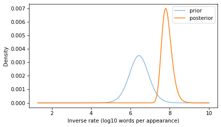
With this likelihood and the prior, we can compute the posterior distribution in the usual way.
prior.plot(alpha=0.5, label="prior")
posterior.plot(label="posterior")
decorate(
    xlabel="Inverse rate (log10 words per appearance)",
    ylabel="Density",
)
If you go 50 years without hearing a word, that suggests that it is a rare word, and the posterior distribution reflects that logic.
The posterior distribution represents a range of possible values for the inverse rate of the word you heard. Now we can use it to answer the question we started with: what is the probability of hearing the same word again on the same day – that is, within the next 10,000 words you hear?
To answer that, we can use the survival function of the binomial distribution to compute the probability of more than 0 successes in the next n_pred attempts. We’ll compute this probability for each of the ps that correspond to the inverse rates in the posterior.
And we can use the probabilities in the posterior to compute the expected value – by the law of total probability, the result is the probability of hearing the same word again within a day.
p = np.sum(posterior * ps_pred)
p, 1 / p
(0.00016019406802217392, 6242.42840166579)
The result is about 1 in 6000.
With all of the assumptions we made in this calculation, there’s no reason to be more precise than that. And as I mentioned at the beginning, we should probably not take this conclusion too seriously. For one thing, it’s likely that my experience is an example of the frequency illusion, which is “a cognitive bias in which a person notices a specific concept, word, or product more frequently after recently becoming aware of it.” Also, if you hear a word for the first time after 50 years, there’s a good chance the word is having a moment, which greatly increases the chance you’ll hear it again. I can’t think of why chartism might be in the news at the moment, but maybe this post will go viral and make it happen.
This is the second is a series of excerpts from Elements of Data Science which available from Lulu.com and online booksellers. It’s from Chapter 8, which is about representing distribution using PMFs and CDFs. This section explains why I think CDFs are often better for plotting and comparing distributions.You can read the complete chapter here, or run the Jupyter notebook on Colab.
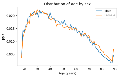
So far we’ve seen two ways to represent distributions, PMFs and CDFs. Now we’ll use PMFs and CDFs to compare distributions, and we’ll see the pros and cons of each. One way to compare distributions is to plot multiple PMFs on the same axes. For example, suppose we want to compare the distribution of age for male and female respondents. First we’ll create a Boolean Series that’s true for male respondents and another that’s true for female respondents.
male = (gss['sex'] == 1)
female = (gss['sex'] == 2)
We can use these Series to select ages for male and female respondents.
male_age = age[male]
female_age = age[female]
And plot a PMF for each.
pmf_male_age = Pmf.from_seq(male_age)
pmf_male_age.plot(label='Male')

pmf_female_age = Pmf.from_seq(female_age)
pmf_female_age.plot(label='Female')

plt.xlabel('Age (years)')
plt.ylabel('PMF')
plt.title('Distribution of age by sex')
plt.legend();
A plot as variable as this is often described as noisy. If we ignore the noise, it looks like the PMF is higher for men between ages 40 and 50, and higher for women between ages 70 and 80. But both of those differences might be due to randomness.
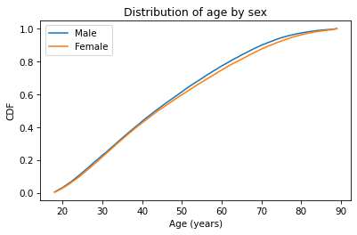
Now let’s do the same thing with CDFs – everything is the same except we replace Pmf with Cdf.
cdf_male_age = Cdf.from_seq(male_age)
cdf_male_age.plot(label='Male')

cdf_female_age = Cdf.from_seq(female_age)
cdf_female_age.plot(label='Female')

plt.xlabel('Age (years)')
plt.ylabel('CDF')
plt.title('Distribution of age by sex')
plt.legend();
Because CDFs smooth out randomness, they provide a better view of real differences between distributions. In this case, the lines are close together until age 40 – after that, the CDF is higher for men than women.
So what does that mean? One way to interpret the difference is that the fraction of men below a given age is generally more than the fraction of women below the same age. For example, about 77% of men are 60 or less, compared to 75% of women.
cdf_male_age(60), cdf_female_age(60)
(array(0.7721998), array(0.7474241))
Going the other way, we could also compare percentiles. For example, the median age woman is older than the median age man, by about one year.
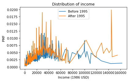
As another example, let’s look at household income and compare the distribution before and after 1995 (I chose 1995 because it’s roughly the midpoint of the survey). We’ll make two Boolean Series objects to select respondents interviewed before and after 1995.
There are a lot of unique values in this distribution, and none of them appear very often. As a result, the PMF is so noisy and we can’t really see the shape of the distribution. It’s also hard to compare the distributions. It looks like there are more people with high incomes after 1995, but it’s hard to tell. We can get a clearer picture with a CDF.
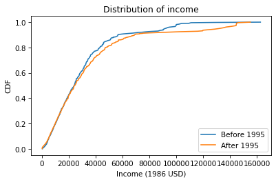
Below $30,000 the CDFs are almost identical; above that, we can see that the post-1995 distribution is shifted to the right. In other words, the fraction of people with high incomes is about the same, but the income of high earners has increased.
In general, I recommend CDFs for exploratory analysis. They give you a clear view of the distribution, without too much noise, and they are good for comparing distributions.