Right, left, apart, together?
Is the United States getting more conservative? With the rise of the alt-right, Republican control of Congress, and the election of Donald Trump, it might seem so.
Or is the country getting more liberal? With the 2015 Supreme Court decision supporting same-sex marriage, the incremental legalization of marijuana, and recent proposals to expand public health care, you might think so.
Or maybe the country is becoming more polarized, with moderates choosing sides and partisans moving to the extremes.
In a series of articles, I’ll use data from the General Social Survey (GSS) to explore these questions. The GSS goes back to 1972; every second year they survey a representative sample of U.S. residents and ask questions about their political beliefs. Many of the questions have been unchanged for almost 50 years, making it possible to observe long-term trends.
In this article, I’ll look at political alignment, that is, whether the respondents consider themselves liberal or conservative. In subsequent articles, I’ll explore their political beliefs on a range of topics.
Political alignment
From 1974 to the most recent cycle in 2018, the GSS asked the following question, “We hear a lot of talk these days about liberals and conservatives.
I’m going to show you a seven-point scale on which the political views that people might hold are arranged from extremely liberal–point 1–to extremely conservative–point 7. Where would you place yourself on this scale?”
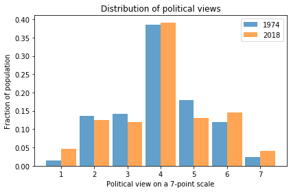
The following figure shows the distribution of responses in 1974 and 2018.

In 2018, it looks like there are more 1s (Extremely Liberal) and maybe more 7s (Extremely Conservative). So this figure provides some evidence of polarization.
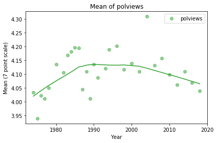
We can get a better sense of the long term trend by taking the mean of the 7-point scale and plotting it over time. By treating this scale as a numerical quantity, I’m making assumptions about the spacing between the values. The numbers we get don’t mean much in absolute terms, but they provide a quick look at the trend.

It looks like the “center of mass” was increasing until about 1990, which means more conservative on this scale, and has been decreasing ever since. On average the country might be a little more conservative now than it was in 1974.
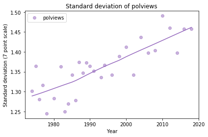
With the same caveat about treating this scale as a numerical quantity, we can also compute the standard deviation, which measures average distance from the mean, as a way of quantifying polarization.

The trend is clearly increasing, indicating increasing polarization, but with the way we computed these numbers, it’s hard to get a sense of how substantial the increase is in practical terms.
In the next article, I’ll look more closely at changes in political alignment over time.
I am planning to turn these articles into a case study for an upcoming Data Science class, so I welcome comments and questions.
The code I used to generate these figures is in this Jupyter notebook.