How Gaussian Is It?
This article is an excerpt from the current draft of my book Probably Overthinking It, to be published by the University of Chicago Press in early 2023.
If you would like to receive infrequent notifications about the book (and possibly a discount), please sign up for this mailing list.
This book is intended for a general audience, so I explain some things that might be familiar to readers of this blog – and I leave out the Python code. After the book is published, I will post the Jupyter notebooks with all of the details!
How tall are you? How long are your arms? How far it is from the radiale landmark on your right elbow to the stylion landmark on your right wrist?
You might not know that last one, but the U.S. Army does. Or rather, they know the answer for the 6068 members of the armed forces they measured at the Natick Soldier Center (just a few miles from my house) as part of the Anthropometric Surveys of 2010-2011, abbreviated army-style as ANSUR-II.
In addition to the radiale-stylion length of each participant, the ANSUR dataset includes 93 other measurements “chosen as the most useful ones for meeting current and anticipated Army and [Marine Corps] needs.” The results were declassified in 2017 and are available to download from the Open Design Lab at Penn State.
Measurements like the ones in the ANSUR dataset tend to follow a Gaussian distribution. As an example, let’s look at the sitting height of the male participants, which is the “vertical distance between a sitting surface and the top of the head.” The following figure shows the distribution of these measurements as a dashed line and the Gaussian model as a shaded area.
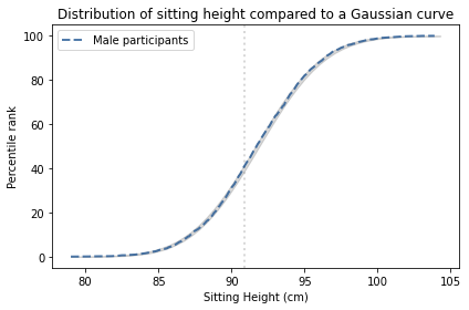
The width of the shaded area shows the variability we would expect from a Gaussian distribution with this sample size. The distribution falls entirely within the shaded area, which indicates that the model is consistent with the data.
To quantify how well the model fits the data, I computed the maximum vertical distance between them; in this example, it is 0.26 percentile ranks, at the location indicated by the vertical dotted line. The deviation is barely visible.
Why should measurements like this follow a Gaussian distribution? The answer comes in three parts:
- Physical characteristics like height depend on many factors, both genetic and environmental.
- The contribution of these factors tends to be additive; that is, the measurement is the sum of many contributions.
- In a randomly-chosen individual, the set of factors they have inherited or experienced is effectively random.
According to the Central Limit Theorem, the sum of a large number of random values follows a Gaussian distribution. Mathematically, the theorem is only true if the random values come from the same distribution and they are not correlated with each other.
Of course, genetic and environmental factors are more complicated than that. In reality, some contributions are bigger than others, so they don’t all come from the same distribution. And they are likely to be correlated with each other. And their effects are not purely additive; they can interact with each other in more complicated ways.
However, even when the requirements of the Central Limit Theorem are not met exactly, the combined effect of many factors will be approximately Gaussian as long as:
- None of the contributions are much bigger than the others,
- The correlations between them are not too strong,
- The total effect is not too far from the sum of the parts.
Many natural systems satisfy these requirements, which is why so many distributions in the world are approximately Gaussian.
However, there are exceptions. In the ANSUR dataset, the measurement that is the worst match to the Gaussian model is the forearm length of the female participants, which is the distance I mentioned earlier between the radiale landmark on the right elbow and the stylion landmark on the right wrist.
The following figure shows the distribution of these measurements and a Gaussian model.
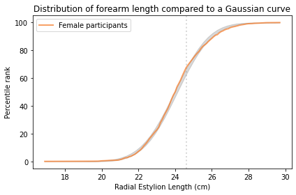
The maximum vertical distance between them is 4.2 percentile ranks, at the location indicated by the vertical dotted line; it looks like there are more measurements between 24 and 25 cm than we would expect in a Gaussian distribution.
There are two ways to think about this difference between the data and the model. One, which is widespread in the history of statistics and natural philosophy, is that the model represents some kind of ideal, and if the world fails to meet this ideal, the fault lies in the world, not the model.
In my opinion, this is nonsense. The world is complicated. Sometimes we can describe it with simple models, and it is often useful when we can. Sometimes, as in this case, a simple model fits the data surprisingly well. And when that happens, sometimes we find a reason the model works so well, which helps to explain why the world is as it is. But when the world deviates from the model, that’s a problem for the model, not a deficiency of the world.
Differences and Mixtures
I have cut the following section from the book. I still think it’s interesting, but it was in the way of more important things. Sometimes you have to kill your darlings.
So far I have analyzed measurements from male and female participants separately, and you might have wondered why. For some of these measurements, the distributions for men and women are similar, and if we combine them, the mixture is approximately Gaussian. But for some of them the distributions are substantially different; if we combine them, the result is not very Gaussian at all.
To show what that looks like, I computed the distance between the male and female distributions for each measurement and identified the distributions that are most similar and most different.
The measurement with the smallest difference between men and women is “buttock circumference”, which is “the horizontal circumference of the trunk at the level of the maximum protrusion of the right buttock”. The following figure shows the distribution of this measurement for men and women.
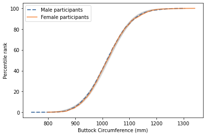
The two distributions are nearly identical, and both are well-modeled by a Gaussian distribution. As a result, if we combine measurements from men and women into a single distribution, the result is approximately Gaussian.
The measurement with the biggest difference between men and women is “neck circumference”, which is the circumference of the neck at the point of the thyroid cartilage. The following figure shows the distributions of this measurement for the male and female participants.
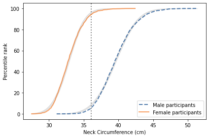
The difference is substantial. The average for women is 33 cm; for men it is 40 cm. The protrusion of the thyroid cartilage has been known since at least the 1600s as an “Adam’s apple”, named for the masculine archetype of the Genesis creation narrative. The origin of the term suggests that we are not the first to notice this difference.
There is some overlap between the distributions; that is, some women have thicker necks than some men. Nevertheless, if we choose a threshold between the two means, shown as a vertical line in the figure, we find fewer than 6% of women above the threshold, and fewer than 6% of men below it.
The following figure shows the distribution of neck size if we combine the male and female participants into a single sample.
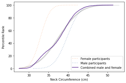
The result is a distribution that deviates substantially from the Gaussian model. This example shows one of several reasons we find non-Gaussian distributions in nature: mixtures of populations with different means. That’s why Gaussian distributions are generally found within a species. If we combine measurements from different species, we should not expect Gaussian distributions.
Although I generally recommend CDFs as the best ways to visualize distributions, mixtures like this might be an exception. As an alternative, here is a KDE plot of the combined male and female measurements.
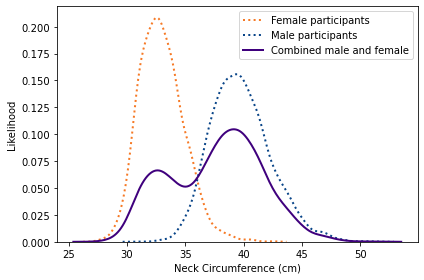
This view shows more clearly that the combined distribution is a mixture of distributions with different means; as a result, the mixture has two distinct peaks, known as modes.
In subsequent chapters we’ll see other distributions that deviate from the Gaussian model and develop models to explain where they come from.
If you would like to get infrequent email announcements about my book, please sign up below. I’ll let you know about milestones, promotions, and other news, but not more than one email per month. I will not share your email or use this list for any other purpose.

