Are we really polarized?

Are we really polarized?

I’m working on a book called Probably Overthinking It that is about using evidence and reason to answer questions and guide decision making. If you would like to get an occasional update about the book, please join my mailing list.

I’m a little tired of hearing about how polarized we are, partly because I suspect it’s not true and mostly because it is “not even wrong” — that is, not formulated as a meaningful hypothesis.

To make it meaningful, we can start by distinguishing “mass polarization“, which is movement of popular attitudes toward the extremes, from polarization at the level of political parties. I’ll address mass polarization in this article and the other kind in the next.

The distribution of attitudes

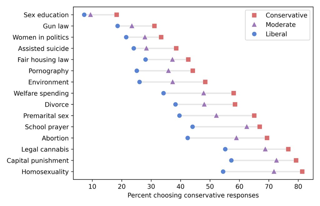
To see whether popular opinion is moving toward the extremes, I’ll use data from the General Social Survey (GSS). And I’ll build on the methodology I presented in this previous article, where I identified fifteen questions that most strongly distinguish conservatives and liberals.

Not all respondents were asked all fifteen questions, but with some help from item response theory, I estimated the number of conservative responses each respondent would give, if they had been asked. From that, we can estimate the distribution of responses during each year of the survey. For example, here’s a comparison of distributions from 1986 and 2016:

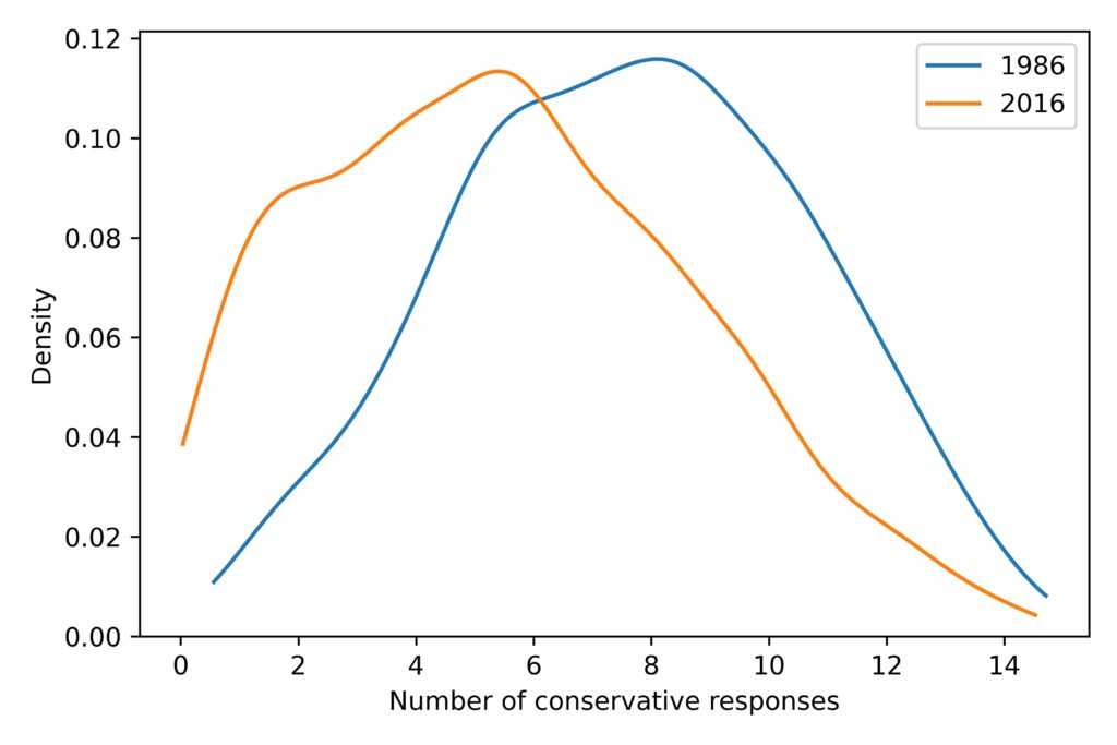
First, notice that the distributions have one big mode near the middle, not two modes at the extremes. That means that most people choose a mixture of liberal and conservative responses to the questions; the people at the extremes are a small minority.

Second, the distribution shifted to the left during this period. In 1986, the average number of conservative responses was 7.6; in 2016, it was 5.5.

Now, let’s see what happened during the other years.

It’s just a jump to the left

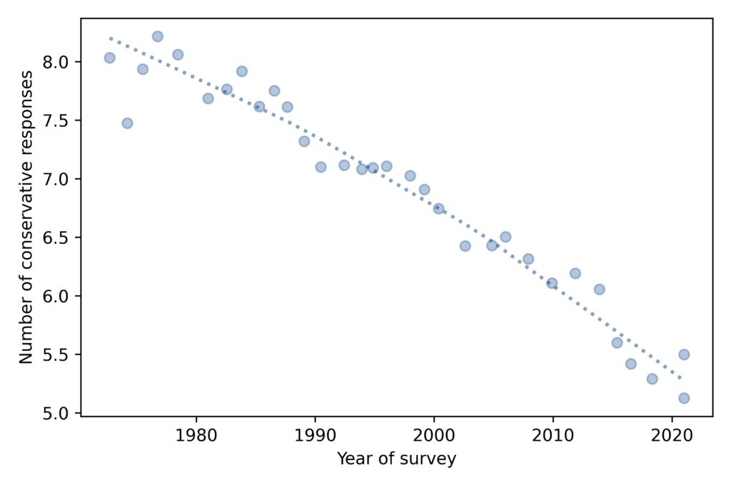
To summarize how the distribution of responses has changed over time, we’ll look at the mean, standard deviation, and mean absolute difference. Here’s the mean for each year of the survey:

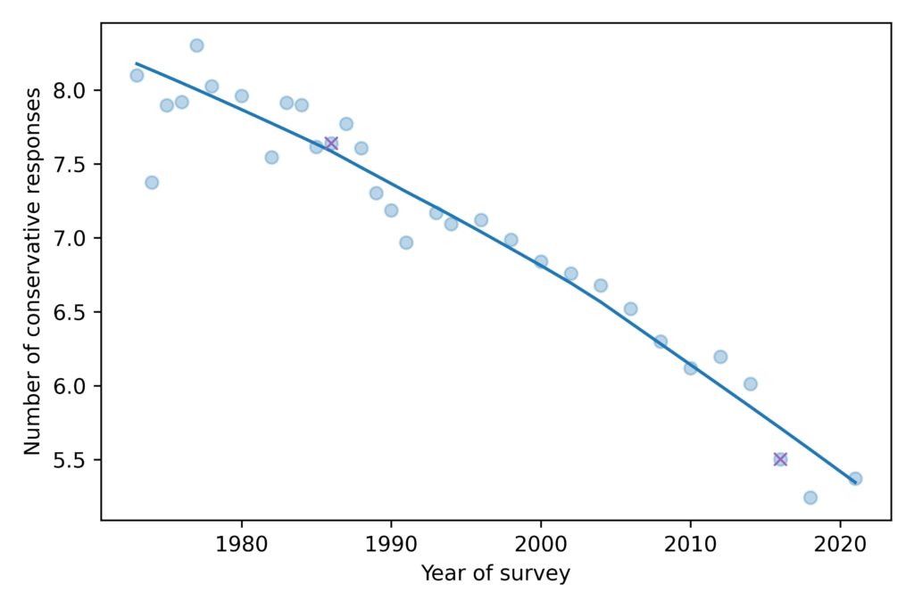
The average level of conservatism, as measured by the fifteen questions, has been declining consistently for the duration of the GSS, almost 50 years.

The ‘x’ markers highlight 1986 and 2016, the years I chose in the previous figure. So we can see that these years are not anomalies; they are both close to the long-term trend.

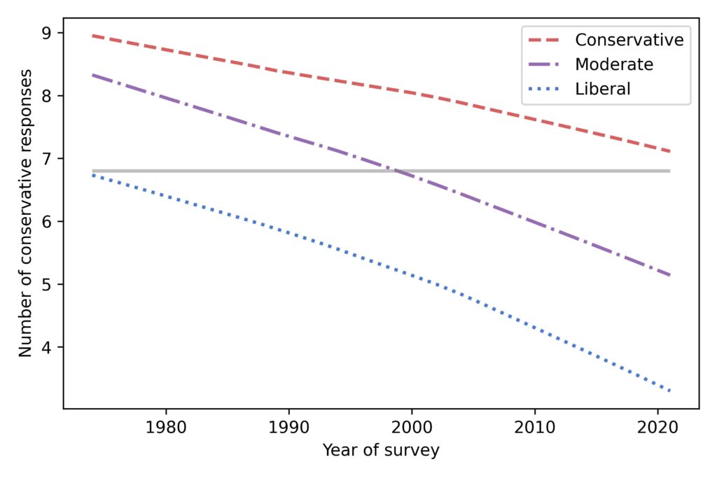
Measuring polarization

Now, to see if we are getting more polarized, let’s look at the standard deviation of the distribution over time:

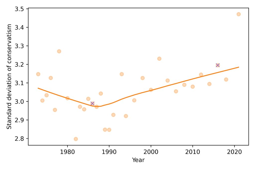
The spread of the distribution was decreasing until the 1980s and has been increasing ever since. The value for 2021 is substantially above the long term trend, but it’s too early to say whether that’s a real change in polarization or an artifact of pandemic-related changes in data collection.

Again, the ‘x’ markers highlight the years I chose, and show why I chose them: they are close to the lowest and highest points in the long-term trend.

So there is some evidence of popular polarization. In fact, using standard deviation to quantify polarization might underestimate the size of the change, because the tail of the most recent distribution is compressed at the left end of the scale.

However, it is hard to interpret a change in standard deviation in practical terms. It was 3.0 in 1986 and 3.2 in 2016; is that a big change? I don’t know.

Don’t get MAD, get mean average difference

We can mitigate the effect of compression and help with interpretation by switching to a different measure of spread, mean absolute difference, which is the average size of the differences between pairs of people. Here’s how this measure has changed over time:

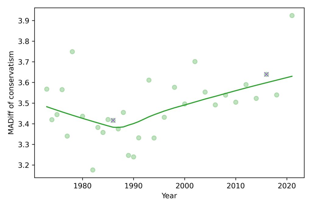
The mean absolute difference (MADiff) follows the same trend as standard deviation. It decreased until the 1980s and has increased ever since. It was 3.4 in 1986, which means that if you chose two people at random and asked them the fifteen questions, they would differ on 3.4 questions, on average. If you repeated the experiment in 2016, they would differ by 3.6.

This measure of polarization suggests that the increase since the 1980s has not been big enough to make much of a difference. If civilized society can survive when people disagree on 3.4 questions, it’s hard to imagine that the walls will come tumbling down when they disagree on 3.6.

In conclusion, it doesn’t look like mass polarization has changed much in the last 50 years, and certainly not enough to justify the amount of coverage it gets.

But there is another kind of polarization, at the level of political parties, that might be a bigger problem. I’ll get to that in the next article.

Support for Gun Control is Still Declining

Support for Gun Control is Still Declining

In 2019 I presented a talk at SciPy where I showed that support for gun control has been declining in the U.S. since about 1999. And, contrary to what many people believe, it is lowest among millennials and Gen Z.

Those results were based on data from the General Social Survey up to 2018. Now that the data from 2021 is available, I’ve run the same analysis and I can report:

  • Support for gun control has continued to decline, and
  • Among young adults it has reached a new low.

The following figure shows the fraction of GSS respondents who said that they would favor “a law which would require a person to obtain a police permit before he or she could buy a gun.”

Support for this form of gun control increased between 1972 and 1999, and has been decreasing ever since.

The following figure shows the results from the same question plotted over year of birth.

People born between 1890 and 1970 supported gun control at about the same level. More recent generations — including millennials and Gen Z — are substantially less likely to support gun control.

The Plurality of the Nones

The Plurality of the Nones

Some time in the next 10-15 years, the most common religion in the United States will be “none”.

Data from the General Social Survey

In this figure, the solid lines show estimated proportions of each religious affiliation from 1972 to 2021. Since the early 1990s, the proportion of Protestants has been declining and the proportion of people with no religious affiliation has been increasing. Catholicism has declined slightly and other religions have increased slightly.

Some of the data from 2021 is out of line with long-term trends. The pandemic affected data collection in several ways, so we should not make too much of these results for now.

The shaded areas show results from a model I used to fit past data and forecast future changes. The model predicts that “Nones” will overtake Protestants in the 2030s. The primary cause of these changes is generational replacement: as older people die, they are replaced by young people who are less likely to be religious. The following figure shows the proportion of each religious tradition as a function of year of birth:

Among people born around 1900, nearly all were Protestant or Catholic; few belonged to another religion or none. Among people born around 2000, the plurality have no religious affiliation; Protestants and Catholics are statistically tied for second.

In general, forecasting social phenomena is hard because things change. However, generational replacement is relatively predictable. To see how predictable, let’s see what would have happened if we used the same method to generate predictions 15 years ago:

Predictions made in 2006 (using only the data in the shaded area) would have been pretty good. We would have underestimated the growth of the Nones, but the predictions for the other groups would have been accurate. So we have reason to think 15-year predictions based on current data are reliable.

If you want details, the model is multinomial logistic regression using two features: year of birth and year of survey. It is based on the assumption that (1) the distribution of ages will not change substantially over the next 15 years, and (2) most people don’t change religious affiliation as adults, or if they do, the resulting net flow between affiliations is small.

Off to Technical Review

Off to Technical Review

I have news. I finished the last two chapters of Probably Overthinking It last week and sent a complete draft of the book off for technical review. Yay!

In the last chapter, I used some methodology I thought was worth reporting, but too technical for the book, which is intended for an intelligent general audience. So I’ve started a public site for the book, where I will post technical details from each chapter and maybe some of the material that I decided to cut.

The last chapter is about changes in political beliefs over the last 50 years, particularly along the axis of liberal and conservative views. I found 15 questions in the General Social Survey (GSS) where liberals and conservatives give different answers by the widest margin. The following figure shows the topics, which will come as no surprise, and the differences between the groups.

Based on the answers to these questions, I estimate a score for each respondent that quantifies how conservative their beliefs are. By this measure, people have been getting more liberal, pretty consistently, for the last 50 years:

And it’s not just liberals becoming more liberal. People who consider themselves conservative are more liberal than they used to be, too.

That gray line is at 6.8 conservative responses, which was the expected level in 1974 among people who called themselves liberal.

Now, suppose you take a time machine back to 1974, find an average liberal, and bring them to the turn of the millennium. Based on their survey responses, they would be indistinguishable from the average moderate in 2000.

And if you bring them to 2021, their quaint 1970s liberalism would be almost as far to the right as the average conservative.

If you are curious about the methodology, here’s the article explaining where these results came from.

If you would like to get occasional email announcements about the book, please sign up for my mailing list.

Almost done?

Almost done?

I thought I would be done this week, but it looks like there will be one more chapter. If you don’t know, I am working on a book that includes updated articles from this blog, plus new examples, and pulls the whole thing together. So far, it’s going well. I have consistently finished one chapter per month and I am almost done.

The problem is that several times a chapter has mitosed (it’s a word) into multiple chapters. In the most extreme case, the material I thought would be one chapter turned into four, and I think I’m going to cut one of them.

Most recently, what I thought was the last chapter has turned into two. The first is about Simpson’s paradox, including this mandatory example from the ubiquitous penguin dataset:

The new chapter is about Overton’s window. Fortunately, before the mitosis, I had written a substantial chunk of it, so I think I can finish it in less than a month.

I have posted a few excerpts from the book already, about Preston’s paradox, long-tailed distributions, and our old friend the Gaussian distribution. Once I send the draft off for technical review, I should have time to post a few more.

Until then, if you would like to get infrequent email announcements about the book, please sign up below. I’ll let you know about milestones, promotions, and other news, but not more than one email per month. I will not share your email or use this list for any other purpose.

Probably Overthinking It mailing list

* indicates required
Preston’s Paradox

Preston’s Paradox

This article is an excerpt from my book Probably Overthinking It, to be published by the University of Chicago Press in early 2023. This book is intended for a general audience, so I explain some things that might be familiar to readers of this blog – and I leave out the Python code. After the book is published, I will post the Jupyter notebooks with all of the details!

If you would like to receive infrequent notifications about the book (and possibly a discount), please sign up for this mailing list.

Suppose you are the ruler of a small country where the population is growing quickly. Your advisers warn you that unless growth slows down, the population will exceed the capacity of the farms and the peasants will starve.

The Royal Demographer informs you that the average family size is currently 3; that is, each woman in the kingdom bears three children, on average. He explains that the replacement level is close to 2, so if family sizes decrease by one, the population will stabilize at a sustainable size.

One of your advisors asks: “What if we make a new law that says every woman has to have fewer children than her mother?”

It sounds promising. As a benevolent despot, you are reluctant to restrict your subjects’ reproductive freedom, but it seems like such a policy could be effective at reducing family size with minimal imposition.

“Make it so,” you say.

Twenty-five years later, you summon the Royal Demographer to find out how things are going.

“Your Highness,” they say, “I have good news and bad news. The good news is that adherence to the new law has been perfect. Since it was put into effect, every woman in the kingdom has had fewer children than her mother.”

“That’s amazing,” you say. “What’s the bad news?”

“The bad news is that the average family size has increased from 3.0 to 3.3, so the population is growing faster than before, and we are running out of food.”

“How is that possible?” you ask. “If every woman has fewer children than her mother, family sizes have to get smaller, and population growth has to slow down.”

Actually, that’s not true.

In 1976, Samuel Preston, a demographer at the University of Washington, published a description of this apparent paradox: “A major intergenerational change at the individual level is required in order to maintain intergenerational stability at the aggregate level.”

To make sense of this, I’ll use the distribution of fertility in the United States (rather than your imaginary island). Every other year, the Census Bureau surveys a representative sample women in the United States and asks, among other things, how many children they have ever born. To measure completed family sizes, they select women aged 40-44 (of course, some women have children in their forties, so these estimates might be a little low).

I used the data from 1979 to estimate the distribution of family sizes at the time of Preston’s paper. Here’s what it looks like.

The average total fertility was close to 3. Starting from this distribution, what would happen if every woman had the same number of children as her mother? A woman with 1 child would have only one grandchild; a woman with 2 children would have 4 grandchildren; a woman with 3 children would have 9 grandchildren, and so on. In the next generation, there would be more big families and fewer small families.

Here’s what the distribution would look like in this “Same as mother” scenario.

The net effect is to shift the distribution to the right. If this continues, family sizes would increase quickly and population growth would explode.

So what happens in the “One child fewer” scenario? Here’s what the distribution looks like:

Bigger families are still overrepresented, but not as much as in the “Same as mother” scenario. The net effect is an increase is average fertility from 3 to 3.3.

As Preston explained, “under current [1976] patterns a woman would have to bear an average of almost two children fewer than … her mother merely to keep population fertility rates constant from generation to generation”. One child fewer was not enough!

As it turned out, the next generation in the U.S. had 2.3 fewer children than their mothers, on average, which caused a steep decline in average fertility:

Average fertility in the U.S. has been close to 2 since about 1990, although it might have increased in the last few years (keeping in mind that the women interviewed in 2018 had most of their children 10-20 years earlier).

Preston concludes, “Those who exhibit the most traditional behavior with respect to marriage and women’s roles will always be overrepresented as parents of the next generation, and a perpetual disaffiliation from their model by offspring is required in order to avert an increase in traditionalism for the population as a whole.”

So, if you have fewer children than your parents, don’t let anyone say you are selfish; you are doing your part to avert population explosion!

My thanks to Prof. Preston for comments on a previous version of this article.

If you would like to get infrequent email announcements about my book, please sign up below. I’ll let you know about milestones, promotions, and other news, but not more than one email per month. I will not share your email or use this list for any other purpose.

Probably Overthinking It mailing list

* indicates required
The Student-t model of Long-Tailed Distributions

The Student-t model of Long-Tailed Distributions

As I’ve mentioned, I’m working on a book called Probably Overthinking It, to be published in early 2023. It’s intended for a general audience, so I’m not trying to do research, but I might have found something novel while working on a chapter about power law distributions.

If you are familiar with the topic, you know that there are a bunch of distributions in natural and engineered systems that seem to follow a power law. But ever since people have claimed to find power law distributions, other people have said, “Not so fast”. There are two persistent problems with power law distributions:

  • They generally don’t fit the left part of the distribution, only the tail.
  • They don’t fit the whole tail; in the extreme, the data usually drop off faster than a real power law.

On the other hand, a lognormal distribution often fits the left part of these distributions, but it’s not always good model for the tail.

Well, what if there was another simple, well-known model that fits the entire distribution? I think there is, at least for some datasets: the Student-t distribution.

For example, here’s the distribution of city sizes in the U.S. from the 2020 Census. On the left is the survival function (complementary CDF), with city size on a log scale. On the right is the survival function again, with the y-axis also on a log scale.

The dashed line is the data; the shaded area is a 90% CI based on the data; and the gray line is the model, with parameters chosen to match the data. On the left, the Student-t model fits the data over the entire range; on the right, it also fits the tail over five orders of magnitude.

Here’s the distribution of earthquake magnitudes in California (the Richter scale is already logarithmic, so no need to transform).

Again, the model fits the survival function well over the entire range, and also fits the tail over almost six orders of magnitude.

As another example, here’s the distribution of magnitudes for solar flares (logarithms of integrated flux in J/m²):

Again, the model fits the data well in the body and the tail of the distribution. At the top of the left figure, we can see that there are not as many small-magnitude flares as the model expects, but that might be because we don’t detect all of them.

Finally, here are the relative changes in the daily closing price of the Dow Jones Industrial Average (thanks to Samuel H. Williamson), going all the way back to 1896.

The Student-t model is a remarkably good fit for the data.

Notably, the model is capable of matching tail curves with different shapes:

  • The tail of the city size distribution drops off with increasing curvature.
  • The tail of the earthquake distribution is initially curved and then straight.
  • The tail of the solar flare distribution is initially curved, then straight, then drops off again.
  • The tail of the changes in stock prices curves upward over a large part of the range.

You might think it would take a lot of parameters to track these different shapes, but the Student-t model has only three: location, scale, and tail thickness. It’s a bit of a pain to fit the model to data — I had to break out some optimization tools from SciPy. But at least I didn’t have to fit it by hand.

I’m not sure how much of this discussion will end up in the book, but if you would like to receive infrequent notifications about Probably Overthinking It (and possibly a discount), please sign up for this mailing list.

How Gaussian Is It?

How Gaussian Is It?

This article is an excerpt from the current draft of my book Probably Overthinking It, to be published by the University of Chicago Press in early 2023.

If you would like to receive infrequent notifications about the book (and possibly a discount), please sign up for this mailing list.

This book is intended for a general audience, so I explain some things that might be familiar to readers of this blog – and I leave out the Python code. After the book is published, I will post the Jupyter notebooks with all of the details!

How tall are you? How long are your arms? How far it is from the radiale landmark on your right elbow to the stylion landmark on your right wrist?

You might not know that last one, but the U.S. Army does. Or rather, they know the answer for the 6068 members of the armed forces they measured at the Natick Soldier Center (just a few miles from my house) as part of the Anthropometric Surveys of 2010-2011, abbreviated army-style as ANSUR-II.

In addition to the radiale-stylion length of each participant, the ANSUR dataset includes 93 other measurements “chosen as the most useful ones for meeting current and anticipated Army and [Marine Corps] needs.” The results were declassified in 2017 and are available to download from the Open Design Lab at Penn State.

Measurements like the ones in the ANSUR dataset tend to follow a Gaussian distribution. As an example, let’s look at the sitting height of the male participants, which is the “vertical distance between a sitting surface and the top of the head.” The following figure shows the distribution of these measurements as a dashed line and the Gaussian model as a shaded area.

The width of the shaded area shows the variability we would expect from a Gaussian distribution with this sample size. The distribution falls entirely within the shaded area, which indicates that the model is consistent with the data.

To quantify how well the model fits the data, I computed the maximum vertical distance between them; in this example, it is 0.26 percentile ranks, at the location indicated by the vertical dotted line. The deviation is barely visible.

Why should measurements like this follow a Gaussian distribution? The answer comes in three parts:

  • Physical characteristics like height depend on many factors, both genetic and environmental.
  • The contribution of these factors tends to be additive; that is, the measurement is the sum of many contributions.
  • In a randomly-chosen individual, the set of factors they have inherited or experienced is effectively random.

According to the Central Limit Theorem, the sum of a large number of random values follows a Gaussian distribution. Mathematically, the theorem is only true if the random values come from the same distribution and they are not correlated with each other.

Of course, genetic and environmental factors are more complicated than that. In reality, some contributions are bigger than others, so they don’t all come from the same distribution. And they are likely to be correlated with each other. And their effects are not purely additive; they can interact with each other in more complicated ways.

However, even when the requirements of the Central Limit Theorem are not met exactly, the combined effect of many factors will be approximately Gaussian as long as:

  • None of the contributions are much bigger than the others,
  • The correlations between them are not too strong,
  • The total effect is not too far from the sum of the parts.

Many natural systems satisfy these requirements, which is why so many distributions in the world are approximately Gaussian.

However, there are exceptions. In the ANSUR dataset, the measurement that is the worst match to the Gaussian model is the forearm length of the female participants, which is the distance I mentioned earlier between the radiale landmark on the right elbow and the stylion landmark on the right wrist.

The following figure shows the distribution of these measurements and a Gaussian model.

The maximum vertical distance between them is 4.2 percentile ranks, at the location indicated by the vertical dotted line; it looks like there are more measurements between 24 and 25 cm than we would expect in a Gaussian distribution.

There are two ways to think about this difference between the data and the model. One, which is widespread in the history of statistics and natural philosophy, is that the model represents some kind of ideal, and if the world fails to meet this ideal, the fault lies in the world, not the model.

In my opinion, this is nonsense. The world is complicated. Sometimes we can describe it with simple models, and it is often useful when we can. Sometimes, as in this case, a simple model fits the data surprisingly well. And when that happens, sometimes we find a reason the model works so well, which helps to explain why the world is as it is. But when the world deviates from the model, that’s a problem for the model, not a deficiency of the world.

Differences and Mixtures

I have cut the following section from the book. I still think it’s interesting, but it was in the way of more important things. Sometimes you have to kill your darlings.

So far I have analyzed measurements from male and female participants separately, and you might have wondered why. For some of these measurements, the distributions for men and women are similar, and if we combine them, the mixture is approximately Gaussian. But for some of them the distributions are substantially different; if we combine them, the result is not very Gaussian at all.

To show what that looks like, I computed the distance between the male and female distributions for each measurement and identified the distributions that are most similar and most different.

The measurement with the smallest difference between men and women is “buttock circumference”, which is “the horizontal circumference of the trunk at the level of the maximum protrusion of the right buttock”. The following figure shows the distribution of this measurement for men and women.

The two distributions are nearly identical, and both are well-modeled by a Gaussian distribution. As a result, if we combine measurements from men and women into a single distribution, the result is approximately Gaussian.

The measurement with the biggest difference between men and women is “neck circumference”, which is the circumference of the neck at the point of the thyroid cartilage. The following figure shows the distributions of this measurement for the male and female participants.

The difference is substantial. The average for women is 33 cm; for men it is 40 cm. The protrusion of the thyroid cartilage has been known since at least the 1600s as an “Adam’s apple”, named for the masculine archetype of the Genesis creation narrative. The origin of the term suggests that we are not the first to notice this difference.

There is some overlap between the distributions; that is, some women have thicker necks than some men. Nevertheless, if we choose a threshold between the two means, shown as a vertical line in the figure, we find fewer than 6% of women above the threshold, and fewer than 6% of men below it.

The following figure shows the distribution of neck size if we combine the male and female participants into a single sample.

The result is a distribution that deviates substantially from the Gaussian model. This example shows one of several reasons we find non-Gaussian distributions in nature: mixtures of populations with different means. That’s why Gaussian distributions are generally found within a species. If we combine measurements from different species, we should not expect Gaussian distributions.

Although I generally recommend CDFs as the best ways to visualize distributions, mixtures like this might be an exception. As an alternative, here is a KDE plot of the combined male and female measurements.

This view shows more clearly that the combined distribution is a mixture of distributions with different means; as a result, the mixture has two distinct peaks, known as modes.

In subsequent chapters we’ll see other distributions that deviate from the Gaussian model and develop models to explain where they come from.


If you would like to get infrequent email announcements about my book, please sign up below. I’ll let you know about milestones, promotions, and other news, but not more than one email per month. I will not share your email or use this list for any other purpose.

Probably Overthinking It mailing list

* indicates required
Probably Overthinking The Book

Probably Overthinking The Book

I have not posted a new article for a few months, and I am now happy to announce the reason: I am working on a book! The working title is, of all things, Probably Overthinking It. If things go according to plan, it will be published by the University of Chicago Press in early 2023.

When I started, I thought it would be a collection of articles from this blog, but I ended up writing more new material than I expected. But it’s going well; out of 12 chapters, I have a solid draft of 10 and a pretty good idea what will go in the other two.

Over the next few months, I will publish excerpts here, but for now I am working at maximum speed to get a complete first draft to the technical reviewers.

So, sorry for going quiet, but it will be worth the wait!


If you would like to get infrequent email announcements about my book, please sign up below. I’ll let you know about milestones, promotions, and other news, but not more than one email per month. I will not share your email or use this list for any other purpose.

Probably Overthinking It mailing list

* indicates required
Data Structures and Information Retrieval in Python

Data Structures and Information Retrieval in Python

I am happy to announce the first release of a new book, Data Structures and Information Retrieval in Python, which is an introduction to data structures organized around a motivating example: building a search engine.

The elements of the search engine are the Crawler, which downloads web pages and follows links to other pages, the Indexer, which builds a map from each word to the pages where it appears, and the Retriever, which looks up search terms and finds pages that maximize relevance and quality.

The index is stored in Redis, which is a NoSQL database that provides data structures like sets, lists, and hashmaps. The book presents each data structure first in Python, then in Redis, which should help readers see which features are essential and which are implementation details.

The book is loosely based on Think Data Structures, which uses Java. When I started, I thought it would be a translation, but the changes were so pervasive, I ended up writing it from scratch.

As I did with Think Bayes, I wrote this book entirely in Jupyter notebooks, and used JupyterBook to translate them to HTML. The notebooks run on Colab, which is a service provided by Google that runs notebooks in a browser. So you can read the book, run the code, and work on exercises without installing anything.

Why?

I have mixed feelings about data structures. In the computer science curriculum, it is often used as a weed-out class, and in the technical interview process, it is used as a gatekeeper. In both cases, it plays a disproportionate role in determining who studies computer science and who gets jobs in the field.

And it tends to be a bad class. The material is presented theoretically, without context or application, organized in a way that seems designed to maximize tedium, and often taught badly. The goals of the course are ambiguous — is it about theoretical foundations or programming proficiency? — and the result is often a hybrid that does nothing well.

Also, it has not kept up with changes in the software landscape. When people were learning to program in C, it might have been appropriate to focus on the implementation of data structures. But for people learning Python, it’s probably better to learn how to use them first, and see how they are implemented when (and if) necessary.

Despite my misgivings about the material, in 2016 I found myself designing a data structures curriculum for the Flatiron School, on behalf of a large software company. In 2017 I updated the curriculum and published Think Data Structures. But the software curriculum at Olin uses more Python than Java, so I have not used the Java version in a class.

Since I was scheduled to teach Data Structures this fall, I decided to write a Python version. I started last August with an outline and about 10 notebooks in various stages of completion. I developed the rest of the material during the semester, staying about a week ahead of the students.

Now there are 29 notebooks including 22 that present the material and 7 quizzes that include practice questions. I hope people will find it useful!