Whenever something unlikely happens, it is tempting to ask, “What are the odds?”
In some very limited cases, we can answer that question. For example, if someone deals you five cards from a well-shuffled deck, and you want to know the odds of getting a royal flush, we can answer that question precisely. At least, we can if you are clearly referring to just this one hand.
But if you’ve been playing poker regularly for a decade and then one night you are dealt a royal flush, it might not be clear, when you ask the question, whether you mean the odds of getting a royal flush on one deal, or one evening of play, or some time in your career, or once in all of the poker hands that have every been dealt. Those are different questions with very different answers — in fact, the first is close to 0 and the last is close to 1 (and known to be 1 in this universe).
So, even in a highly constrained environment like a poker game, answering questions like this can be tricky. It’s even worse in real life. Say you go to college in Massachusetts and then two years later you visit Paris, go for a walk in the Tuileries Garden, and run into a friend from college. What are the odds? Now we have to define both “in how many attempts?” and “odds of what?” Meeting this friend in this particular place? Or any old friend in any unexpected place?
Now let’s put all of this thinking to the test with an example, which is the most surprising thing that has happened to me since the time I ran into a college friend in Paris. Two days ago I was working on a heat vent in my house and wanted to attach this socket
to this screwdriver
But the socket takes a 1/4 inch square drive, and the screwdriver takes 1/4 inch hex bits. I figured there was probably an adapter that could connect them, but I didn’t have one. I thought about getting one, but then I found another way to do the job.
Two days later I went for a walk and about 30 yards from my house, in the middle of the street, I saw a small bit of metal that I picked up just to get it out of the way. And when I looked more closely at what is was — it was a 1/4 inch hex to 1/4 inch square drive adapter.
And here’s how it works.
So, what are the odds of that? I don’t know, but if you have a non-zero prior for the existence of a benevolent deity, you might want to update it.
In the preface of Probably Overthinking It, I wrote:
Sometimes interpreting data is easy. For example, one of the reasons we know that smoking causes lung cancer is that when only 20% of the population smoked, 80% of people with lung cancer were smokers. If you are a doctor who treats patients with lung cancer, it does not take long to notice numbers like that.
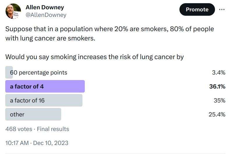
When I re-read that paragraph recently, it occurred to me that interpreting those number might not be as easy as I thought. To find out, I ran a Twitter poll. Here are the results:
Some of the people who chose “other” said that there is not enough information — we need to know the absolute risk for one or both of the groups.
I think that’s not right — with just these two numbers, we can compute the relative risk of the two groups. There are a few ways to do it, but a good way to get started is to check each of the multiple choice responses.
Off the bat, “60 percentage points” is just wrong. If the lifetime risk of cancer was 20% in one group and 80% in the other, we could describe that difference in terms of percentage points. But those are not the numbers we were given, and the actual risks are much lower.
But “a factor of 4” is at least plausible, so let’s check it. Suppose that the actual lifetime risk of lung cancer for non-smokers is 1% — in that case the risk for smokers would be 4%. In a group of 1000 people, we would expect 800 non-smokers and 8 cases among them, and we would expect 200 smokers and 8 cases among them. Under these assumptions 50% of people with lung cancer would be smokers, but the question says it should be 80%, so this check fails.
Let’s try again with “a factor of 16”. If the risk for non-smokers is 1%, the risk for smokers would be 16%. Among 800 non-smokers, we expect 8 cases again, but among 200 smokers, now we expect 32. Under these assumptions, 80% of people with lung cancer are smokers, so 16 is the correct answer.
Here are the same numbers in a table.
Number
Risk
Cases
Percent
Non-smoker
800
1%
8
20%
Smoker
200
16%
32
80%
Now, you might object that I chose 1% and 16% arbitrarily, but as it turns out it doesn’t matter. To see why, let’s assume that the risk is x for non-smokers and 16x for smokers. Here’s the table with these unknown risks.
Number
Risk
Cases
Percent
Non-smoker
800
x
800x
20%
Smoker
200
16x
3200x
80%
The percentage of cases among smokers is 80%, regardless of x.
Now suppose you are not satisfied with this guess-and-check method. We can solve the problem more generally using Bayes’s rule.
We are given p(smoker) = 20%, which we can convert to odds(smoker) = 1/4.
And we are given p(smoker | cancer) = 80%, which we can convert to odds(smoker | cancer) = 4.
That’s the answer I had in mind, but let me address an objection raised by one poll respondent, who chose “Other” because, “You can’t draw casual inferences from observational data without certain assumptions which I’m unwilling to make.”
That’s true. Even if the risk is 16x higher for smokers, that’s not enough to conclude that the entire difference, or any of it, is caused by smoking. It is still possible either:
(1) that the supposed effect is really the cause, or in this case that incipient cancer, or a pre-cancerous condition with chronic inflammation, is a factor in inducing the smoking of cigarettes, or (2) that cigarette smoking and lung cancer, though not mutually causative, are both influenced by a common cause, in this case the individual genotype.
If you think that’s the stupidest thing you’ve ever heard, you can take it up with Sir Ronald Fisher, who actually made this argument with apparent sincerity in a 1957 letter to the British Medical Journal. I mention this in case you didn’t already know what an ass he was.
However, if we are willing to accept that smoking causes lung cancer, and is in fact responsible for all or nearly all of the increased risk, then we can use the data we have to answer a related question: if a smoker is diagnosed with lung cancer, what is the probability that it was caused by smoking?
To answer that, let’s assume that smokers are exposed at the same rate as non-smokers to causes of cancer other than smoking. In that case, their 16x risk would consist of 15x risk due to smoking and 1x risk due to other causes. So 15/16 cancers among smokers would be due to smoking, which is about 94%.
Which means the lifetime risk is about 1% for non-smokers and 25% for smokers. If we update the table with these numbers, we have
Number
Risk
Cases
Percent
Non-smoker
800
1%
8
14%
Smoker
200
25%
50
86%
And with that, we can address another point raised by a Twitter friend:
By “smoking increases the risk of lung cancer” you could either mean relative to being a non-smoker or relative to the overall base rate of cancer (including a weighted average of smokers and non-smokers).
I meant the first (which is more common in epidemiology), but if we want the second, it’s about 25 / 6, which is a little more than 4.
Finally, looking at that figure you might wonder why the relative risk of smoking has increased so much. Based on my first pass through the literature, it seems like no one knows. There are at least three possibilities:
Over this period, cigarettes have been reformulated in ways that might make them more dangerous.
As the prevalence of smoking has decreased, it’s possible that the number of casual smokers has decreased more quickly, leaving a higher percentage of heavy smokers.
Or maybe the denominator of the ratio — the risk for non-smokers — has decreased.
In what I’ve read so far, the first explanation seems to get the most attention, but there doesn’t seem to be a clear causal path for it.The second and third explanations seem plausible to me, but I haven’t found the data to support them.
Causes of lung cancer in non-smokers include radon, second-hand smoke, asbestos, heavy metals, diesel exhaust, and air pollution. I would guess that exposure to all of them has decreased substantially since the 1960s. But it seems like we don’t have good evidence that the risk for non-smokers has decreased. That’s surprising, and a possible topic for a future post.
Today is the official publication date of Probably Overthinking It! You can get a 30% discount if you order from the publisher and use the code UCPNEW. You can also order from Amazon or, if you want to support independent bookstores, from Bookshop.org.
“The fastest runners are much faster than we expect from a Gaussian distribution, and the best chess players are much better. In almost every field of human endeavor, there are outliers who stand out even among the most talented people in the world. Where do they come from?
“In this talk, I present as possible explanations two data-generating processes that yield lognormal distributions, and show that these models describe many real-world scenarios in natural and social sciences, engineering, and business. And I suggest methods — using SciPy tools — for identifying these distributions, estimating their parameters, and generating predictions.”
Probably Overthinking It is available to predorder now. You can get a 30% discount if you order from the publisher and use the code UCPNEW. You can also order from Amazon or, if you want to support independent bookstores, from Bookshop.org.
Recently I read a Scientific American article about superbolts, which are lightning strikes that “can be 1,000 times as strong as ordinary strikes”. This reminded me of distributions I’ve seen of many natural phenomena — like earthquakes, asteroids, and solar flares — where the most extreme examples are thousands of times bigger than the ordinary ones. So the article about superbolts made we wonder
Whether superbolts are really a separate category, or whether they are just extreme examples from a long-tailed distribution, and
Whether the distribution is well-modeled by a Student t-distribution on a log scale, like many of the examples I’ve looked at.
The SciAm article refers to this paper from 2019, which uses data from the World Wide Lightning Location Network (WWLLN). That data is not freely available, but I contacted the authors of the paper, who kindly agreed to share a histogram of data collected over from 2010 to 2018, including more than a billion lightning strokes (what is called a lightning strike in common usage is an event that can include more than one stroke).
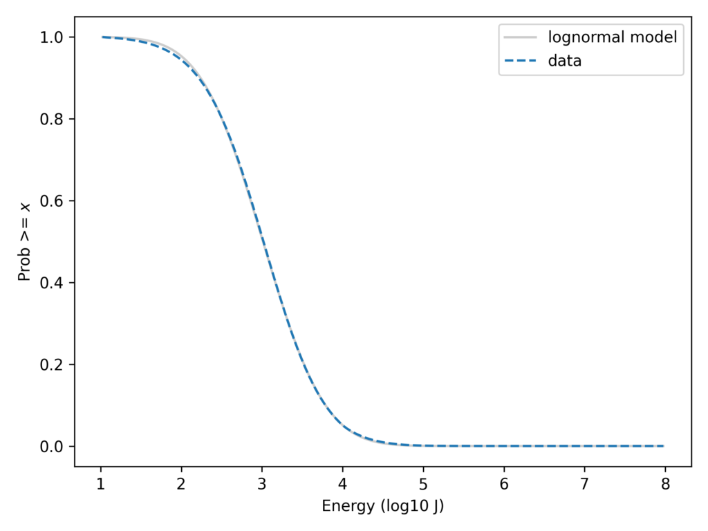
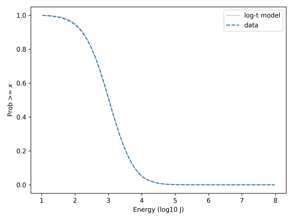
For each stroke, the dataset includes an estimate of the energy released in 1 millisecond within a certain range of frequencies, reported in Joules. The following figure shows the distribution of these measurements on a log scale, along with a lognormal model. Specifically, it shows the tail distribution, which is the fraction of the sample greater than or equal to each value.
On the left part of the curve, there is some daylight between the data and the model, probably because low-energy strokes are less likely to be detected and measured accurately. Other than that, we could conclude that the data are well-modeled by a lognormal distribution.
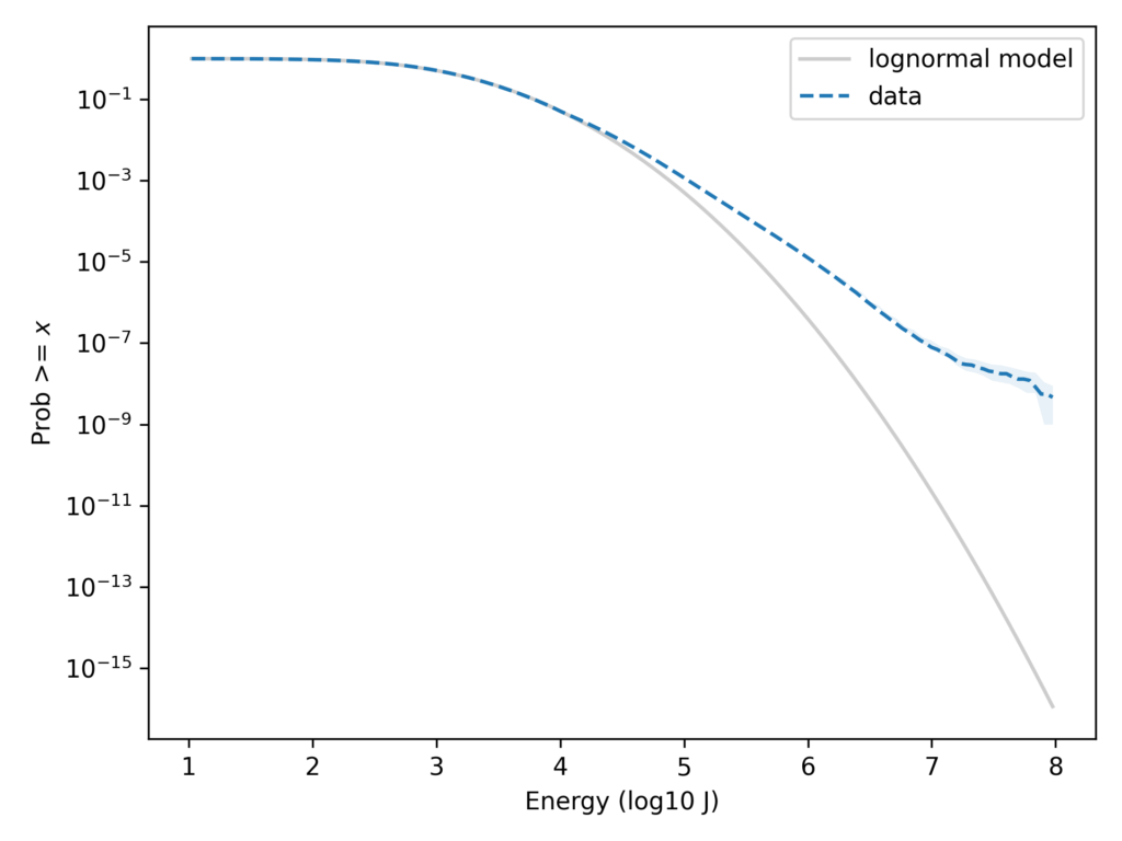
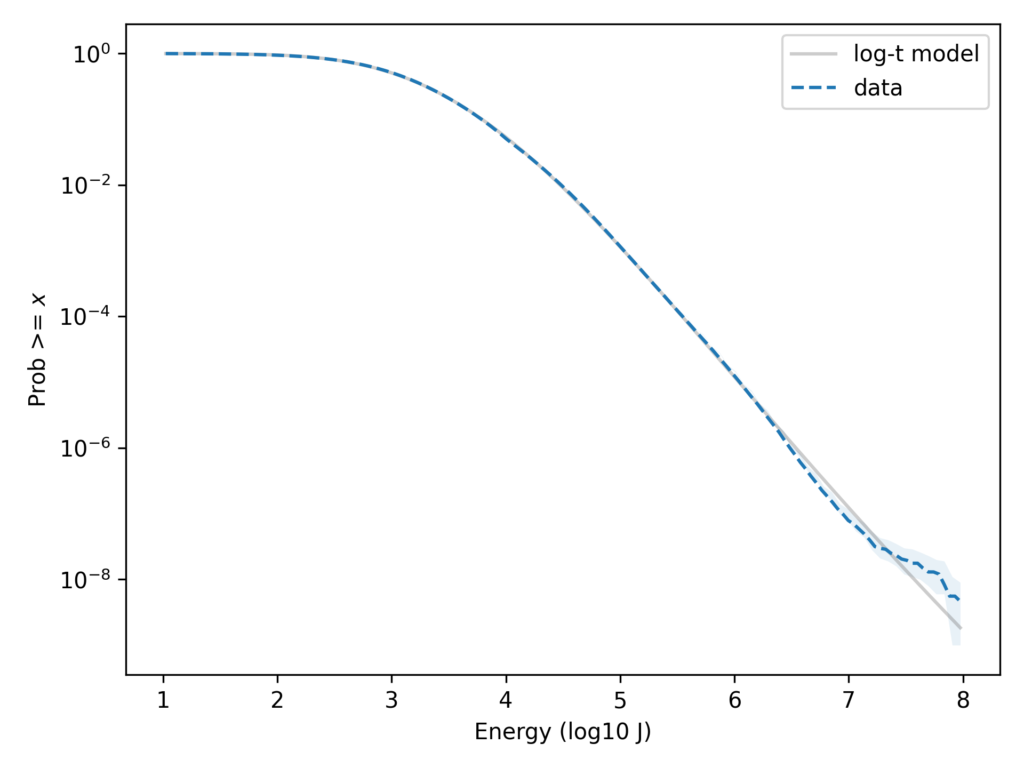
But with the y-axis on a linear scale, it’s hard to tell whether the tail of the distribution fits the model. We can see the low probabilities in the tail more clearly if we put the y-axis on a log scale. Here’s what that looks like.
On this scale it’s apparent that the lognormal model seriously underestimates the frequency of superbolts. In the dataset, the fraction of strokes that exceed 10e7.9 J is about 6 per 10e9. According to the lognormal model, it would be about 3 per 10e16 — so it’s off by about 7 orders of magnitude.
In this previous article, I showed that a Student t-distribution on a log scale, which I call a log-t distribution, is a good model for several datasets like this one. Here’s the lightning data again with a log-t model I chose to fit the data.
With the y-axis on a linear scale, we can see that the log-t model fits the data as well as the lognormal or better. And here’s the same comparison with the y-axis on a log scale.
Here we can see that the log-t model fits the tail of the distribution substantially better. Even in the extreme tail, the data fall almost entirely within the bounds we would expect to see by chance.
One of the researchers who provided this data explained that if you look at data collected from different regions of the world during different seasons, the distributions have different parameters. And that suggests a reason the combined magnitudes might follow a t distribution, which can be generated by a mixture of Gaussian distributions with different variance.
I would not say that these data are literally generated from a t distribution. The world is more complicated than that. But if we are particularly interested in the tail of the distribution — as superbolt researchers are — this might be a useful model.
Thanks to Professors Robert Holzworth and Michael McCarthy for sharing the data from their paper and reading a draft of this post (with the acknowledgement that any errors are my fault, not theirs).
The fastest runners are much faster than we expect from a Gaussian distribution, and the best chess players are much better. In almost every field of human endeavor, there are outliers who stand out even among the most talented people in the world. Where do they come from?
In this talk, I present as possible explanations two data-generating processes that yield lognormal distributions, and show that these models describe many real-world scenarios in natural and social sciences, engineering, and business. And I suggest methods — using SciPy tools — for identifying these distributions, estimating their parameters, and generating predictions.
You can buy tickets for the virtual conference here. If your budget for conferences is limited, PyData tickets are sold under a pay-what-you-can pricing model, with suggested donations based on your role and location.
My talk is based partly on Chapter 4 of Probably Overthinking It and partly on an additional exploration that didn’t make it into the book.
The exploration is motivated by this paper by Philip Gingerich, which takes the heterodox view that measurements in many biological systems follow a lognormal model rather than a Gaussian. Looking at anthropometric data, Gingerich reports that the two models are equally good for 21 of 28 measurements, “but whenever alternatives are distinguishable, [the lognormal model] is consistently and strongly favored.”
I replicated his analysis with two other datasets:
Results of medical blood tests from supplemental material from “Quantitative laboratory results: normal or lognormal distribution?” by Frank Klawonn , Georg Hoffmann and Matthias Orth.
I used different methods to fit the models and compare them. The details are in this Jupyter notebook.
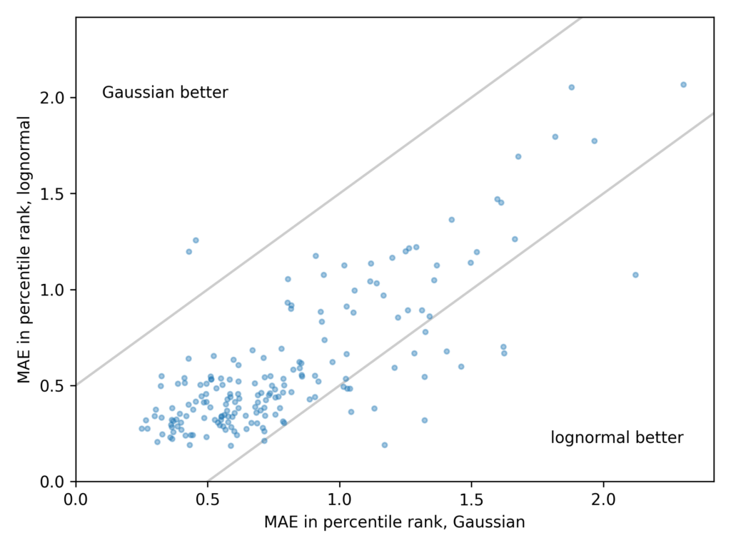
The ANSUR dataset contains 93 measurements from 4,082 male and 1,986 female members of the U.S. armed forces. For each measurement, I found the Gaussian and lognormal models that best fit the data and computed the mean absolute error (MAE) of the models.
The following scatter plot shows one point for each measurement, with the average error of the Gaussian model on the x-axis and the average error of the lognormal model on the y-axis.
Points in the lower left indicate that both models are good.
Points in the upper right indicate that both models are bad.
In the upper left, the Gaussian model is better.
In the lower right, the lognormal model is better.
These results are consistent with Gingerich’s. For many measurements, the Gaussian and lognormal models are equally good, and for a few they are equally bad. But when one model is better than the other, it is almost always the lognormal.
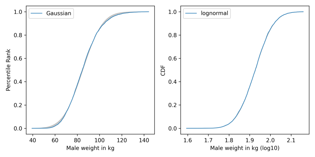
The most notable example is weight:
In these figures, the grey area shows the difference between the data and the best-fitting model. On the left, the Gaussian model does not fit the data very well; on the right, the lognormal model fits so well, the gray area is barely visible.
So why should measurements like these follow a lognormal distribution? For that you’ll have to come to my talk.
In the meantime, Probably Overthinking It is available to predorder now. You can get a 30% discount if you order from the publisher and use the code UCPNEW. You can also order from Amazon or, if you want to support independent bookstores, from Bookshop.org.
If you want a copy for yourself, you can get a 30% discount if you order from the publisher and use the code UCPNEW. You can also order from Amazon or, if you want to support independent bookstores, from Bookshop.org.
The official release date is December 6, but since the book is in warehouses now, it might arrive a little early. While you wait, please enjoy this excerpt from the introduction…
Introduction
Let me start with a premise: we are better off when our decisions are guided by evidence and reason. By “evidence,” I mean data that is relevant to a question. By “reason” I mean the thought processes we use to interpret evidence and make decisions. And by “better off,” I mean we are more likely to accomplish what we set out to do—and more likely to avoid undesired outcomes.
Sometimes interpreting data is easy. For example, one of the reasons we know that smoking causes lung cancer is that when only 20% of the population smoked, 80% of people with lung cancer were smokers. If you are a doctor who treats patients with lung cancer, it does not take long to notice numbers like that.
But interpreting data is not always that easy. For example, in 1971 a researcher at the University of California, Berkeley, published a pa per about the relationship between smoking during pregnancy, the weight of babies at birth, and mortality in the first month of life. He found that babies of mothers who smoke are lighter at birth and more likely to be classified as “low birthweight.” Also, low-birthweight babies are more likely to die within a month of birth, by a factor of 22. These results were not surprising.
However, when he looked specifically at the low-birthweight babies, he found that the mortality rate for children of smokers is lower, by a factor of two. That was surprising. He also found that among low-birthweight babies, children of smokers are less likely to have birth defects, also by a factor of 2. These results make maternal smoking seem beneficial for low-birthweight babies, somehow protecting them from birth defects and mortality.
The paper was influential. In a 2014 retrospective in the Inter- national Journal of Epidemiology, one commentator suggests it was responsible for “holding up anti-smoking measures among pregnant women for perhaps a decade” in the United States. Another suggests it “postponed by several years any campaign to change mothers’ smoking habits” in the United Kingdom. But it was a mistake. In fact, maternal smoking is bad for babies, low birthweight or not. The reason for the apparent benefit is a statistical error I will explain in chapter 7.
Among epidemiologists, this example is known as the low-birthweight paradox. A related phenomenon is called the obesity paradox. Other examples in this book include Berkson’s paradox and Simpson’s paradox. As you might infer from the prevalence of “paradoxes,” using data to answer questions can be tricky. But it is not hopeless. Once you have seen a few examples, you will start to recognize them, and you will be less likely to be fooled. And I have collected a lot of examples.
So we can use data to answer questions and resolve debates. We can also use it to make better decisions, but it is not always easy. One of the challenges is that our intuition for probability is sometimes dangerously misleading. For example, in October 2021, a guest on a well-known podcast reported with alarm that “in the U.K. 70-plus percent of the people who die now from COVID are fully vaccinated.” He was correct; that number was from a report published by Public Health England, based on reliable national statistics. But his implication—that the vaccine is useless or actually harmful—is wrong.
As I’ll show in chapter 9, we can use data from the same report to compute the effectiveness of the vaccine and estimate the number of lives it saved. It turns out that the vaccine was more than 80% effective at preventing death and probably saved more than 7000 lives, in a four-week period, out of a population of 48 million. If you ever find yourself with the opportunity to save 7000 people in a month, you should take it.
The error committed by this podcast guest is known as the base rate fallacy, and it is an easy mistake to make. In this book, we will see examples from medicine, criminal justice, and other domains where decisions based on probability can be a matter of health, freedom, and life.
The Ground Rules
Not long ago, the only statistics in newspapers were in the sports section. Now, newspapers publish articles with original research, based on data collected and analyzed by journalists, presented with well-designed, effective visualization. And data visualization has come a long way. When USA Today started publishing in 1982, the infographics on their front page were a novelty. But many of them presented a single statistic, or a few percentages in the form of a pie chart.
Since then, data journalists have turned up the heat. In 2015, “The Upshot,” an online feature of the New York Times, published an interactive, three-dimensional representation of the yield curve — a notoriously difficult concept in economics. I am not sure I fully understand this figure, but I admire the effort, and I appreciate the willingness of the authors to challenge the audience. I will also challenge my audience, but I won’t assume that you have prior knowledge of statistics beyond a few basics. Everything else, I’ll explain as we go.
Some of the examples in this book are based on published research; others are based on my own observations and exploration of data. Rather than report results from a prior work or copy a figure, I get the data, replicate the analysis, and make the figures myself. In some cases, I was able to repeat the analysis with more recent data. These updates are enlightening. For example, the low-birthweight paradox, which was first observed in the 1970s, persisted into the 1990s, but it has disappeared in the most recent data.
All of the work for this book is based on tools and practices of reproducible science. I wrote each chapter in a Jupyter notebook, which combines the text, computer code, and results in a single document. These documents are organized in a version-control system that helps to ensure they are consistent and correct. In total, I wrote about 6000 lines of Python code using reliable, open-source libraries like NumPy, SciPy, and pandas. Of course, it is possible that there are bugs in my code, but I have tested it to minimize the chance of errors that substantially affect the results.
Recently a shoe store in France ran a promotion called “Rob It to Get It”, which invited customers to try to steal something by grabbing it and running out of the store. But there was a catch — the “security guard” was a professional sprinter, Méba Mickael Zeze. As you would expect, he is fast, but you might not appreciate how much faster he is than an average runner, or even a good runner.
If you are a fan of the Atlanta Braves, a Major League Baseball team, or if you watch enough videos on the internet, you have probably seen one of the most popular forms of between-inning entertainment: a foot race between one of the fans and a spandex-suit-wearing mascot called the Freeze.
The route of the race is the dirt track that runs across the outfield, a distance of about 160 meters, which the Freeze runs in less than 20 seconds. To keep things interesting, the fan gets a head start of about 5 seconds. That might not seem like a lot, but if you watch one of these races, this lead seems insurmountable. However, when the Freeze starts running, you immediately see the difference between a pretty good runner and a very good runner. With few exceptions, the Freeze runs down the fan, overtakes them, and coasts to the finish line with seconds to spare.
Here are some examples:
But as fast as he is, the Freeze is not even a professional runner; he is a member of the Braves’ ground crew named Nigel Talton. In college, he ran 200 meters in 21.66 seconds, which is very good. But the 200 meter collegiate record is 20.1 seconds, set by Wallace Spearmon in 2005, and the current world record is 19.19 seconds, set by Usain Bolt in 2009.
To put all that in perspective, let’s start with me. For a middle-aged man, I am a decent runner. When I was 42 years old, I ran my best-ever 10 kilometer race in 42:44, which was faster than 94% of the other runners who showed up for a local 10K. Around that time, I could run 200 meters in about 30 seconds (with wind assistance).
But a good high school runner is faster than me. At a recent meet, the fastest girl at a nearby high school ran 200 meters in about 27 seconds, and the fastest boy ran under 24 seconds.
So, in terms of speed, a fast high school girl is 11% faster than me, a fast high school boy is 12% faster than her; Nigel Talton, in his prime, was 11% faster than him, Wallace Spearmon was about 8% faster than Talton, and Usain Bolt is about 5% faster than Spearmon.
Unless you are Usain Bolt, there is always someone faster than you, and not just a little bit faster; they are much faster. The reason is that the distribution of running speed is not Gaussian — It is more like lognormal.
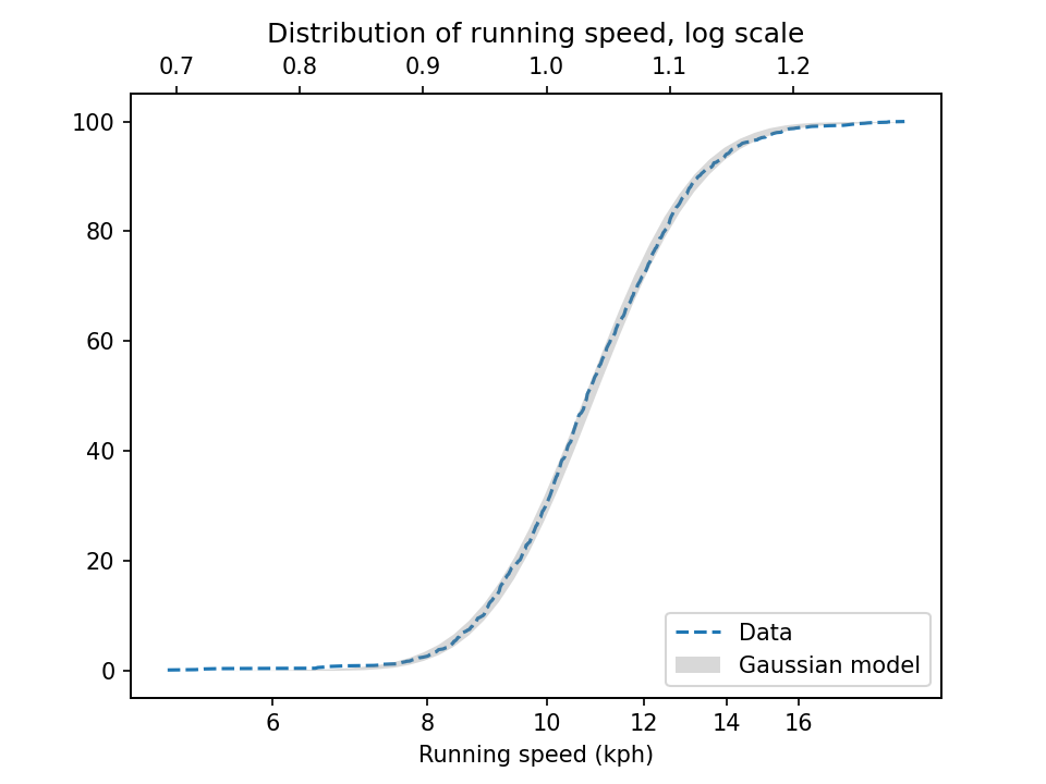
To demonstrate, I’ll use data from the James Joyce Ramble, which is the 10 kilometer race where I ran my previously-mentioned personal record time. I downloaded the times for the 1,592 finishers and converted them to speeds in kilometers per hour. The following figure shows the distribution of these speeds on a logarithmic scale, along with a Gaussian model I fit to the data.
The logarithms follow a Gaussian distribution, which means the speeds themselves are lognormal. You might wonder why. Well, I have a theory, based on the following assumptions:
First, everyone has a maximum speed they are capable of running, assuming that they train effectively.
Second, these speed limits can depend on many factors, including height and weight, fast- and slow-twitch muscle mass, cardiovascular conditioning, flexibility and elasticity, and probably more.
Finally, the way these factors interact tends to be multiplicative; that is, each person’s speed limit depends on the product of multiple factors.
Here’s why I think speed depends on a product rather than a sum of factors. If all of your factors are good, you are fast; if any of them are bad, you are slow. Mathematically, the operation that has this property is multiplication.
For example, suppose there are only two factors, measured on a scale from 0 to 1, and each person’s speed limit is determined by their product. Let’s consider three hypothetical people:
The first person scores high on both factors, let’s say 0.9. The product of these factors is 0.81, so they would be fast.
The second person scores relatively low on both factors, let’s say 0.3. The product is 0.09, so they would be quite slow.
So far, this is not surprising: if you are good in every way, you are fast; if you are bad in every way, you are slow. But what if you are good in some ways and bad in others?
The third person scores 0.9 on one factor and 0.3 on the other. The product is 0.27, so they are a little bit faster than someone who scores low on both factors, but much slower than someone who scores high on both.
That’s a property of multiplication: the product depends most strongly on the smallest factor. And as the number of factors increases, the effect becomes more dramatic.
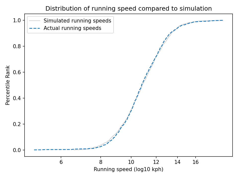
To simulate this mechanism, I generated five random factors from a Gaussian distribution and multiplied them together. I adjusted the mean and standard deviation of the Gaussians so that the resulting distribution fit the data; the following figure shows the results.
The simulation results fit the data well. So this example demonstrates a second mechanism [the first is described earlier in the chapter] that can produce lognormal distributions: the limiting power of the weakest link. If there are at least five factors affect running speed, and each person’s limit depends on their worst factor, that would explain why the distribution of running speed is lognormal.
And that’s why you can’t beat the Freeze.
You can read about the “Rob It to Get It” promotion in this article and watch people get run down in this video.
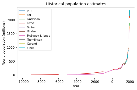
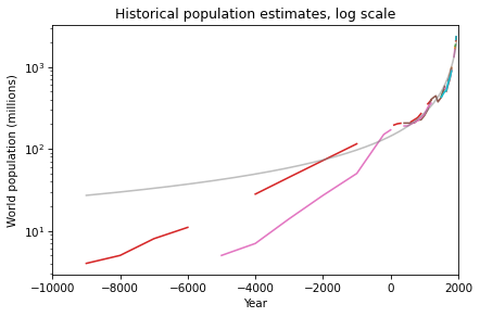
One of the exercises in Modeling and Simulation in Python invites readers to download estimates of world population from 10,000 BCE to the present, and to see if they are well modeled by any simple mathematical function. Here’s what the estimates look like (aggregated on Wikipedia from several researchers and organizations):
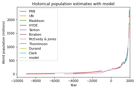
After some trial and error, I found a simple model that fits the data well: a / (b-x), where a is 300,000 and b is 2100. Here’s what the model looks like compared to the data:
So that’s a pretty good fit, but it’s a very strange model. The first problem is that there is no theoretical reason to expect world population to follow this model, and I can’t find any prior work where researchers in this area have proposed a model like this.
The second problem is that this model is headed for a singularity: it goes to infinity in 2100. Now, there’s no cause for concern — this data only goes up to 1950, and as we saw in this previous article, the nature of population growth since then has changed entirely. Since 1950, world population has grown only linearly, and it is now expected to slow down and stop growing before 2100. So the singularity has been averted.
But what should we make of this strange model? We can get a clearer view by plotting the y-axis on a log scale:
On this scale, we can see that the model does not fit the data as well prior to 4000 BCE. I’m not sure how much of a problem that is, considering that the estimates during that period are not precise. The retrodictions of the model might actually fall within the uncertainty of the estimates.
Regardless, even if the model only fits the data after 4000 BCE, it is still worth asking why it fits as well as it does. One step toward an answer is to express the model in terms of doubling time. With a little math, we can show that a function with the form a / (b-x) has a doubling time that decreases linearly.
In 10,000 BCE, doubling time was about 8000 years, in 5000 BCE, it was about 5000 years, and in Year 0, it was 1455 years. Doubling time decreased because of the Neolithic Revolution, which was the transition of human populations from hunting and gathering to agriculture and settlement, starting about 10,000 years ago.
During this period, the domestication of plants and animals vastly increased the calories people could obtain, and the organization of large, permanent settlements accelerated the conversion of those calories into population growth.
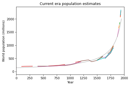
If we zoom in on the last 2000 years, we see that the most recent data points are higher and steeper than the model’s predictions, which suggest that the Industrial Revolution accelerated growth even more.
So, if the Neolithic Revolution started world population on the path to a singularity, and the Industrial Revolution sped up the process, what stopped it? Why has population growth since 1950 slowed so dramatically?
The ironic answer is the Green Revolution, which increased our ability to produce calories so quickly, it contributed to rapid improvements in public health, education, and economic opportunity — all of which led to drastic decreases in child mortality. And, it turns out, when children are likely to survive, people choose to have fewer of them.
As a result, population growth left the regime where doubling time decreases linearly, and entered a regime where doubling time increases linearly. And soon, if not already, it will enter a regime of deceleration and decline. At this point it is unlikely that world population will ever double again.
So, to summarize the last 10,000 years of population growth, the Neolithic and Industrial Revolutions made it possible for humans to breed like crazy, and the Green Revolution made it so we don’t want to.
This is an update to an analysis I run each time the marathon world record is broken. If you like this sort of thing, you will like my forthcoming book, Probably Overthinking It, which is available for preorder now.
On October 8, 2023, Kelvin Kiptum ran the Chicago Marathon in 2:00:35, breaking by 34 seconds the record set last year by Eliud Kipchoge — and taking another big step in the progression toward a two-hour marathon.
In a previous article, I noted that the marathon record speed since 1970 has been progressing linearly over time, and I proposed a model that explains why we might expect it to continue. Based on a linear extrapolation of the data so far, I predicted that someone would break the two hour barrier in 2036, plus or minus five years.
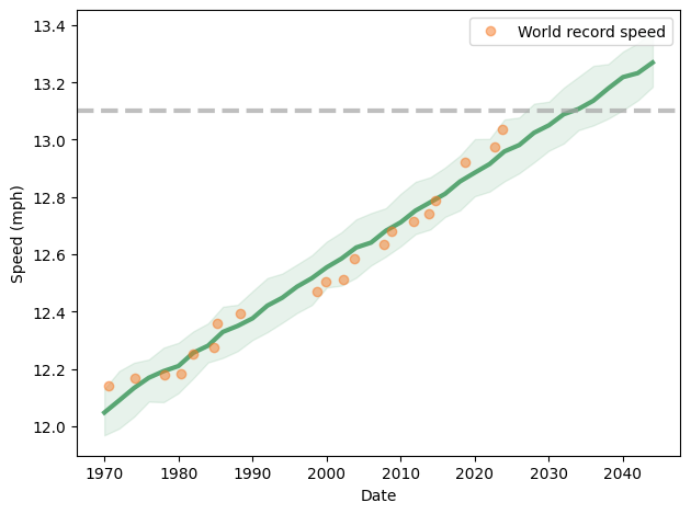
Now it is time to update my predictions in light of the new record. The following figure shows the progression of world record speed since 1970 (orange dots), a linear fit to the data (green line) and a 90% predictive confidence interval (shaded area).
This model predicts that we will see a two-hour marathon in 2033 plus or minus 6 years.
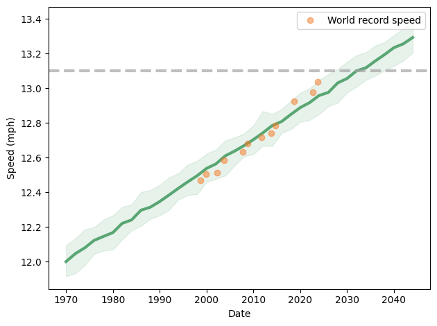
However, it looks more and more like the slope of the line has changed since 1998. If we consider only data since then, we get the following prediction:
This model predicts a two hour marathon in 2032 plus or minus 5 years. But with the last three points above the long-term trend, and with two active runners knocking on the door, I would bet on the early end of that range.
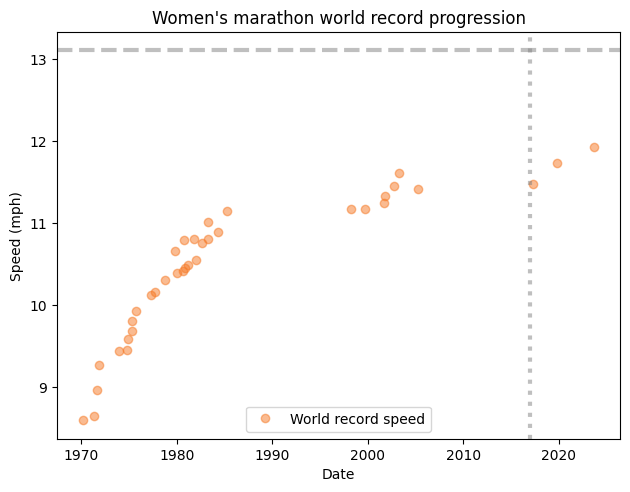
UPDATE: I was asked if the same analysis works for the women’s marathon world record progression. The short answer is no. Here’s what the data look like:
You might notice that the record speed does not increase monotonically — that’s because there are two records, one in races where women compete separately from men, and another where they are mixed. In a mixed race, women can take advantage of male pacers.
Notably, there have been two long stretches where a record went unbroken. More recently, Paula Radcliffe’s women-only record, set in 2005, stood until 2017, when it was broken by Mary Jepkosgei Keitany in 2017.
After that drought, two new records followed quickly — both set by runners wearing supershoes.
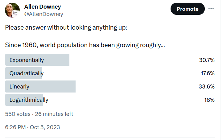
Recently I posed this question on Twitter: “Since 1960, has world population grown exponentially, quadratically, linearly, or logarithmically?”
Here are the responses:
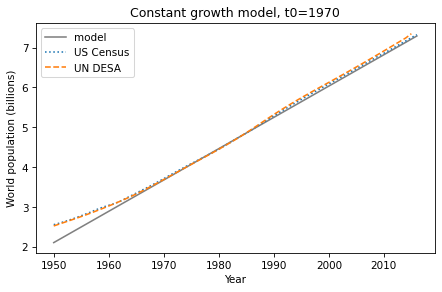
By a narrow margin, the most popular answer is correct — since 1960 world population growth has been roughly linear. I know this because it’s the topic of Chapter 5 of Modeling and Simulation in Python, now available from No Starch Press and Amazon.com.
This figure — from one of the exercises — shows estimates of world population from the U.S. Census Bureau and the United Nations Department of Economic and Social Affairs, compared to a linear model.
That’s pretty close to linear.
Looking again at the poll, the distribution of responses suggests that this pattern is not well known. And it is a surprising pattern, because there is no obvious mechanism to explain why growth should be linear.
If the global average fertility rate is constant, population grows exponentially. But over the last 60 years fertility rates have declined at precisely the rate that cancels exponential growth.
I don’t think that can be anything other than a coincidence, and it looks like it won’t last. World population is now growing less-than-linearly, and demographers predict that it will peak around 2100, and then decline — that is, population growth after 2100 will be negative.
If you did not know that fertility rates are declining, you might wonder why — and why it really got going in the 1960s. Of course the answer is complicated, but there is one potential explanation with the right timing and the necessary global scale: the Green Revolution, which greatly increased agricultural yields in one region after another.
It might seem like more food would yield more people, but that’s not how it turned out. More food frees people from subsistence farming and facilitates urbanization, which creates wealth and improves public health, especially child survival. And when children are more likely to survive, people generally choose to have fewer children.
Urbanization and wealth also improve education and economic opportunity, especially for women. And that, along with expanded human rights, tends to lower fertility rates even more. This set of interconnected causes and effects is called the demographic transition.
These changes in fertility, and their effect on population growth, will be the most important global trends of the 21st century. If you want to know more about them, you might like: