Announcing Think Stats 3e
The third edition of Think Stats is on its way to the printer! You can preorder now from Bookshop.org and Amazon (those are affiliate links), or if you can’t wait to get a paper copy, you can read the free, online version here.
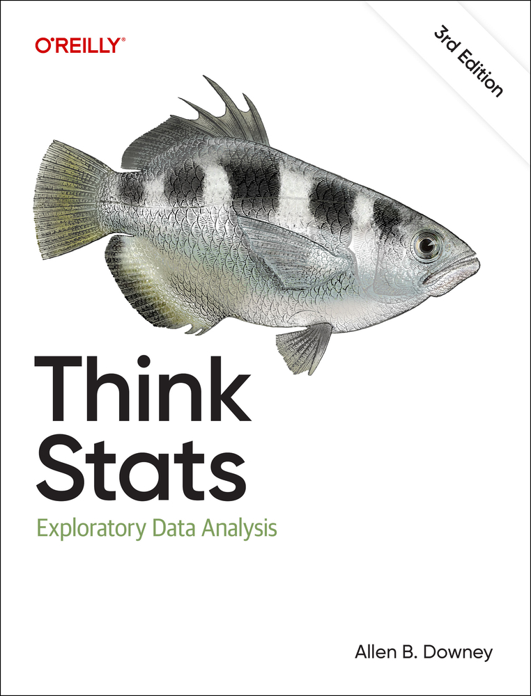
Here’s the new cover, still featuring a suspicious-looking archerfish.
If you are not familiar with the previous editions, Think Stats is an introduction to practical methods for exploring and visualizing data, discovering relationships and trends, and communicating results.
The organization of the book follows the process I use when I start working with a dataset:
- Importing and cleaning: Whatever format the data is in, it usually takes some time and effort to read the data, clean and transform it, and check that everything made it through the translation process intact.
- Single variable explorations: I usually start by examining one variable at a time, finding out what the variables mean, looking at distributions of the values, and choosing appropriate summary statistics.
- Pair-wise explorations: To identify possible relationships between variables, I look at tables and scatter plots, and compute correlations and linear fits.
- Multivariate analysis: If there are apparent relationships between variables, I use multiple regression to add control variables and investigate more complex relationships.
- Estimation and hypothesis testing: When reporting statistical results, it is important to answer three questions: How big is the effect? How much variability should we expect if we run the same measurement again? Is it plausible that the apparent effect is due to chance?
- Visualization: During exploration, visualization is an important tool for finding possible relationships and effects. Then if an apparent effect holds up to scrutiny, visualization is an effective way to communicate results.
What’s new?
For the third edition, I started by moving the book into Jupyter notebooks. This change has one immediate benefit — you can read the text, run the code, and work on the exercises all in one place. And the notebooks are designed to work on Google Colab, so you can get started without installing anything.
The move to notebooks has another benefit — the code is more visible. In the first two editions, some of the code was in the book and some was in supporting files available online. In retrospect, it’s clear that splitting the material in this way was not ideal, and it made the code more complicated than it needed to be. In the third edition, I was able to simplify the code and make it more readable.
Since the last edition was published, I’ve developed a library called empiricaldist that provides objects that represent statistical distributions. This library is more mature now, so the updated code makes better use of it.
When I started this project, NumPy and SciPy were not as widely used, and Pandas even less, so the original code used Python data structures like lists and dictionaries. This edition uses arrays and Pandas structures extensively, and makes more use of functions these libraries provide.
The third edition covers the same topics as the original, in almost the same order, but the text is substantially revised. Some of the examples are new; others are updated with new data. I’ve developed new exercises, revised some of the old ones, and removed a few. I think the updated exercises are better connected to the examples, and more interesting.
Since the first edition, this book has been based on the thesis that many ideas that are hard to explain with math are easier to explain with code. In this edition, I have doubled down on this idea, to the point where there is almost no mathematical notation left.
New Data, New Examples
In the previous edition, I was not happy with the chapter on time-series analysis, so I almost entirely replaced it, using as an example data on renewable electricity generation from U.S. Energy Information Administration. This dataset is more interesting than the one it replaced, and it works better with time-series methods, including seasonal decomposition and ARIMA.
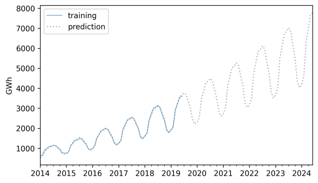
Example from Chapter 12, showing electricity production from solar power in the US.
And for the chapters on regression (simple and multiple) I couldn’t resist using the now-famous Palmer penguin dataset.
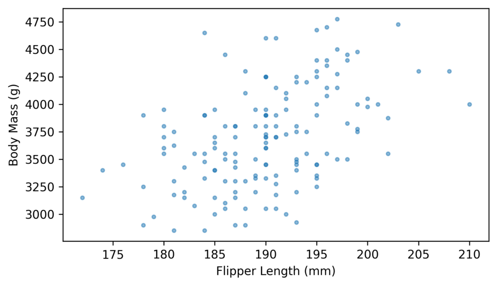
Example from Chapter 10, showing a scatter plot of penguin measurements.
Other examples use some of the same datasets from the previous edition, including the National Survey of Family Growth (NSFG) and Behavioral Risk Factor Surveillance System (BRFSS).
Overall, I’m very happy with the results. I hope you like it!