Browsed by
Month: January 2025

Algorithmic Fairness

Algorithmic Fairness

This is the last in a series of excerpts from Elements of Data Science, now available from Lulu.com and online booksellers.

This article is based on the Recidivism Case Study, which is about algorithmic fairness. The goal of the case study is to explain the statistical arguments presented in two articles from 2016:

Both are about COMPAS, a statistical tool used in the justice system to assign defendants a “risk score” that is intended to reflect the risk that they will commit another crime if released.

The ProPublica article evaluates COMPAS as a binary classifier, and compares its error rates for black and white defendants. In response, the Washington Post article shows that COMPAS has the same predictive value black and white defendants. And they explain that the test cannot have the same predictive value and the same error rates at the same time.

In the first notebook I replicated the analysis from the ProPublica article. In the second notebook I replicated the analysis from the WaPo article. In this article I use the same methods to evaluate the performance of COMPAS for male and female defendants. I find that COMPAS is unfair to women: at every level of predicted risk, women are less likely to be arrested for another crime.

You can run this Jupyter notebook on Colab.

Male and female defendants

The authors of the ProPublica article published a supplementary article, How We Analyzed the COMPAS Recidivism Algorithm, which describes their analysis in more detail. In the supplementary article, they briefly mention results for male and female respondents:

The COMPAS system unevenly predicts recidivism between genders. According to Kaplan-Meier estimates, women rated high risk recidivated at a 47.5 percent rate during two years after they were scored. But men rated high risk recidivated at a much higher rate – 61.2 percent – over the same time period. This means that a high-risk woman has a much lower risk of recidivating than a high-risk man, a fact that may be overlooked by law enforcement officials interpreting the score.

We can replicate this result using the methods from the previous notebooks; we don’t have to do Kaplan-Meier estimation.

According to the binary gender classification in this dataset, about 81% of defendants are male.

male = cp["sex"] == "Male"
male.mean()
0.8066260049902967
female = cp["sex"] == "Female"
female.mean()
0.19337399500970334

Here are the confusion matrices for male and female defendants.

from rcs_utils import make_matrix

matrix_male = make_matrix(cp[male])
matrix_male
Pred PositivePred Negative
Actual
Positive17321021
Negative9942072
matrix_female = make_matrix(cp[female])
matrix_female
Pred PositivePred Negative
Actual
Positive303195
Negative288609

And here are the metrics:

from rcs_utils import compute_metrics

metrics_male = compute_metrics(matrix_male, "Male defendants")
metrics_male
Percent
Male defendants
FPR32.4
FNR37.1
PPV63.5
NPV67.0
Prevalence47.3
metrics_female = compute_metrics(matrix_female, "Female defendants")
metrics_female
Percent
Female defendants
FPR32.1
FNR39.2
PPV51.3
NPV75.7
Prevalence35.7

The fraction of defendants charged with another crime (prevalence) is substantially higher for male defendants (47% vs 36%).

Nevertheless, the error rates for the two groups are about the same. As a result, the predictive values for the two groups are substantially different:

  • PPV: Women classified as high risk are less likely to be charged with another crime, compared to high-risk men (51% vs 64%).
  • NPV: Women classified as low risk are more likely to “survive” two years without a new charge, compared to low-risk men (76% vs 67%).

The difference in predictive values implies that COMPAS is not calibrated for men and women. Here are the calibration curves for male and female defendants.

_images/0c00fcec5fcb5d27076980d67c956f77bd0f84a3c39072a7a423b9f462b40780.png

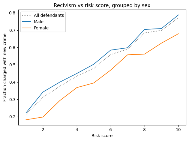
For all risk scores, female defendants are substantially less likely to be charged with another crime. Or, reading the graph the other way, female defendants are given risk scores 1-2 points higher than male defendants with the same actual risk of recidivism.

To the degree that COMPAS scores are used to decide which defendants are incarcerated, those decisions:

  • Are unfair to women.
  • Are less effective than they could be, if they incarcerate lower-risk women while allowing higher-risk men to go free.

What would it take?

Suppose we want to fix COMPAS so that predictive values are the same for male and female defendants. We could do that by using different thresholds for the two groups. In this section, we’ll see what it would take to re-calibrate COMPAS; then we’ll find out what effect that would have on error rates.

From the previous notebook, sweep_threshold loops through possible thresholds, makes the confusion matrix for each threshold, and computes the accuracy metrics. Here are the resulting tables for all defendants, male defendants, and female defendants.

from rcs_utils import sweep_threshold

table_all = sweep_threshold(cp)
table_male = sweep_threshold(cp[male])
table_female = sweep_threshold(cp[female])

As we did in the previous notebook, we can find the threshold that would make predictive value the same for both groups.

from rcs_utils import predictive_value

matrix_all = make_matrix(cp)
ppv, npv = predictive_value(matrix_all)
from rcs_utils import crossing

crossing(table_male["PPV"], ppv)
array(3.36782883)
crossing(table_male["NPV"], npv)
array(3.40116329)

With a threshold near 3.4, male defendants would have the same predictive values as the general population. Now let’s do the same computation for female defendants.

crossing(table_female["PPV"], ppv)
array(6.88124668)
crossing(table_female["NPV"], npv)
array(6.82760429)

To get the same predictive values for men and women, we would need substantially different thresholds: about 6.8 compared to 3.4. At those levels, the false positive rates would be very different:

from rcs_utils import interpolate

interpolate(table_male["FPR"], 3.4)
array(39.12)
interpolate(table_female["FPR"], 6.8)
array(9.14)

And so would the false negative rates.

interpolate(table_male["FNR"], 3.4)
array(30.98)
interpolate(table_female["FNR"], 6.8)
array(74.18)

If the test is calibrated in terms of predictive value, it is uncalibrated in terms of error rates.

ROC

In the previous notebook I defined the receiver operating characteristic (ROC) curve. The following figure shows ROC curves for male and female defendants:

from rcs_utils import plot_roc

plot_roc(table_male)
plot_roc(table_female)
_images/6c3b663c6aee1331f0bd08cae9c973892e52b264950db4baa0d3db68ea2dc790.png

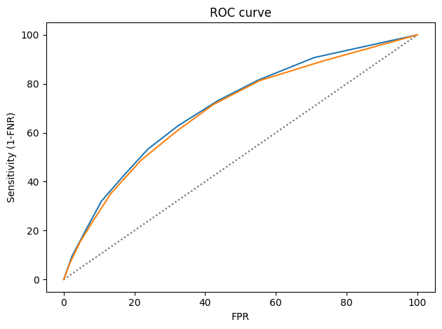
The ROC curves are nearly identical, which implies that it is possible to calibrate COMPAS equally for male and female defendants.

Summary

With respect to sex, COMPAS is fair by the criteria posed by the ProPublica article: it has the same error rates for groups with different prevalence. But it is unfair by the criteria of the WaPo article, which argues:

A risk score of seven for black defendants should mean the same thing as a score of seven for white defendants. Imagine if that were not so, and we systematically assigned whites higher risk scores than equally risky black defendants with the goal of mitigating ProPublica’s criticism. We would consider that a violation of the fundamental tenet of equal treatment.

With respect to male and female defendants, COMPAS violates this tenet.

So who’s right? We have two competing definitions of fairness, and it is mathematically impossible to satisfy them both. Is it better to have equal error rates for all groups, as COMPAS does for men and women? Or is it better to be calibrated, which implies equal predictive values? Or, since we can’t have both, should the test be “tempered”, allowing both error rates and predictive values to depend on prevalence?

In the next notebook I explore these trade-offs in more detail. And I summarized these results in Chapter 9 of Probably Overthinking It.

Confidence In the Press

Confidence In the Press

This is the fifth in a series of excerpts from Elements of Data Science, now available from Lulu.com and online booksellers. It’s based on Chapter 16, which is part of the political alignment case study. You can read the complete example here, or run the Jupyter notebook on Colab.

Because this is a teaching example, it builds incrementally. If you just want to see the results, scroll to the end!

Chapter 16 is a template for exploring relationships between political alignment (liberal or conservative) and other beliefs and attitudes. In this example, we’ll use that template to look at the ways confidence in the press has changed over the last 50 years in the U.S.

The dataset we’ll use is an excerpt of data from the General Social Survey. It contains three resamplings of the original data. We’ll start with the first.

datafile = "gss_pacs_resampled.hdf"
gss = pd.read_hdf(datafile, "gss0")
gss.shape
(72390, 207)

It contains one row for each respondent and one column per variable.

Changes in Confidence

The General Social Survey includes several questions about a confidence in various institutions. Here are the names of the variables that contain the responses.

' '.join(column for column in gss.columns if 'con' in column)
'conarmy conbus conclerg coneduc confed confinan coninc conjudge conlabor conlegis conmedic conpress conrinc consci contv'

Here’s how this section of the survey is introduced.

I am going to name some institutions in this country. As far as the people running these institutions are concerned, would you say you have a great deal of confidence, only some confidence, or hardly any confidence at all in them?

The variable we’ll explore is conpress, which is about “the press”.

varname = "conpress"
column = gss[varname]
column.tail()
72385    2.0
72386    3.0
72387    3.0
72388    2.0
72389    2.0
Name: conpress, dtype: float64

As we’ll see, response to this question have changed substantiall over the last few decades.

Responses

Here’s the distribution of responses:

column.value_counts(dropna=False).sort_index()
1.0     6968
2.0    24403
3.0    16769
NaN    24250
Name: conpress, dtype: int64

The special value NaN indicates that the respondent was not asked the question, declined to answer, or said they didn’t know.

The following cell shows the numerical values and the text of the responses they stand for.

responses = [1, 2, 3]

labels = [
    "A great deal",
    "Only some",
    "Hardly any",
]

Here’s what the distribution looks like. plt.xticks puts labels on the

-axis.

pmf = Pmf.from_seq(column)
pmf.bar(alpha=0.7)

decorate(ylabel="PMF", title="Distribution of responses")
plt.xticks(responses, labels);
_images/f652e115b3186a827e67d0882df2218fecf3f5466985f3da007a09e983e93aa6.png

About had of the respondents have “only some” confidence in the press – but we should not make too much of this result because it combines different numbers of respondents interviewed at different times.

Responses over time

If we make a cross tabulation of year and the variable of interest, we get the distribution of responses over time.

xtab = pd.crosstab(gss["year"], column, normalize="index") * 100
xtab.head()
conpress1.02.03.0
year
197322.69647762.39837414.905149
197424.84683555.75221219.400953
197523.92807758.16044317.911480
197629.32330853.58851717.088175
197724.48436559.14837016.367265

Now we can plot the results.

for response, label in zip(responses, labels):
    xtab[response].plot(label=label)

decorate(xlabel="Year", ylabel="Percent", title="Confidence in the press")
_images/1ccb963b40a30d032cdec783f0da628e36b802486bacad5d0d9217c581e0a275.png

The percentages of “A great deal” and “Only some” have been declining since the 1970s. The percentage of “Hardly any” has increased substantially.

Political alignment

To explore the relationship between these responses and political alignment, we’ll recode political alignment into three groups:

d_polviews = {
    1: "Liberal",
    2: "Liberal",
    3: "Liberal",
    4: "Moderate",
    5: "Conservative",
    6: "Conservative",
    7: "Conservative",
}

Now we can use replace and store the result as a new column in the DataFrame.

gss["polviews3"] = gss["polviews"].replace(d_polviews)

With this scale, there are roughly the same number of people in each group.

pmf = Pmf.from_seq(gss["polviews3"])
pmf.bar(color="C1", alpha=0.7)

decorate(
    xlabel="Political alignment",
    ylabel="PMF",
    title="Distribution of political alignment",
)
_images/af209238e95c5c1c14543db06c71d0c98aa336c5bee1a163552a20b8eeb44fbe.png

Group by political alignment

Now we can use groupby to group the respondents by political alignment.

by_polviews = gss.groupby("polviews3")

Here’s a dictionary that maps from each group to a color.

muted = sns.color_palette("muted", 5)
color_map = {"Conservative": muted[3], "Moderate": muted[4], "Liberal": muted[0]}

Now we can make a PMF of responses for each group.

for name, group in by_polviews:
    plt.figure()
    pmf = Pmf.from_seq(group[varname])
    pmf.bar(label=name, color=color_map[name], alpha=0.7)

    decorate(ylabel="PMF", title="Distribution of responses")
    plt.xticks(responses, labels)
_images/4ba4c1231ab8c9458e69e622f31289dab6b1173ac7b1e91678fe140d8d3dec7b.png
_images/ec0ce0935368ef84d8f055c1270e9705607f398028601094b01e686f9e9eebe0.png
_images/aced56562db7764eda5e7d9f4d87f680fb71cac3f44983280ab873aa3ab48be8.png

Looking at the “Hardly any” response, it looks like conservatives have the least confidence in the press.

Recode

To quantify changes in these responses over time, one option is to put them on a numerical scale and compute the mean. Another option is to compute the percentage who choose a particular response or set of responses. Since the changes have been most notable in the “Hardly any” response, that’s what we’ll track. We’ll use replace to recode the values so “Hardly any” is 1 and all other responses are 0.

d_recode = {1: 0, 2: 0, 3: 1}

gss["recoded"] = column.replace(d_recode)
gss["recoded"].name = varname

We can use value_counts to confirm that it worked.

gss["recoded"].value_counts(dropna=False)
0.0    31371
NaN    24250
1.0    16769
Name: conpress, dtype: int64

Now if we compute the mean, we can interpret it as the fraction of respondents who report “hardly any” confidence in the press. Multiplying by 100 makes it a percentage.

gss["recoded"].mean() * 100
34.833818030743664

Note that the Series method mean drops NaN values before computing the mean. The NumPy function mean does not.

Average by group

We can use by_polviews to compute the mean of the recoded variable in each group, and multiply by 100 to get a percentage.

means = by_polviews["recoded"].mean() * 100
means
polviews3
Conservative    44.410101
Liberal         27.293806
Moderate        34.113831
Name: conpress, dtype: float64

By default, the group names are in alphabetical order. To get the values in a particular order, we can use the group names as an index:

groups = ["Conservative", "Moderate", "Liberal"]
means[groups]
polviews3
Conservative    44.410101
Moderate        34.113831
Liberal         27.293806
Name: conpress, dtype: float64

Now we can make a bar plot with color-coded bars:

title = "Percent with hardly any confidence in the press"
colors = color_map.values()
means[groups].plot(kind="bar", color=colors, alpha=0.7, label="")

decorate(
    xlabel="",
    ylabel="Percent",
    title=title,
)

plt.xticks(rotation=0);
_images/9582dd9bf6d69f9295d546ba69db763928bf20cdf27d8dab7a08f64d33fb7f49.png

Conservatives have less confidence in the press than liberals, and moderates are somewhere in the middle.

But again, these results are an average over the interval of the survey, so you should not interpret them as a current condition.

Time series

We can use groupby to group responses by year.

by_year = gss.groupby("year")

From the result we can select the recoded variable and compute the percentage that responded “Hardly any”.

time_series = by_year["recoded"].mean() * 100

And we can plot the results with the data points themselves as circles and a local regression model as a line.

plot_series_lowess(time_series, "C1", label='')

decorate(
    xlabel="Year",
    ylabel="Percent",
    title=title
)
_images/82515fa4a863c7a0e972d039c05e2ab431d278a1ec98601173f492d03b020d74.png

The fraction of respondents with “Hardly any” confidence in the press has increased consistently over the duration of the survey.

Time series by group

So far, we have grouped by polviews3 and computed the mean of the variable of interest in each group. Then we grouped by year and computed the mean for each year. Now we’ll use pivot_table to compute the mean in each group for each year.

table = gss.pivot_table(
    values="recoded", index="year", columns="polviews3", aggfunc="mean"
) * 100
table.head()
polviews3ConservativeLiberalModerate
year
197422.48243617.31207316.604478
197522.33502510.88435417.481203
197619.49541317.79448614.901257
197722.39819013.20754714.650767
197827.17622118.04878016.819013

The result is a table that has years running down the rows and political alignment running across the columns. Each entry in the table is the mean of the variable of interest for a given group in a given year.

Plotting the results

Now let’s see the results.

for group in groups:
    series = table[group]
    plot_series_lowess(series, color_map[group])
    
decorate(
    xlabel="Year",
    ylabel="Percent",
    title="Percent with hardly any confidence in the press",
)
_images/b206bc96158affd5c576feea8e214bc24069a26028e343a303b0d987b6581c99.png

Confidence in the press has decreased in all three groups, but among liberals it might have leveled off or even reversed.

Resampling

The figures we’ve generated so far in this notebook are based on a single resampling of the GSS data. Some of the features we see in these figures might be due to random sampling rather than actual changes in the world. By generating the same figures with different resampled datasets, we can get a sense of how much variation there is due to random sampling. To make that easier, the following function contains the code from the previous analysis all in one place.

def plot_by_polviews(gss, varname):
    """Plot mean response by polviews and year.

    gss: DataFrame
    varname: string column name
    """
    gss["polviews3"] = gss["polviews"].replace(d_polviews)

    column = gss[varname]
    gss["recoded"] = column.replace(d_recode)

    table = gss.pivot_table(
        values="recoded", index="year", columns="polviews3", aggfunc="mean"
    ) * 100

    for group in groups:
        series = table[group]
        plot_series_lowess(series, color_map[group])

    decorate(
        xlabel="Year",
        ylabel="Percent",
        title=title,
    )

Now we can loop through the three resampled datasets and generate a figure for each one.

datafile = "gss_pacs_resampled.hdf"

for key in ["gss0", "gss1", "gss2"]:
    df = pd.read_hdf(datafile, key)

    plt.figure()
    plot_by_polviews(df, varname)
_images/b206bc96158affd5c576feea8e214bc24069a26028e343a303b0d987b6581c99.png
_images/60b020b2033eee5acf7c98ef76f7fb2346cd4ec9f5c4aaa680f30cb77e362664.png
_images/5e9b362b7385c42b2e13cb9bbf57b15aafb71cdd804e687f8eeaadb98f2b6f1f.png

If you see an effect that is consistent in all three figures, it is less likely to be due to random sampling. If it varies from one resampling to the next, you should probably not take it too seriously.

Based on these results, it seems likely that confidence in the press is continuing to decrease among conservatives and moderates, but not liberals – with the result that polarization on this issue has increased since the 1990s.