Browsed by
Month: December 2024

Political Alignment and Outlook

Political Alignment and Outlook

This is the fourth in a series of excerpts from Elements of Data Science, now available from Lulu.com and online booksellers. It’s from Chapter 15, which is part of the political alignment case study. You can read the complete chapter here, or run the Jupyter notebook on Colab.

In the previous chapter, we used data from the General Social Survey (GSS) to plot changes in political alignment over time. In this notebook, we’ll explore the relationship between political alignment and respondents’ beliefs about themselves and other people.

First we’ll use groupby to compare the average response between groups and plot the average as a function of time. Then we’ll use the Pandas function pivot table to compute the average response within each group as a function of time.

Are People Fair?

In the GSS data, the variable fair contains responses to this question:

Do you think most people would try to take advantage of you if they got a chance, or would they try to be fair?

The possible responses are:

CodeResponse
1Take advantage
2Fair
3Depends

As always, we start by looking at the distribution of responses, that is, how many people give each response:

values(gss["fair"])
1.0    16089
2.0    23417
3.0     2897
Name: fair, dtype: int64

The plurality think people try to be fair (2), but a substantial minority think people would take advantage (1). There are also a number of NaNs, mostly respondents who were not asked this question.

gss["fair"].isna().sum()
29987

To count the number of people who chose option 2, “people try to be fair”, we’ll use a dictionary to recode option 2 as 1 and the other options as 0.

recode_fair = {1: 0, 2: 1, 3: 0}

As an alternative, we could include option 3, “depends”, by replacing it with 1, or give it less weight by replacing it with an intermediate value like 0.5. We can use replace to recode the values and store the result as a new column in the DataFrame.

gss["fair2"] = gss["fair"].replace(recode_fair)

And we’ll use values to make sure it worked.

values(gss["fair2"])
0.0    18986
1.0    23417
Name: fair2, dtype: int64

Now let’s see how the responses have changed over time.

Fairness Over Time

As we saw in the previous chapter, we can use groupby to group responses by year.

gss_by_year = gss.groupby("year")

From the result we can select fair2 and compute the mean.

fair_by_year = gss_by_year["fair2"].mean()

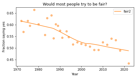
Here’s the result, which shows the fraction of people who say people try to be fair, plotted over time. As in the previous chapter, we plot the data points themselves with circles and a local regression model as a line.

plot_series_lowess(fair_by_year, "C1")

decorate(
    xlabel="Year",
    ylabel="Fraction saying yes",
    title="Would most people try to be fair?",
)
_images/c66dd4e209513c6b52923f0279d558dc7cf98d7002a9608170da7c0372146851.png

Sadly, it looks like faith in humanity has declined, at least by this measure. Let’s see what this trend looks like if we group the respondents by political alignment.

Political Views on a 3-point Scale

In the previous notebook, we looked at responses to polviews, which asks about political alignment. The valid responses are:

CodeResponse
1Extremely liberal
2Liberal
3Slightly liberal
4Moderate
5Slightly conservative
6Conservative
7Extremely conservative

To make it easier to visualize groups, we’ll lump the 7-point scale into a 3-point scale.

recode_polviews = {
    1: "Liberal",
    2: "Liberal",
    3: "Liberal",
    4: "Moderate",
    5: "Conservative",
    6: "Conservative",
    7: "Conservative",
}

We’ll use replace again, and store the result as a new column in the DataFrame.

gss["polviews3"] = gss["polviews"].replace(recode_polviews)

With this scale, there are roughly the same number of people in each group.

values(gss["polviews3"])
Conservative    21573
Liberal         17203
Moderate        24157
Name: polviews3, dtype: int64

Fairness by Group

Now let’s see who thinks people are more fair, conservatives or liberals. We’ll group the respondents by polviews3.

by_polviews = gss.groupby("polviews3")

And compute the mean of fair2 in each group.

by_polviews["fair2"].mean()
polviews3
Conservative    0.577879
Liberal         0.550849
Moderate        0.537621
Name: fair2, dtype: float64

It looks like conservatives are a little more optimistic, in this sense, than liberals and moderates. But this result is averaged over the last 50 years. Let’s see how things have changed over time.

Fairness over Time by Group

So far, we have grouped by polviews3 and computed the mean of fair2 in each group. Then we grouped by year and computed the mean of fair2 for each year. Now we’ll group by polviews3 and year, and compute the mean of fair2 in each group over time.

We could do that computation “by hand” using the tools we already have, but it is so common and useful that it has a name. It is called a pivot table, and Pandas provides a function called pivot_table that computes it. It takes the following arguments:

  • values, which is the name of the variable we want to summarize: fair2 in this example.
  • index, which is the name of the variable that will provide the row labels: year in this example.
  • columns, which is the name of the variable that will provide the column labels: polview3 in this example.
  • aggfunc, which is the function used to “aggregate”, or summarize, the values: mean in this example.

Here’s how we run it.

table = gss.pivot_table(
    values="fair2", index="year", columns="polviews3", aggfunc="mean"
)

The result is a DataFrame that has years running down the rows and political alignment running across the columns. Each entry in the table is the mean of fair2 for a given group in a given year.

table.head()
polviews3ConservativeLiberalModerate
year
19750.6256160.6171170.647280
19760.6316960.5717820.612100
19780.6949150.6594200.665455
19800.6000000.5549450.640264
19830.5724380.5853660.463492

Reading across the first row, we can see that in 1975, moderates were slightly more optimistic than the other groups. Reading down the first column, we can see that the estimated mean of fair2 among conservatives varies from year to year. It is hard to tell looking at these numbers whether it is trending up or down – we can get a better view by plotting the results.

Plotting the Results

Before we plot the results, I’ll make a dictionary that maps from each group to a color. Seaborn provide a palette called muted that contains the colors we’ll use.

muted = sns.color_palette("muted", 5)
sns.palplot(muted)
_images/b9bf5d3cbb6f6a04d01b52567e56405de67e9bf8bcb03a1e273d04a32110617d.png

And here’s the dictionary.

color_map = {"Conservative": muted[3], "Moderate": muted[4], "Liberal": muted[0]}

Now we can plot the results.

groups = ["Conservative", "Liberal", "Moderate"]
for group in groups:
    series = table[group]
    plot_series_lowess(series, color_map[group])

decorate(
    xlabel="Year",
    ylabel="Fraction saying yes",
    title="Would most people try to be fair?",
)
_images/d2722be4b358d5c87b76d18010edb6d4725fe64d9bbb4ec4c55b2fde9d3cf5df.png

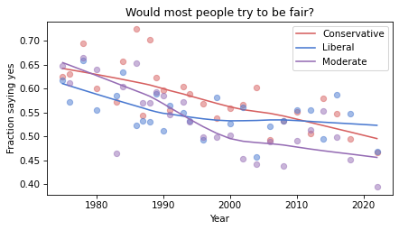
The fraction of respondents who think people try to be fair has dropped in all three groups, although liberals and moderates might have leveled off. In 1975, liberals were the least optimistic group. In 2022, they might be the most optimistic. But the responses are quite noisy, so we should not be too confident about these conclusions.

Discussion

I heard from a reader that they appreciated this explanation of pivot tables because it provides a concrete example of something that can be pretty abstract. I occurred to me that it is hard to define what a pivot table it because the table itself can be almost anything. What the term really refers to is the computation pattern rather than the result. One way to express the computational pattern is “Group by this on one axis, group by that on the other axis, select a variable, and summarize”.

In Pandas, another way to compute a pivot table is like this:

table = gss.groupby(['year', 'polviews3'])['fair2'].mean().unstack()

This way of writing it makes the grouping part of the computation more explicit. And the groupby function is more versatile, so if you only want to learn one thing, you might prefer this version. The unstack at the end is only needed if you want a wide table (with time down the rows and alignment across the columns) — without it, you get the long table (with one row for each pair of time and alignment, and only one column).

So, should we forget about pivot_table (and crosstab while we’re at it) and use groupby for everything? I’m not sure. For people who are already know the terms, it can be helpful to use functions with familiar names. But if you understand the group-by computational pattern, it might not be useful to use different functions for particular instances of the pattern.
Reject Math Supremacy

Reject Math Supremacy

The premise of Think Stats, and the other books in the Think series, is that programming is a tool for teaching and learning — and many ideas that are commonly presented in math notation can be more clearly presented in code.

In the draft third edition of Think Stats there is almost no math — not because I made a special effort to avoid it, but because I found that I didn’t need it. For example, here’s how I present the binomial distribution in Chapter 5:

Mathematically, the distribution of these outcomes follows a binomial distribution, which has a PMF that is easy to compute.

from scipy.special import comb

def binomial_pmf(k, n, p):
return comb(n, k) * (p**k) * ((1 - p) ** (n - k))

SciPy provides the comb function, which computes the number of combinations of n things taken k at a time, often pronounced “n choose k”.

binomial_pmf computes the probability of getting k hits out of n attempts, given p.

I could also present the PMF in math notation, but I’m not sure how it would help — the Python code represents the computation just as clearly. Some readers find math notation intimidating, and even for the ones who don’t, it takes some effort to decode. In my opinion, the payoff for this additional effort is too low.

But one of the people who read the draft disagrees. They wrote:

Provide equations for the distributions. You assume that the reader knows them and then you suddenly show a programming code for them — the code is a challenge to the reader to interpret without knowing the actual equation.

I acknowledge that my approach defies the expectation that we should present math first and then translate it into code. For readers who are used to this convention, presenting the code first is “sudden”.

But why? I think there are two reasons, one practical and one philosophical:

  • The practical reason is the presumption that the reader is more familiar with math notation and less familiar with code. Of course that’s true for some people, but for other people, it’s the other way around. People who like math have lots of books to choose from; people who like code don’t.
  • The philosophical reason is what I’m calling math supremacy, which is the idea that math notation is the real thing, and everything else — including and especially code — is an inferior imitation. My correspondent hints at this idea with the suggestion that the reader should see the “actual equation”. Math is actual; code is not.

I reject math supremacy. Math notation did not come from the sky on stone tablets; it was designed by people for a purpose. Programming languages were also designed by people, for different purposes. Math notation has some good properties — it is concise and it is nearly universal. But programming languages also have good properties — most notably, they are executable. When we express an idea in code, we can run it, test it, and debug it.

So here’s a thought: if you are writing for an audience that is comfortable with math notation, and your ideas can be expressed well in that form — go ahead and use math notation. But if you are writing for an audience that understands code, and your ideas can be expressed well in code — well then you should probably use code. “Actual” code.

Young Americans are Marrying Later or Never

Young Americans are Marrying Later or Never

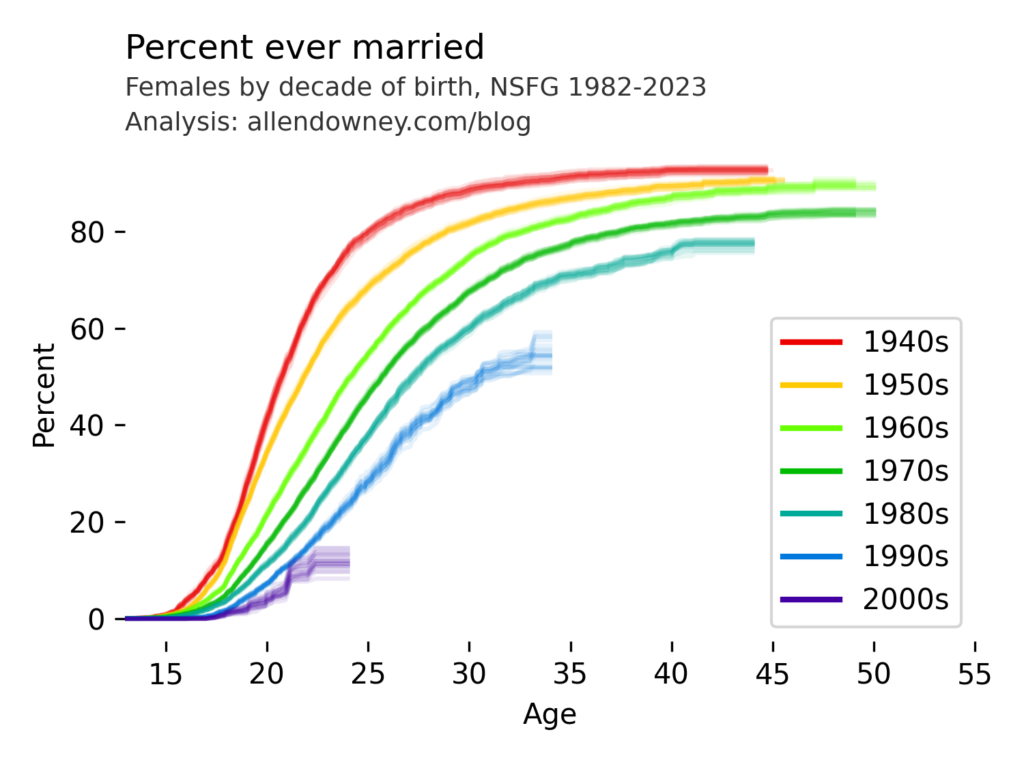
I’ve written before about changes in marriage patterns in the U.S., and it’s one of the examples in Chapter 13 of the new third edition of Think Stats. My analysis uses data from the National Survey of Family Growth (NSFG). Today they released the most recent data, from surveys conducted in 2022 and 2023. So here are the results, updated with the newest data:

The patterns are consistent with what we’ve see in previous iterations — each successive cohort marries later than the previous one, and it looks like an increasing percentage of them will remain unmarried.

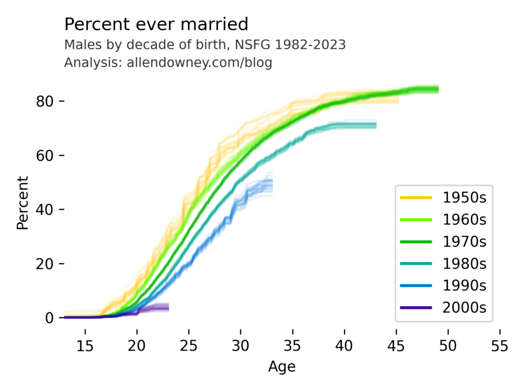
UPDATE: Here’s the same analysis for male respondents:

The pattern is similar — compared to previous generations, very few young men are getting married.

Data: National Center for Health Statistics (NCHS). (2024). 2022–2023 National Survey of Family Growth Public Use Data and Documentation. Hyattsville, MD: CDC National Center for Health Statistics. Retrieved from NSFG 2022–2023 Public Use Data Files, December 11, 2024.

My analysis is in this Jupyter notebook.

Multiple Regression with StatsModels

Multiple Regression with StatsModels

This is the third is a series of excerpts from Elements of Data Science which available from Lulu.com and online booksellers. It’s from Chapter 10, which is about multiple regression. You can read the complete chapter here, or run the Jupyter notebook on Colab.

In the previous chapter we used simple linear regression to quantify the relationship between two variables. In this chapter we’ll get farther into regression, including multiple regression and one of my all-time favorite tools, logistic regression. These tools will allow us to explore relationships among sets of variables. As an example, we will use data from the General Social Survey (GSS) to explore the relationship between education, sex, age, and income.

The GSS dataset contains hundreds of columns. We’ll work with an extract that contains just the columns we need, as we did in Chapter 8. Instructions for downloading the extract are in the notebook for this chapter.

We can read the DataFrame like this and display the first few rows.

import pandas as pd

gss = pd.read_hdf('gss_extract_2022.hdf', 'gss')
gss.head()
yearidageeducdegreesexgunlawgrassrealinc
01972123.016.03.02.01.0NaN18951.0
11972270.010.00.01.01.0NaN24366.0
21972348.012.01.02.01.0NaN24366.0
31972427.017.03.02.01.0NaN30458.0
41972561.012.01.02.01.0NaN50763.0

We’ll start with a simple regression, estimating the parameters of real income as a function of years of education. First we’ll select the subset of the data where both variables are valid.

data = gss.dropna(subset=['realinc', 'educ'])
xs = data['educ']
ys = data['realinc']

Now we can use linregress to fit a line to the data.

from scipy.stats import linregress
res = linregress(xs, ys)
res._asdict()
{'slope': 3631.0761003894995,
 'intercept': -15007.453640508655,
 'rvalue': 0.37169252259280877,
 'pvalue': 0.0,
 'stderr': 35.625290800764,
 'intercept_stderr': 480.07467595184363}

The estimated slope is about 3450, which means that each additional year of education is associated with an additional $3450 of income.

Regression with StatsModels

SciPy doesn’t do multiple regression, so we’ll to switch to a new library, StatsModels. Here’s the import statement.

import statsmodels.formula.api as smf

To fit a regression model, we’ll use ols, which stands for “ordinary least squares”, another name for regression.

results = smf.ols('realinc ~ educ', data=data).fit()

The first argument is a formula string that specifies that we want to regress income as a function of education. The second argument is the DataFrame containing the subset of valid data. The names in the formula string correspond to columns in the DataFrame.

The result from ols is an object that represents the model – it provides a function called fit that does the actual computation.

The result is a RegressionResultsWrapper, which contains a Series called params, which contains the estimated intercept and the slope associated with educ.

results.params
Intercept   -15007.453641
educ          3631.076100
dtype: float64

The results from Statsmodels are the same as the results we got from SciPy, so that’s good!

Multiple Regression

In the previous section, we saw that income depends on education, and in the exercise we saw that it also depends on age. Now let’s put them together in a single model.

results = smf.ols('realinc ~ educ + age', data=gss).fit()
results.params
Intercept   -17999.726908
educ          3665.108238
age             55.071802
dtype: float64

In this model, realinc is the variable we are trying to explain or predict, which is called the dependent variable because it depends on the the other variables – or at least we expect it to. The other variables, educ and age, are called independent variables or sometimes “predictors”. The + sign indicates that we expect the contributions of the independent variables to be additive.

The result contains an intercept and two slopes, which estimate the average contribution of each predictor with the other predictor held constant.

  • The estimated slope for educ is about 3665 – so if we compare two people with the same age, and one has an additional year of education, we expect their income to be higher by $3514.
  • The estimated slope for age is about 55 – so if we compare two people with the same education, and one is a year older, we expect their income to be higher by $55.

In this model, the contribution of age is quite small, but as we’ll see in the next section that might be misleading.

Grouping by Age

Let’s look more closely at the relationship between income and age. We’ll use a Pandas method we have not seen before, called groupby, to divide the DataFrame into age groups.

grouped = gss.groupby('age')
type(grouped)
pandas.core.groupby.generic.DataFrameGroupBy

The result is a GroupBy object that contains one group for each value of age. The GroupBy object behaves like a DataFrame in many ways. You can use brackets to select a column, like realinc in this example, and then invoke a method like mean.

mean_income_by_age = grouped['realinc'].mean()

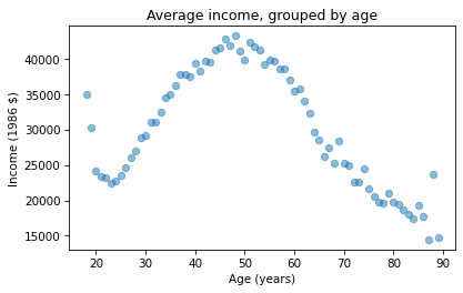
The result is a Pandas Series that contains the mean income for each age group, which we can plot like this.

import matplotlib.pyplot as plt

plt.plot(mean_income_by_age, 'o', alpha=0.5)
plt.xlabel('Age (years)')
plt.ylabel('Income (1986 $)')
plt.title('Average income, grouped by age');
_images/ecc1aef34032bb07cf1639367d00ddbe2fc8a8ed7532628b9ddddafed10f7f38.png

Average income increases from age 20 to age 50, then starts to fall. And that explains why the estimated slope is so small, because the relationship is non-linear. To describe a non-linear relationship, we’ll create a new variable called age2 that equals age squared – so it is called a quadratic term.

gss['age2'] = gss['age']**2

Now we can run a regression with both age and age2 on the right side.

model = smf.ols('realinc ~ educ + age + age2', data=gss)
results = model.fit()
results.params
Intercept   -52599.674844
educ          3464.870685
age           1779.196367
age2           -17.445272
dtype: float64

In this model, the slope associated with age is substantial, about $1779 per year.

The slope associated with age2 is about -$17. It might be unexpected that it is negative – we’ll see why in the next section. But first, here are two exercises where you can practice using groupby and ols.

Visualizing regression results

In the previous section we ran a multiple regression model to characterize the relationships between income, age, and education. Because the model includes quadratic terms, the parameters are hard to interpret. For example, you might notice that the parameter for educ is negative, and that might be a surprise, because it suggests that higher education is associated with lower income. But the parameter for educ2 is positive, and that makes a big difference. In this section we’ll see a way to interpret the model visually and validate it against data.

Here’s the model from the previous exercise.

gss['educ2'] = gss['educ']**2

model = smf.ols('realinc ~ educ + educ2 + age + age2', data=gss)
results = model.fit()
results.params
Intercept   -26336.766346
educ          -706.074107
educ2          165.962552
age           1728.454811
age2           -17.207513
dtype: float64

The results object provides a method called predict that uses the estimated parameters to generate predictions. It takes a DataFrame as a parameter and returns a Series with a prediction for each row in the DataFrame. To use it, we’ll create a new DataFrame with age running from 18 to 89, and age2 set to age squared.

import numpy as np

df = pd.DataFrame()
df['age'] = np.linspace(18, 89)
df['age2'] = df['age']**2

Next, we’ll pick a level for educ, like 12 years, which is the most common value. When you assign a single value to a column in a DataFrame, Pandas makes a copy for each row.

df['educ'] = 12
df['educ2'] = df['educ']**2

Then we can use results to predict the average income for each age group, holding education constant.

pred12 = results.predict(df)

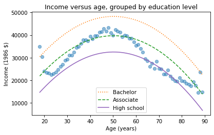
The result from predict is a Series with one prediction for each row. So we can plot it with age on the x-axis and the predicted income for each age group on the y-axis. And we’ll plot the data for comparison.

plt.plot(mean_income_by_age, 'o', alpha=0.5)
plt.plot(df['age'], pred12, label='High school', color='C4')

plt.xlabel('Age (years)')
plt.ylabel('Income (1986 $)')
plt.title('Income versus age, grouped by education level')
plt.legend();
_images/891bc6bf5b349cf7c4b5d16771cfabd3322ae5486b9e9501ed58f7f79426ffb8.png

The dots show the average income in each age group. The line shows the predictions generated by the model, holding education constant. This plot shows the shape of the model, a downward-facing parabola.

We can do the same thing with other levels of education, like 14 years, which is the nominal time to earn an Associate’s degree, and 16 years, which is the nominal time to earn a Bachelor’s degree.

df['educ'] = 16
df['educ2'] = df['educ']**2
pred16 = results.predict(df)

df['educ'] = 14
df['educ2'] = df['educ']**2
pred14 = results.predict(df)
plt.plot(mean_income_by_age, 'o', alpha=0.5)
plt.plot(df['age'], pred16, ':', label='Bachelor')
plt.plot(df['age'], pred14, '--', label='Associate')
plt.plot(df['age'], pred12, label='High school', color='C4')

plt.xlabel('Age (years)')
plt.ylabel('Income (1986 $)')
plt.title('Income versus age, grouped by education level')
plt.legend();
_images/582915f2a0348e2f09c863fdeb4f0a9f36c532b1594572564761a207119c7684.png

The lines show expected income as a function of age for three levels of education. This visualization helps validate the model, since we can compare the predictions with the data. And it helps us interpret the model since we can see the separate contributions of age and education.

Sometimes we can understand a model by looking at its parameters, but often it is better to look at its predictions. In the exercises, you’ll have a chance to run a multiple regression, generate predictions, and visualize the results.