Comparing Distributions
This is the second is a series of excerpts from Elements of Data Science which available from Lulu.com and online booksellers. It’s from Chapter 8, which is about representing distribution using PMFs and CDFs. This section explains why I think CDFs are often better for plotting and comparing distributions.You can read the complete chapter here, or run the Jupyter notebook on Colab.
So far we’ve seen two ways to represent distributions, PMFs and CDFs. Now we’ll use PMFs and CDFs to compare distributions, and we’ll see the pros and cons of each. One way to compare distributions is to plot multiple PMFs on the same axes. For example, suppose we want to compare the distribution of age for male and female respondents. First we’ll create a Boolean Series that’s true for male respondents and another that’s true for female respondents.
male = (gss['sex'] == 1)
female = (gss['sex'] == 2)
We can use these Series to select ages for male and female respondents.
male_age = age[male]
female_age = age[female]
And plot a PMF for each.
pmf_male_age = Pmf.from_seq(male_age)
pmf_male_age.plot(label='Male')

pmf_female_age = Pmf.from_seq(female_age)
pmf_female_age.plot(label='Female')

plt.xlabel('Age (years)')
plt.ylabel('PMF')
plt.title('Distribution of age by sex')
plt.legend();

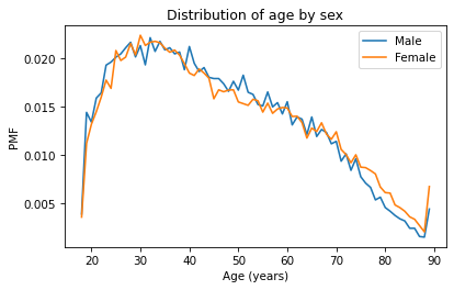
A plot as variable as this is often described as noisy. If we ignore the noise, it looks like the PMF is higher for men between ages 40 and 50, and higher for women between ages 70 and 80. But both of those differences might be due to randomness.
Now let’s do the same thing with CDFs – everything is the same except we replace Pmf with Cdf.
cdf_male_age = Cdf.from_seq(male_age)
cdf_male_age.plot(label='Male')

cdf_female_age = Cdf.from_seq(female_age)
cdf_female_age.plot(label='Female')

plt.xlabel('Age (years)')
plt.ylabel('CDF')
plt.title('Distribution of age by sex')
plt.legend();

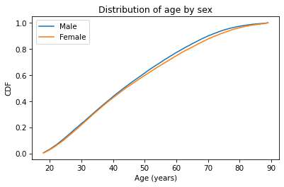
Because CDFs smooth out randomness, they provide a better view of real differences between distributions. In this case, the lines are close together until age 40 – after that, the CDF is higher for men than women.
So what does that mean? One way to interpret the difference is that the fraction of men below a given age is generally more than the fraction of women below the same age. For example, about 77% of men are 60 or less, compared to 75% of women.
cdf_male_age(60), cdf_female_age(60)
(array(0.7721998), array(0.7474241))
Going the other way, we could also compare percentiles. For example, the median age woman is older than the median age man, by about one year.
cdf_male_age.inverse(0.5), cdf_female_age.inverse(0.5)
(array(44.), array(45.))
Comparing Incomes
As another example, let’s look at household income and compare the distribution before and after 1995 (I chose 1995 because it’s roughly the midpoint of the survey). We’ll make two Boolean Series objects to select respondents interviewed before and after 1995.
pre95 = (gss['year'] < 1995)
post95 = (gss['year'] >= 1995)
Now we can plot the PMFs of realinc, which records household income converted to 1986 dollars.
realinc = gss['realinc']

Pmf.from_seq(realinc[pre95]).plot(label='Before 1995')
Pmf.from_seq(realinc[post95]).plot(label='After 1995')

plt.xlabel('Income (1986 USD)')
plt.ylabel('PMF')
plt.title('Distribution of income')
plt.legend();

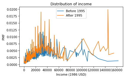
There are a lot of unique values in this distribution, and none of them appear very often. As a result, the PMF is so noisy and we can’t really see the shape of the distribution. It’s also hard to compare the distributions. It looks like there are more people with high incomes after 1995, but it’s hard to tell. We can get a clearer picture with a CDF.
Cdf.from_seq(realinc[pre95]).plot(label='Before 1995')
Cdf.from_seq(realinc[post95]).plot(label='After 1995')

plt.xlabel('Income (1986 USD)')
plt.ylabel('CDF')
plt.title('Distribution of income')
plt.legend();

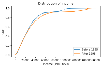
Below $30,000 the CDFs are almost identical; above that, we can see that the post-1995 distribution is shifted to the right. In other words, the fraction of people with high incomes is about the same, but the income of high earners has increased.
In general, I recommend CDFs for exploratory analysis. They give you a clear view of the distribution, without too much noise, and they are good for comparing distributions.