Probably the Book
Last week I had the pleasure of presenting a keynote at posit::conf(2024). When the video is available, I will post it here [UPDATE here it is].
In the meantime, you can read the slides, if you don’t mind spoilers.
For people at the conference who don’t know me, this might be a good time to introduce you to this blog, where I write about data science and Bayesian statistics, and to Probably Overthinking It, the book based on the blog, which was published by University of Chicago Press last December. Here’s an outline of the book with links to excerpts I’ve published in the blog and talks I’ve presented based on some of the chapters.
For your very own copy, you can order from Bookshop.org if you want to support independent bookstores, or Amazon if you don’t.
Twelve Excellent Chapters
In Chapter 1, we learn that no one is normal, everyone is weird, and everyone is about the same amount of weird. I published an excerpt from this chapter, and talked about it during this section of the SuperDataScience podcast. And it is featured in an interactive article at Brilliant.org, which includes this animation showing how measurements are distributed in multiple dimensions.
Chapter 2 is about the inspection paradox, which affects our perception of many real-world scenarios, including fun examples like class sizes and relay races, and more serious examples like our understanding of criminal justice and ability to track infectious disease. I published a prototype of this chapter as an article called “The Inspection Paradox is Everywhere“, and gave a talk about it at PyData NYC:
Chapter 3 presents three consequences of the inspection paradox in demography, especially changes in fertility in the United States over the last 50 years. It explains Preston’s paradox, named after the demographer who discovered it: if each woman has the same number of children as her mother, family sizes — and population — grow quickly; in order to maintain constant family sizes, women must have fewer children than their mothers, on average. I published an excerpt from this chapter, and it was discussed on Hacker News.
Chapter 4 is about extremes, outliers, and GOATs (greatest of all time), and two reasons the distribution of many abilities tends toward a lognormal distribution: proportional gain and weakest link effects. I gave a talk about this chapter for PyData Global 2023:
And here’s a related exploration I cut from the book.
Chapter 5 is about the surprising conditions where something used is better than something new. Most things wear out over time, but sometimes longevity implies information, which implies even greater longevity. This property has implications for life expectancy and the possibility of much longer life spans. I gave a talk about this chapter at ODSC East 2024 — there’s no recording, but the slides are here.
Chapter 6 introduces Berkson’s paradox — a form of collision bias — with some simple examples like the correlation of test scores and some more important examples like COVID and depression. Chapter 7 uses collision bias to explain the low birthweight paradox and other confusing results from epidemiology. I gave a “Talk at Google” about these chapters:
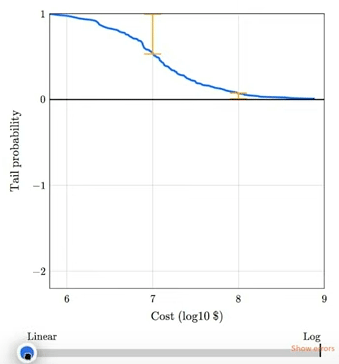
Chapter 8 shows that the magnitudes of natural and human-caused disasters follow long-tailed distributions that violate our intuition, defy prediction, and leave us unprepared. Examples include earthquakes, solar flares, asteroid impacts, and stock market crashes. I gave a talk about this chapter at SciPy 2023:
The talk includes this animation showing how plotting a tail distribution on a log-y scale provides a clearer picture of the extreme tail behavior.
Chapter 9 is about the base rate fallacy, which is the cause of many statistical errors, including misinterpretations of medical tests, field sobriety tests, and COVID statistics. It includes a discussion of the COMPAS system for predicting criminal behavior.
Chapter 10 is about Simpson’s paradox, with examples from ecology, sociology, and economics. It is the key to understanding one of the most notorious examples of misinterpretation of COVID data. This is the first of three chapters that use data from the General Social Survey (GSS).
Chapter 11 is about the expansion of the Moral Circle — specifically about changes in attitudes about race, gender, and homosexuality in the U.S. over the last 50 years. I published an excerpt about the remarkable decline of homophobia since 1990, featuring lyrics from “A Message From the Gay Community“.
Chapter 12 is about the Overton Paradox, a name I’ve given to a pattern observed in GSS data: as people get older, their beliefs become more liberal, on average, but they are more likely to say they are conservative. This chapter is the basis of this interactive lesson at Brilliant.org. And I gave a talk about it at PyData NYC 2022:
There are still a few chapters I haven’t given a talk about, so watch this space!
Again, you can order the book from Bookshop.org if you want to support independent bookstores, or Amazon if you don’t.
Supporting code for the book is in this GitHub repository. All of the chapters are available as Jupyter notebooks that run in Colab, so you can replicate my analysis. If you are teaching a data science or statistic class, they make good teaching examples.
Chapter 1: Are You Normal? Hint: No.
Run the code that prepares the BRFSS data
Run the code that prepares the Big Five data
Chapter 2: Relay Races and Revolving Doors
Chapter 3: Defy Tradition, Save the World
Chapter 4: Extremes, Outliers, and GOATs
Run the code that prepares the BRFSS data
Run the code that prepares the NSFG data
Chapter 5: Bettter Than New
Chapter 6: Jumping to Conclusions
Chapter 7: Causation, Collision, and Confusion
Run the code that prepares the NCHS data
Chapter 8: The Long Tail of Disaster
Run the code that prepares the earthquake data
Run the code that prepares the solar flare data
Chapter 9: Fairness and Fallacy
Chapter 10: Penguins, Pessimists, and Paradoxes
Run the code that prepares the GSS data
Chapter 11: Changing Hearts and Minds
Chapter 12: Chasing the Overton Window