Browsed by
Month: October 2023

Why are you so slow?

Why are you so slow?

Recently a shoe store in France ran a promotion called “Rob It to Get It”, which invited customers to try to steal something by grabbing it and running out of the store. But there was a catch — the “security guard” was a professional sprinter, Méba Mickael Zeze. As you would expect, he is fast, but you might not appreciate how much faster he is than an average runner, or even a good runner.

Why? That’s the topic of Chapter 4 of Probably Overthinking It, which is available for preorder now. Here’s an excerpt.

Running Speeds

If you are a fan of the Atlanta Braves, a Major League Baseball team, or if you watch enough videos on the internet, you have probably seen one of the most popular forms of between-inning entertainment: a foot race between one of the fans and a spandex-suit-wearing mascot called the Freeze.

The route of the race is the dirt track that runs across the outfield, a distance of about 160 meters, which the Freeze runs in less than 20 seconds. To keep things interesting, the fan gets a head start of about 5 seconds. That might not seem like a lot, but if you watch one of these races, this lead seems insurmountable. However, when the Freeze starts running, you immediately see the difference between a pretty good runner and a very good runner. With few exceptions, the Freeze runs down the fan, overtakes them, and coasts to the finish line with seconds to spare.

Here are some examples:

But as fast as he is, the Freeze is not even a professional runner; he is a member of the Braves’ ground crew named Nigel Talton. In college, he ran 200 meters in 21.66 seconds, which is very good. But the 200 meter collegiate record is 20.1 seconds, set by Wallace Spearmon in 2005, and the current world record is 19.19 seconds, set by Usain Bolt in 2009.

To put all that in perspective, let’s start with me. For a middle-aged man, I am a decent runner. When I was 42 years old, I ran my best-ever 10 kilometer race in 42:44, which was faster than 94% of the other runners who showed up for a local 10K. Around that time, I could run 200 meters in about 30 seconds (with wind assistance).

But a good high school runner is faster than me. At a recent meet, the fastest girl at a nearby high school ran 200 meters in about 27 seconds, and the fastest boy ran under 24 seconds.

So, in terms of speed, a fast high school girl is 11% faster than me, a fast high school boy is 12% faster than her; Nigel Talton, in his prime, was 11% faster than him, Wallace Spearmon was about 8% faster than Talton, and Usain Bolt is about 5% faster than Spearmon.

Unless you are Usain Bolt, there is always someone faster than you, and not just a little bit faster; they are much faster. The reason is that the distribution of running speed is not Gaussian — It is more like lognormal.

To demonstrate, I’ll use data from the James Joyce Ramble, which is the 10 kilometer race where I ran my previously-mentioned personal record time. I downloaded the times for the 1,592 finishers and converted them to speeds in kilometers per hour. The following figure shows the distribution of these speeds on a logarithmic scale, along with a Gaussian model I fit to the data.
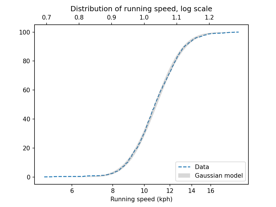
The logarithms follow a Gaussian distribution, which means the speeds themselves are lognormal. You might wonder why. Well, I have a theory, based on the following assumptions:

  • First, everyone has a maximum speed they are capable of running, assuming that they train effectively.
  • Second, these speed limits can depend on many factors, including height and weight, fast- and slow-twitch muscle mass, cardiovascular conditioning, flexibility and elasticity, and probably more.
  • Finally, the way these factors interact tends to be multiplicative; that is, each person’s speed limit depends on the product of multiple factors.

Here’s why I think speed depends on a product rather than a sum of factors. If all of your factors are good, you are fast; if any of them are bad, you are slow. Mathematically, the operation that has this property is multiplication.

For example, suppose there are only two factors, measured on a scale from 0 to 1, and each person’s speed limit is determined by their product. Let’s consider three hypothetical people:

  • The first person scores high on both factors, let’s say 0.9. The product of these factors is 0.81, so they would be fast.
  • The second person scores relatively low on both factors, let’s say 0.3. The product is 0.09, so they would be quite slow.

So far, this is not surprising: if you are good in every way, you are fast; if you are bad in every way, you are slow. But what if you are good in some ways and bad in others?

  • The third person scores 0.9 on one factor and 0.3 on the other. The product is 0.27, so they are a little bit faster than someone who scores low on both factors, but much slower than someone who scores high on both.

That’s a property of multiplication: the product depends most strongly on the smallest factor. And as the number of factors increases, the effect becomes more dramatic.

To simulate this mechanism, I generated five random factors from a Gaussian distribution and multiplied them together. I adjusted the mean and standard deviation of the Gaussians so that the resulting distribution fit the data; the following figure shows the results.
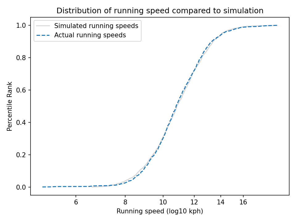
The simulation results fit the data well. So this example demonstrates a second mechanism [the first is described earlier in the chapter] that can produce lognormal distributions: the limiting power of the weakest link. If there are at least five factors affect running speed, and each person’s limit depends on their worst factor, that would explain why the distribution of running speed is lognormal.

And that’s why you can’t beat the Freeze.


You can read about the “Rob It to Get It” promotion in this article and watch people get run down in this video.
The World Population Singularity

The World Population Singularity

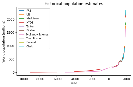
One of the exercises in Modeling and Simulation in Python invites readers to download estimates of world population from 10,000 BCE to the present, and to see if they are well modeled by any simple mathematical function. Here’s what the estimates look like (aggregated on Wikipedia from several researchers and organizations):

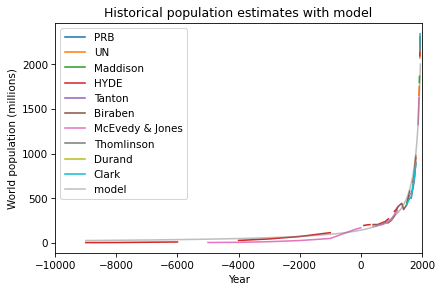
After some trial and error, I found a simple model that fits the data well: a / (b-x), where a is 300,000 and b is 2100. Here’s what the model looks like compared to the data:

So that’s a pretty good fit, but it’s a very strange model. The first problem is that there is no theoretical reason to expect world population to follow this model, and I can’t find any prior work where researchers in this area have proposed a model like this.

The second problem is that this model is headed for a singularity: it goes to infinity in 2100. Now, there’s no cause for concern — this data only goes up to 1950, and as we saw in this previous article, the nature of population growth since then has changed entirely. Since 1950, world population has grown only linearly, and it is now expected to slow down and stop growing before 2100. So the singularity has been averted.

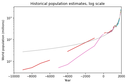
But what should we make of this strange model? We can get a clearer view by plotting the y-axis on a log scale:

On this scale, we can see that the model does not fit the data as well prior to 4000 BCE. I’m not sure how much of a problem that is, considering that the estimates during that period are not precise. The retrodictions of the model might actually fall within the uncertainty of the estimates.

Regardless, even if the model only fits the data after 4000 BCE, it is still worth asking why it fits as well as it does. One step toward an answer is to express the model in terms of doubling time. With a little math, we can show that a function with the form a / (b-x) has a doubling time that decreases linearly.

In 10,000 BCE, doubling time was about 8000 years, in 5000 BCE, it was about 5000 years, and in Year 0, it was 1455 years. Doubling time decreased because of the Neolithic Revolution, which was the transition of human populations from hunting and gathering to agriculture and settlement, starting about 10,000 years ago.

During this period, the domestication of plants and animals vastly increased the calories people could obtain, and the organization of large, permanent settlements accelerated the conversion of those calories into population growth.

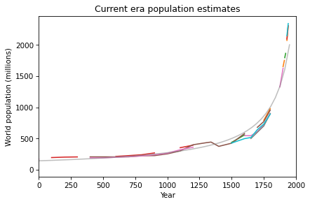
If we zoom in on the last 2000 years, we see that the most recent data points are higher and steeper than the model’s predictions, which suggest that the Industrial Revolution accelerated growth even more.

So, if the Neolithic Revolution started world population on the path to a singularity, and the Industrial Revolution sped up the process, what stopped it? Why has population growth since 1950 slowed so dramatically?

The ironic answer is the Green Revolution, which increased our ability to produce calories so quickly, it contributed to rapid improvements in public health, education, and economic opportunity — all of which led to drastic decreases in child mortality. And, it turns out, when children are likely to survive, people choose to have fewer of them.

As a result, population growth left the regime where doubling time decreases linearly, and entered a regime where doubling time increases linearly. And soon, if not already, it will enter a regime of deceleration and decline. At this point it is unlikely that world population will ever double again.

So, to summarize the last 10,000 years of population growth, the Neolithic and Industrial Revolutions made it possible for humans to breed like crazy, and the Green Revolution made it so we don’t want to.

This article is based on an exercise in Modeling and Simulation in Python, now available from No Starch Press and Amazon.com. You can download the data and run the code in this Jupyter notebook.

Another step toward a two-hour marathon

Another step toward a two-hour marathon

This is an update to an analysis I run each time the marathon world record is broken. If you like this sort of thing, you will like my forthcoming book, Probably Overthinking It, which is available for preorder now.

On October 8, 2023, Kelvin Kiptum ran the Chicago Marathon in 2:00:35, breaking by 34 seconds the record set last year by Eliud Kipchoge — and taking another big step in the progression toward a two-hour marathon.

In a previous article, I noted that the marathon record speed since 1970 has been progressing linearly over time, and I proposed a model that explains why we might expect it to continue.  Based on a linear extrapolation of the data so far, I predicted that someone would break the two hour barrier in 2036, plus or minus five years.

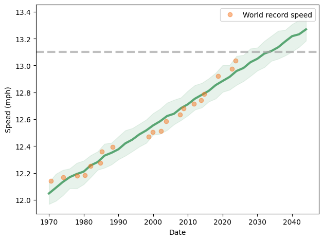
Now it is time to update my predictions in light of the new record.  The following figure shows the progression of world record speed since 1970 (orange dots), a linear fit to the data (green line) and a 90% predictive confidence interval (shaded area).

This model predicts that we will see a two-hour marathon in 2033 plus or minus 6 years.

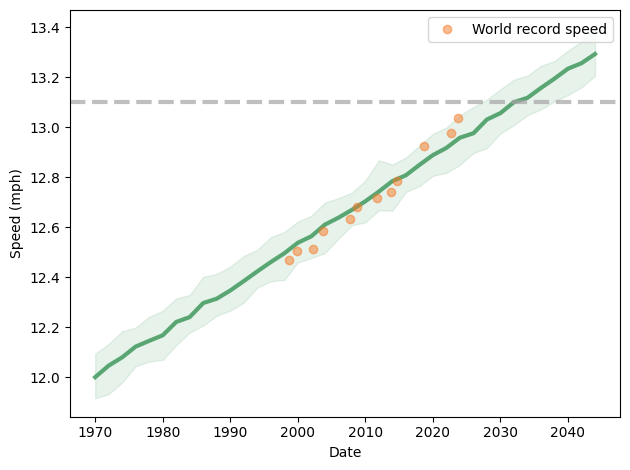
However, it looks more and more like the slope of the line has changed since 1998. If we consider only data since then, we get the following prediction:

This model predicts a two hour marathon in 2032 plus or minus 5 years. But with the last three points above the long-term trend, and with two active runners knocking on the door, I would bet on the early end of that range.

This analysis is one of the examples in Chapter 17 of Think Bayes; you can read it here, or you can click here to run the code in a Colab notebook.

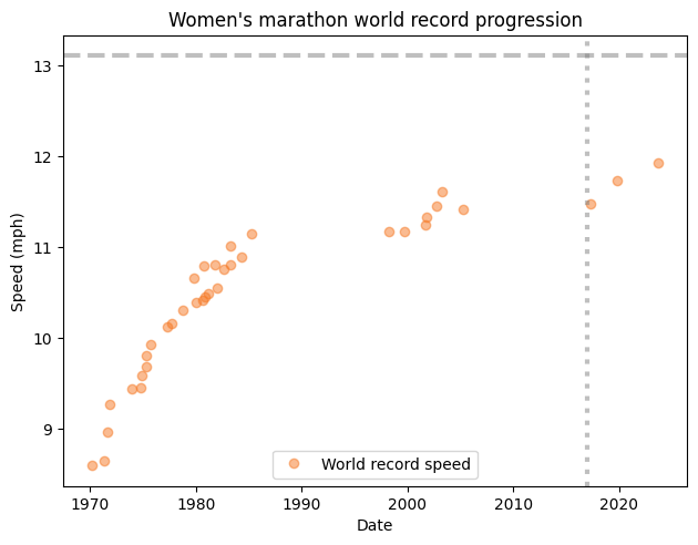
UPDATE: I was asked if the same analysis works for the women’s marathon world record progression. The short answer is no. Here’s what the data look like:

You might notice that the record speed does not increase monotonically — that’s because there are two records, one in races where women compete separately from men, and another where they are mixed. In a mixed race, women can take advantage of male pacers.

Notably, there have been two long stretches where a record went unbroken. More recently, Paula Radcliffe’s women-only record, set in 2005, stood until 2017, when it was broken by Mary Jepkosgei Keitany in 2017.

After that drought, two new records followed quickly — both set by runners wearing supershoes.

How Does World Population Grow?

How Does World Population Grow?

Recently I posed this question on Twitter: “Since 1960, has world population grown exponentially, quadratically, linearly, or logarithmically?”

Here are the responses:

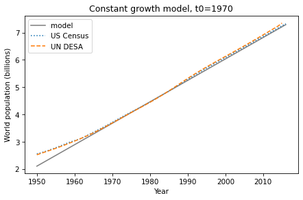
By a narrow margin, the most popular answer is correct — since 1960 world population growth has been roughly linear. I know this because it’s the topic of Chapter 5 of Modeling and Simulation in Python, now available from No Starch Press and Amazon.com.

This figure — from one of the exercises — shows estimates of world population from the U.S. Census Bureau and the United Nations Department of Economic and Social Affairs, compared to a linear model.

That’s pretty close to linear.

Looking again at the poll, the distribution of responses suggests that this pattern is not well known. And it is a surprising pattern, because there is no obvious mechanism to explain why growth should be linear.

If the global average fertility rate is constant, population grows exponentially. But over the last 60 years fertility rates have declined at precisely the rate that cancels exponential growth.

I don’t think that can be anything other than a coincidence, and it looks like it won’t last. World population is now growing less-than-linearly, and demographers predict that it will peak around 2100, and then decline — that is, population growth after 2100 will be negative.

If you did not know that fertility rates are declining, you might wonder why — and why it really got going in the 1960s. Of course the answer is complicated, but there is one potential explanation with the right timing and the necessary global scale: the Green Revolution, which greatly increased agricultural yields in one region after another.

It might seem like more food would yield more people, but that’s not how it turned out. More food frees people from subsistence farming and facilitates urbanization, which creates wealth and improves public health, especially child survival. And when children are more likely to survive, people generally choose to have fewer children.

Urbanization and wealth also improve education and economic opportunity, especially for women. And that, along with expanded human rights, tends to lower fertility rates even more. This set of interconnected causes and effects is called the demographic transition.

These changes in fertility, and their effect on population growth, will be the most important global trends of the 21st century. If you want to know more about them, you might like:

What size is that correlation?

What size is that correlation?

This article is related to Chapter 6 of Probably Overthinking It, which is available for preorder now. It is also related to a new course at Brilliant.org, Explaining Variation.

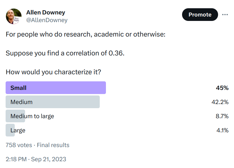
Suppose you find a correlation of 0.36. How would you characterize it? I posed this question to the stalwart few still floating on the wreckage of Twitter, and here are the responses.

It seems like there is no agreement about whether 0.36 is small, medium, or large. In the replies, nearly everyone said it depends on the context, and of course that’s true. But there are two things they might mean, and I only agree with one of them:

  • In different areas of research, you typically find correlations in difference ranges, so what’s “small” in one field might be “large” in another.
  • It depends on the goal of the project — that is, what you are trying to predict, explain, or decide.

The first interpretation is widely accepted in the social sciences. For example, this highly-cited paper proposes as a guideline that, “an effect-size r of .30 indicates an effect that is large and potentially powerful in both the short and the long run.” This guideline is offered in light of “the average sizes of effects in the published literature of social and personality psychology.”

I don’t think that’s a good argument. If you study mice, and you find a large mouse, that doesn’t mean you found an elephant.

But the same paper offers what I think is better advice: “Report effect sizes in terms that are
meaningful in context”. So let’s do that.

What is the context?

I asked about r = 0.36 because that’s the correlation between general mental ability (g) and the general factor of personality (GFP) reported in this paper, which reports meta-analyses of correlations between a large number of cognitive abilities and personality traits.

Now, for purposes of this discussion, you don’t have to believe that g and GFP are valid measures of stable characteristics. Let’s assume that they are — if you are willing to play along — just long enough to ask: if the correlation between them is 0.36, what does that mean?

I propose that the answer depends on whether we are trying to make a prediction, explain a phenomenon, or make decisions that have consequences. Let’s take those in turn.

Prediction

Thinking about correlation in terms of predictive value, let’s assume that we can measure both g and GFP precisely, and that both are expressed as standardized scores with mean 0 and standard deviation 1. If the correlation between them is 0.36, and we know that someone has g=1 (one standard deviation above the mean), we expect them to have GFP=0.36 (0.36 standard deviations above the mean), on average.

In terms of percentiles, someone with g=1 is in the 84th percentile, and we would expect their GFP to be in the 64th percentile. So in that sense, g conveys some information about GFP, but not much.

To quantify predictive accuracy, we have several metrics to choose from — I’ll use mean absolute error (MAE) because I think is the most interpretable metric of accuracy for a continuous variable. In this scenario, if we know g exactly, and use it to predict GFP, the MAE is 0.75, which means that we expect to be off by 0.75 standard deviations, on average.

For comparison, if we don’t know g, and we are asked to guess GFP, we expect to be off by 0.8 standard deviations, on average. Compared to this baseline, knowing g reduces MAE by about 6%. So a correlation of 0.36 doesn’t improve predictive accuracy by much, as I discussed in this previous blog post.

Another metric we might consider is classification accuracy. For example, suppose we know that someone has g>0 — so they are smarter than average. We can compute the probability that they also have GFP>0 — informally, they are nicer than average. This probability is about 0.62.

Again, we can compare this result to a baseline where g is unknown. In that case the probability that someone is smarter than average is 0.5. Knowing that someone is smart moves the needle from 0.5 to 0.62, which means that it contributes some information, but not much.

Going in the other direction, if we think of low g as a risk factor for low GFP, the risk ratio would be 1.2. Expressed as an odds ratio it would be 1.6. In medicine, a risk factor with RR=1.2 or OR=1.6 would be considered a small increase in risk. But again, it depends on context — for a common condition with large health effects, identifying a preventable factor with RR=1.2 could be a very important result!

Explanation

Instead of prediction, suppose you are trying to explain a particular phenomenon and you find a correlation of 0.36 between two relevant variables, A and B. On the face of it, such a correlation is evidence that there is some kind of causal relationship between the variables. But by itself, the correlation gives no information about whether A causes B, B causes A, or any number of other factors cause both A and B.

Nevertheless, it provides a starting place for a hypothetical question like, “If A causes B, and the strength of that causal relationship yields a correlation of 0.36, would that be big enough to explain the phenomenon?” or “What part of the phenomenon could it explain?”

As an example, let’s consider the article that got me thinking about this, which proposes in the title the phenomenon it promises to explain: “Smart, Funny, & Hot: Why some people have it all…”

Supposing that “smart” is quantified by g and that “funny” and other positive personality traits are quantified by GFP, and that the correlation between them is 0.36, does that explain why “some people have it all”?

Let’s say that “having it all” means g>1 and GFP>1. If the factors were uncorrelated, only 2.5% of the population would exceed both thresholds. With correlation 0.36, it would be 5%. So the correlation could explain why people who have it all are about twice as common as they would be otherwise.

Again, you don’t have to buy any part of this argument, but it is an example of how an observed correlation could explain a phenomenon, and how we could report the effect size in terms that are meaningful in context.

Decision-making

After prediction and explanation, a third use of an observed correlation is to guide decision-making.

For example, in a 2106 article, ProPublic evaluated COMPAS, an algorithm used to inform decisions about bail and parole. They found that its classification accuracy was 0.61, which they characterized as “somewhat better than a coin toss”. For decisions that affect people’s lives in such profound ways, that accuracy is disturbingly low.

But in another context, “somewhat better than a coin toss” can be a big deal. In response to my poll about a correlation of 0.36, one stalwart replied, “In asset pricing? Say as a signal of alpha? So implausibly large as to be dismissed outright without consideration.”

If I understand correctly, this means that if you find a quantity known in the present that correlates with future prices with r = 0.36, you can use that information to make decisions that are substantially better than chance and outperform the market. But it is extremely unlikely that such a quantity exists.

However, if you make a large number of decisions, and the results of those decisions accumulate, even a very small correlation can yield a large effect. The paper I quoted earlier makes a similar observation in the context of individual differences:

“If a psychological process is experimentally demonstrated, and this process is found to appear reliably, then its influence could in many cases be expected to accumulate into important implications over time or across people even if its effect size is seemingly small in any particular instance.”

I think this point is correct, but incomplete. If a small effect accumulates, it can yield big differences, but if that’s the argument you want to make, you have to support it with a model of the aggregation process that estimates the cumulative effect that could result from the observed correlation.

Predict, Explain, Decide

Whether a correlation is big or small, important or not, and useful or not, depends on the context, of course. But to be more specific, it depends on whether you are trying to predict, explain, or decide. And what you report should follow:

  • If you are making predictions, report a metric of predictive accuracy. For continuous quantities, I think MAE is most interpretable. For discrete values, report classification accuracy — or recall and precision, or AUC.
  • If you are explaining a phenomenon, use a model to show whether the effect you found is plausibly big enough to explain the phenomenon, or what fraction it could explain.
  • If you are making decisions, use a model to quantify the expected benefit — or the distribution of benefits would be even better. If your argument is that small correlations accumulate into big effects, use a model to show how and quantify how much.

As an aside, thinking of modeling in terms of prediction, explanation, and decision-making is the foundation of Modeling and Simulation in Python, now available from No Starch Press and Amazon.com.