Go Get the Data
My mantra when I was working on Probably Overthinking It was “Go Get the Data.” If I wanted to use a result from prior work, I would get the data whenever possible and make my own visualization. Of course, that’s more work than copying and pasting a figure, but there are a lot of benefits. One is that I can often get newer data. Another is that I can check the results.
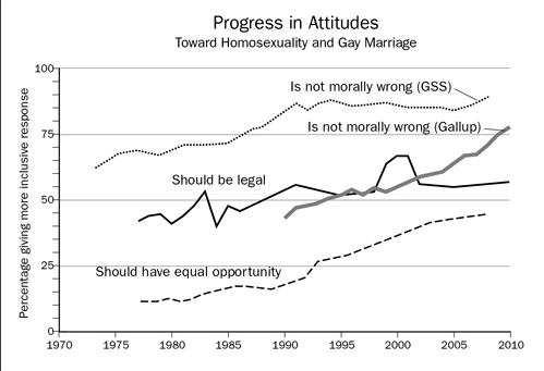
I was reminded of these benefits a few months ago when I was reading a very good book that I won’t name because I’m about to point out an error, and I don’t want to be a jerk about it. The book includes the following figure:

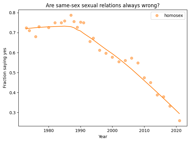
The top line got my attention because I have worked on several projects with data from the General Social Survey (GSS), and this particular question is one of the examples in my Political Alignment Case Study. Plotting the fraction of people who think homosexuality is wrong, I generated this figure:

These results are not the same (even accounting for the inverted y-axis).
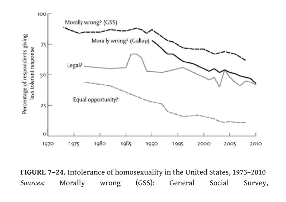
So I checked the source, which is Steven Pinker’s The Better Angels of Our Nature, specifically this figure:

It looks like Pinker’s figure is consistent with mine. So what went wrong with the first figure?
Here’s what I think happened: they wanted to invert the y axis to show the percentage who think homosexuality is not wrong. But instead of flipping the y axis, they seem to have flipped the x axis, reversing the arrow of time! If you compare the other lines, it looks like they have all been reversed left-for-right.
Now, this is just one error in an otherwise excellent book. But it’s a reminder that this kind of thing can be avoided, if you Go Get the Data.