Simpson’s Paradox and Education
Is Simpson’s paradox a mathematical curiosity or something that matters in practice? To answer this question, I’m searching the General Social Survey (GSS) for examples. Last week I published the first batch, examples where we group people by decade of birth and plot their opinions over time. In this article I present the next batch, grouping by education and plotting over time.
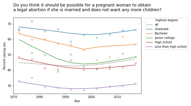
The first example I found is in the responses to this question: “Please tell me whether or not you think it should be possible for a pregnant woman to obtain a legal abortion if she is married and does not want any more children?”
If we group respondents by the highest degree they have earned and compute the fraction who answer “yes” over time, the results meet the criteria for Simpson’s paradox: in every group, the trend over time is downward, but if we put the groups together, the overall trend is upward.
However, if we plot the data, we see that this example is not entirely satisfying.

The markers show the fraction of respondents in each group who answered “yes”; the lines show local regressions through the markers.
In all groups, support for legal abortion (under the specified condition) was decreasing until the 1990s, then started to increase. If we fit a straight line to these curves, the estimated slope is negative. And if we fit a straight line to the overall curve, the estimated slope is positive.
But in both cases, the result doesn’t mean very much because we’re fitting a line to a curve. This is one of many examples I have seen where Simpson’s paradox doesn’t happen because anything interesting is happening in the world; it is just an artifact of a bad model.
This example would have been more interesting in 2002. If we run the same analysis using data from 2002 or earlier, we see a substantial decrease in all groups, and almost no change overall. In that case, the paradox is explained by changes in educational level. Between 1972 and 2002, the fraction of people with a college degree increased substantially. Support for abortion was decreasing in all groups, but more and more people were in the high-support groups.
Free speech
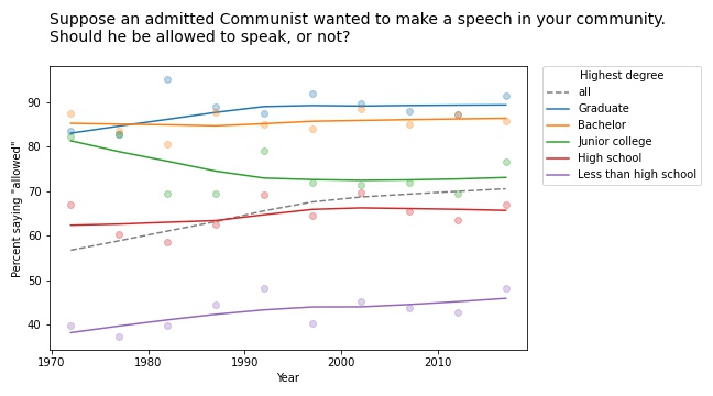
We see a similar pattern in many of the questions related to free speech. For example, the GSS asks, “Suppose an admitted Communist wanted to make a speech in your community. Should he be allowed to speak, or not?” The following figure shows the fraction of respondents at each education level who say “allowed to speak”, plotted over time.

The differences between the groups are big: among people with a bachelor’s or advanced degree, almost 90% would allow an “admitted” Communist to speak; among people without a high school diploma it’s less than 50%. (If you are curious about the wording of questions like this, remember that many GSS questions were written in the 1970s and, for purposes of comparison over time, they avoid changing the text.)
The responses have changed only slightly since 1973: in most groups, support has increased a little; among people with a junior college degree, it has decreased a little.
But overall support has increased substantially, for the same reason as in the previous example: the number of people at higher levels of education increased during this interval.
Whether this is an example of Simpson’s paradox depends on the definition. But it is certainly an example where we see one story if we look at the overall trend and another story if we look at the subgroups.
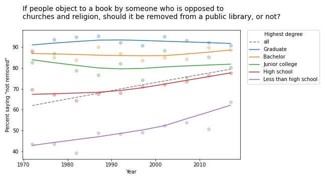
Other questions related to free speech show similar trends. For example, the GSS asks: “There are always some people whose ideas are considered bad or dangerous by other people. For instance, somebody who is against all churches and religion. If some people in your community suggested that a book he wrote against churches and religion should be taken out of your public library, would you favor removing this book, or not?”
The following figure shows the fraction of respondents who say the book should not be removed:

Again, respondents with more education are more likely to support free speech (and probably less hostile to the non-religious, as well). But in this case support is increasing among people with less education. So the overall trend we see is really the sum of two trends: increases within some groups in addition to shifts between groups.
In this example, the overall slope is steeper than the estimated slope in any group. That would be surprising if you expected the overall slope to be like a weighted average of the group slopes. But as all of these examples show, it’s not.
This article presents examples of Simpson’s paradox, and related patterns, when we group people by education level and plot their responses over time. In the next article we’ll see what happens when we groups people by age.