Old optimists and young pessimists
Years ago I told one of my colleagues about my Data Science class and he asked if I taught Simpson’s paradox. I said I didn’t spend much time on it because, I opined, it is a mathematical curiosity unlikely to come up in practice. My colleague was shocked and dismayed because, he said, it comes up all the time in his field (psychology).
Ever since then, I have been undecided about Simpson’s paradox. A lot of people think it’s important, but when I look for compelling examples, I find the same three stories over and over: Berkeley admissions, kidney stones, and Derek Jeter’s batting average. Yawn.
But last week I found a more interesting example:
- Between 2000 and 2018, real wages for full-time employees increased.
- Over the same period, real wages decreased for people at every level of education.
If that seems impossible, go read my article about it.
I also found an article (“Can you Trust the Trend: Discovering Simpson’s Paradoxes in Social Data“) where the authors search a dataset for instances of Simpson’s paradox and describe the ones they find.
And that got me thinking about my old friend, the General Social Survey (GSS). So I’ve started searching the GSS for instances of Simpson’s paradox. I’ll report what I find, and maybe we can get a sense of (1) how often it happens, (2) whether it matters, and (3) what to do about it.
I’ll start with examples where the x-variable is time. For y-variables, I use about 120 questions from the GSS. And for subgroups, I use race, sex, political alignment (liberal-conservative), political party (Democrat-Republican), religion, age, birth cohort, social class, and education level. That’s about 1000 combinations.
Of these, about 10 meet the strict criteria for Simpson’s paradox, where the trend in all subgroups goes in the same direction and the overall trend goes in the other direction. On examination, most of them are not very interesting. In most cases, the actual trend is nonlinear, so the parameters of the linear model don’t mean very much.
But a few of them turn out to be interesting, at least to me. For example, the following figure shows the fraction of respondents who think “most of the time people try to be helpful”, plotted over time, grouped by decade of birth. The markers show the percentage in each group during each interval; the lines show local regressions.
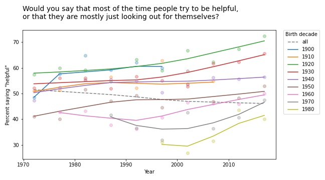
Within each group, the trend is positive: apparently, people get more optimistic about human nature as they age. But overall the trend is negative. Why? Because of generational replacement. People born before 1940 are substantially more optimistic than people born later; as old optimists die, they are being replaced by young pessimists.
Based on this example, we can go looking for similar patterns in other variables. For example, here are the results from a related question about fairness.
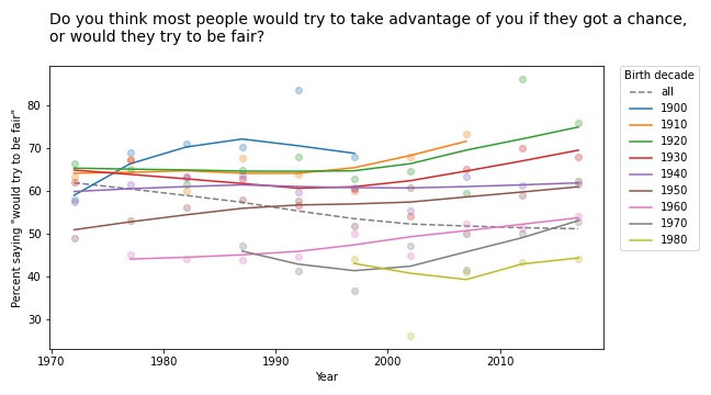
Again, old optimists are being replaced by young pessimists.
For a similar question about trust, the results are a little more chaotic:
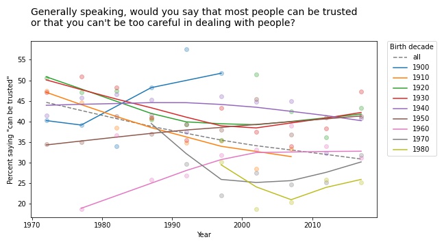
Some groups are going up and others down, so this example doesn’t meet the criteria for Simpson’s paradox. But it shows the same pattern of generational replacement.
Old conservatives, young liberals
Questions related to prohibition show similar patterns. For example, here are the responses to a question about whether pornography should be illegal.
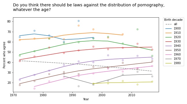
In almost every group, support for banning pornography has increased over time. But recent generations are substantially more tolerant on this point, so overall support for prohibition is decreasing.
The results for legalizing marijuana are similar.
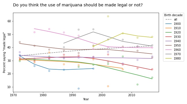
In most groups, support for legalization has gone down over time; nevertheless, through the power of generational replacement, overall support is increasing.
So far, I think this is more interesting than Derek Jeter’s batting average. More examples coming soon!