Left, right, part 3
In the first article in this series, I looked at data from the General Social Survey (GSS) to see how political alignment in the U.S. has changed, on the axis from conservative to liberal, over the last 50 years.
In the second article, I suggested that self-reported political alignment could be misleading.
In this article we’ll look at results from questions related to “outlook”, that is, how the respondents see the world and people in it.
Specifically, the questions are:
- fair: Do you think most people would try to take advantage of you if they got a chance, or would they try to be fair?
- trust: Generally speaking, would you say that most people can be trusted or that you can’t be too careful in dealing with people?
- helpful: Would you say that most of the time people try to be helpful, or that they are mostly just looking out for themselves?
Do people try to be fair?
Let’s start with fair. The responses are coded like this:
1    Take advantage
2    Fair
3    Depends
To put them on a numerical scale, I recoded them like this:
1    Fair
0.5  Depends
0    Take advantage
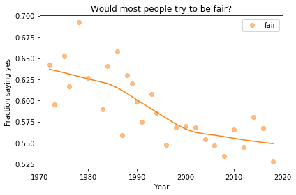
I flipped the axis so the more positive answer is higher, and put “Depends” in the middle. Now we can plot the mean response by year, like this:

Looking at a figure like this, there are three levels we might describe:
- Absolute value: “Most respondents think people try to be fair.”
- Rate of change: “Belief in fairness is falling.”
- Change in rate: “Belief in fairness is falling, but might be leveling off.”
For any of these qualitative descriptions, we could add quantitative estimates. For example, “About 55% of U.S. residents think people try to be fair”, or “Belief in fairness has dropped 10 percentage points since 1970”.
Statistically, the estimates of absolute value are probably reliable, but we should be more cautious estimating rates of change, and substantially more cautious talking about changes in rates. We’ll come back to this issue, but first let’s look at breakdowns by group.
Outlook and political alignment
In the previous article I grouped respondents by self-reported political alignment: Conservative, Moderate, or Liberal.
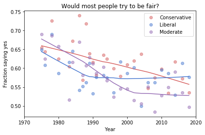
We can use these groups to see the relationship between outlook and political alignment. For example, the following figure shows the average response to the fairness question, grouped by political alignment and plotted over time:

Results like these invite comparisons between groups, and we can make those comparisons at several levels. Here are some potential headlines for this figure:
- Absolute value: “Moderates have the bleakest outlook; Conservatives and Liberals are more optimistic.”
- Rate of change: “Belief in fairness is declining in all groups, but Conservatives are declining fastest.”
- Change in rate: “The Liberal outlook was declining, but it leveled off in 1990.” or “Liberals, who had the bleakest outlook in the 1980s, are now the most optimistic”.
Because we divided the respondents into three groups, the sample size in each group is smaller. Statistically, we need to be more skeptical about our estimates of absolute level, even more skeptical about rates of change, and extremely skeptical about changes in rates.
In the next article, I’ll use resampling to quantify the uncertainly of these estimates, and we’ll see how many of these headlines hold up.